


Two-Day-Old Baby Loses Part of Her Thumb at Skopje Maternity Clinic: The Nurse Is Moved to the Milk Kitchen, the Committee Gets 60 Days
20.11.2026


20.11.2026

20.11.2026

20.11.2026

20.11.2026

20.11.2026

20.11.2026

20.11.2026

19.11.2026

18.11.2026

20.11.2026

20.11.2026

19.11.2026

20.11.2026

20.11.2026

20.11.2026
20.11.2026

19.11.2026

18.11.2026

20.11.2026

19.11.2026

18.11.2026

20.11.2026

20.11.2026

19.11.2026

20.11.2026

19.11.2026

18.11.2026

23.04.2026

23.04.2026

12.04.2026


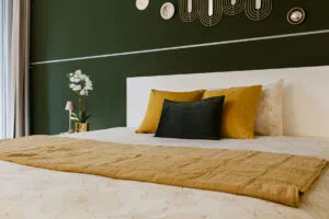
Photo: Image Hunter Pexels, Pexels License
White was long the standard for the bedroom: it promised light, calm and the illusion of more space. In interior designers' new projects, walls are increasingly getting soft brown, grey-brown (taupe), muted green, dusty pink and clay.
The reason is practical, not a fashion thing. We use the bedroom mostly in the evening, when artificial light rules. Under warm bulbs white loses some of its glow and looks colder, while earthy colours soften shadows and create an atmosphere that wraps around you. They also go well with natural materials, wood, linen, wool, rattan and stone, which look richer against a coloured backdrop. The goal is no longer for the room to look bigger or brighter, but for it to feel cosy.

Dark walls, wood and warm light. The studio of architect Anna Uchevatova, Se.Studio, painted the walls of the main bedroom of a flat in Barcelona's Pedralbes neighbourhood in dark tones, with white bedding balancing the darkness. A wooden slatted partition separates the bed from the bathroom while still letting natural light through. A dark wall pairs with light surfaces, beige, raw linen or stone tones, and the wall colour is worth repeating in the furniture or curtains. Compare samples carefully, too: a taupe with a grey base and a taupe with more brown give you two completely different rooms.
Taupe, the neutral that is replacing grey. The Zentrum studio uses it as a warmer alternative to grey and brown, in a project with exposed ceiling beams, raw textiles, a knitted throw and a black-and-white photograph. Its strength is its versatility: with wood it feels warmer, with black or metal details more contemporary. The whole room can even be tonal, with several shades of taupe on the walls, upholstery and bedding, without a single contrasting colour.
Clay with a stone texture. In a renovated house in Cerdanya, the Bombí+Gómez studio achieved character through both colour and finish. Plaster mixed with marble dust shifts into sand and clay tones under side lighting, an effect ordinary paint struggles to give. Mineral finishes, lime plasters and coatings with fine aggregate create subtle irregularities that change with the light. Copper wall lamps, a round wooden side table and an upholstered bouclé headboard complete the picture.

Olive green with terracotta accents. This is a good choice for anyone who wants to step away from neutrals without going overboard. Designer Pia Capdevila painted only the wall behind the bed, in a home in Barcelona's Sant Gervasi neighbourhood, and left the other surfaces light. Pink and terracotta cushions, striped throws and an abstract painting in sand tones stand out against the green. The result is an autumnal mix that goes perfectly with natural wood flooring.
A geometric mural in blue tones. Cool colours can be warm too. The LC Interiorismo studio skipped the classic headboard and covered the entire wall with a geometric composition in blue, grey and stone tones. A velvet headboard in dark petrol blue, matching cushions and pendant lamps with orange cables reinforce the room's graphic character.
Sand and mouldings. The Punto y Seguido studio of designer Pilar Sinca focused all the decoration on the wall behind the bed: sand-coloured wallpaper with a textile effect, framed with white mouldings, and two wall lamps with stone bases and linen shades. This is an idea for anyone renting or without a budget for a big renovation, since only one wall gets done. Tip: a discreet texture, very fine stripes or a small geometric pattern that won't compete with the pictures and cushions.
A pastel palette. Alberto Torres's studio covered the wall behind the bed with floral wallpaper in a very pale pink. A rounded rattan headboard, pendant lamps made of natural fibres and wooden bedside tables reinforce the natural feel, while the bedding mixes pink, aqua green and beige. Pastels gain depth under warm afternoon light, and combined with brown, burgundy or dark green they don't become sickly sweet.
Mixing patterns and textures. Böho Studio combines two wallpapers in one bedroom. A jungle-inspired print with leopards and big palms covers the wall behind the bed and continues around the room, while a wallpaper with a natural-fibre texture calms the lower part of the walls. A solution for those who want a bold wallpaper but also a calm base for the eye.
A combination that relaxes. Paint brand Bruguer named the green shade "Alma de Salvia" (soul of sage) its colour of 2027 and built three palettes around it. Pale browns, soft blues and neutral tones create calm reading corners and bedrooms, where the main wall contrasts with a ceiling in another colour and white walls. With warm earthy tones the green becomes more enveloping, and with ochre, soft pink and bolder accents it takes on a cheerful, contemporary look.
Grey with chocolate accents. GC Studio dressed the wall behind the bed in rounded, buttoned panels of melange fabric with raw and black threads, framed by a dark wooden grid. From a distance, the fibre mix reads as a warm, textured grey. Chocolate velvet cushions, a checked throw in brown and camel and a round-framed mirror repeat the palette. Mixed fabrics, tweed, bouclé or multi-tone weaves, never look flat and change with distance and light, and fabric dampens sound and adds warmth in rooms with high ceilings. For upkeep, stain-resistant fabrics and modular panels that can be removed or replaced one by one are recommended. A narrower strip the width of the bed and bedside tables gives a similar effect in a smaller room.
If you are tired of your white wall but have no budget for a renovation, the easiest place to start is one wall, the one behind the bed. It is the wall everyone sees first the moment they walk into the room, and the cheapest way to make your bedroom stop looking like a hotel room.
The latest 10 news from this category

Endless corridors and a kitchen hidden behind a door, the picture of so many flats from the seventies and eighties....
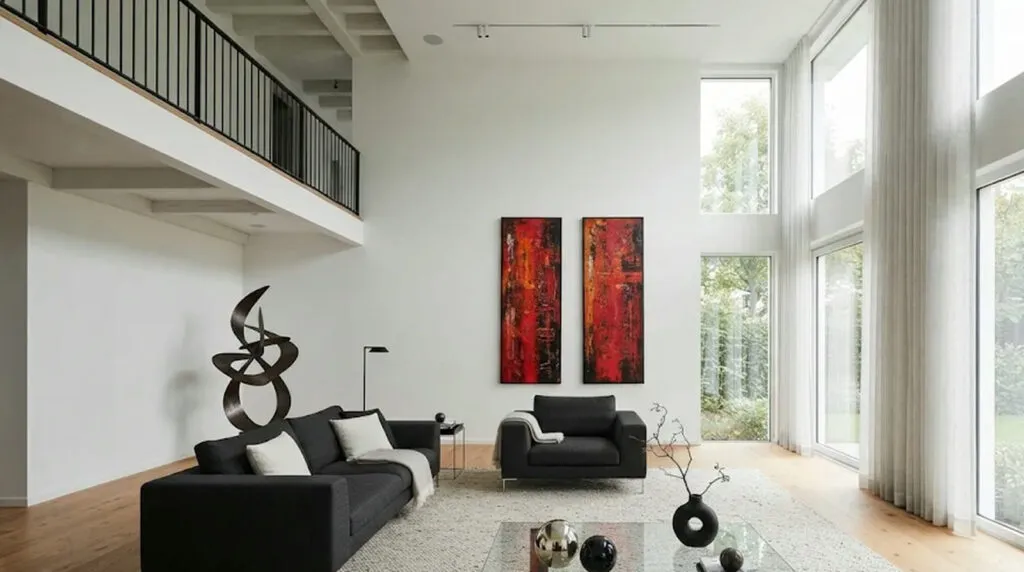
Pilar Miró's son lives in black and white, with abstract canvases in red and a 75 m² terrace. Minimalism for...

A cooperative's building from 1923, one staircase fewer and a dining area under the stairs. A renovation where the old...

An 11-million-euro house with a football pitch, a recording studio and two floors underground. The best spots by the window,...

Black velvet sofas, a sculpture made of railway sleepers and a terrace table under lamps made from recycled bottles. A...

The layout of the flat has barely been touched. Colour did the work, and not as decoration, but as a...

A tiger in the hallway, a cherry-red bookcase and a kitchen that looks nothing like a flat kitchen. A hundred...

The villa "Les Moulins du Villars" never belonged to the Grimaldis, yet it was exactly there that the princess found...

The Planeta Prize winner lives among Spanish writing cabinets, black-lacquer oriental consoles and books that actually get read. A home...

The sofa and shelving in modules, the dining table and armchair in one piece. Our homes change with us -...
This site uses cookies - is that okay? Learn more
Be the first to know when Metla launches something new
Leave your email and we'll write to you when there's a new guide or something new on Metla.