

A sniper rifle, automatic weapons and an ISIS flag from 12 locations in Skopje: intelligence agency talks of radical imams and recruiting young people
30.09.2026


30.09.2026

30.09.2026

30.09.2026

30.09.2026

30.09.2026

30.09.2026

30.09.2026

29.09.2026

28.09.2026
30.09.2026

30.09.2026

29.09.2026

30.09.2026

30.09.2026

30.09.2026
30.09.2026

29.09.2026
28.09.2026
30.09.2026
30.09.2026

30.09.2026

09.03.2026

27.02.2026

19.02.2026
30.09.2026
29.09.2026
28.09.2026

23.04.2026

23.04.2026

12.04.2026

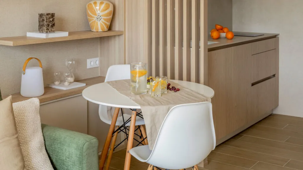
For many families, 42 square metres is the whole home, not a holiday place. That is why it's worth seeing how ERA Studio redesigned exactly that kind of flat, meant for holidays, so that it feels bigger than it is - no miracles, no expensive tricks, just light, order and continuity. Five decisions carry the whole project, and not one of them needs more floor space.
The eye has to travel far
The old layout was classic: a hallway, then a closed kitchen, then a living room, each in its own box. The new one links them into one continuous space. "Long sightlines create spaciousness and calm," the studio says, and they also let natural light reach deep inside. In a small flat, that is the difference between "cramped" and "small but cosy."
Open it up - but only when it really helps
The designers don't sell open-plan living as a religion. Knock down a wall and you also lose space for cupboards. Here the maths came out positive: merging the kitchen, dining area and living room brightened the dark zones. In another flat, the same decision could be a mistake.
Don't fill it with furniture
Behind the sofa, the wall is covered in jute wallpaper, with a made-to-measure storage chest below. "Investing in made-to-measure furniture is especially important when square metres are scarce," says ERA Studio. The priorities: wardrobes, the kitchen and fitted walls. The armchair we'll "put somewhere" is exactly what a small flat can't afford.
Less stimulation, more air
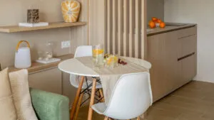
The palette is deliberately restrained: light wood, warm neutrals and natural fibres. The only splash of colour is the green sofa. "Ideally, you would choose one or two focal points," the designers advise - anything more tires the eye and shrinks the room.
A boundary without a wall
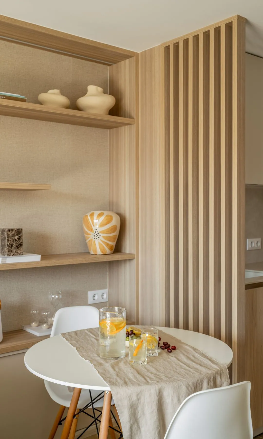
There is no wall between the kitchen and the dining area, just a made-to-measure divider of wooden slats. It marks the transition between the two zones without blocking the light. The studio looks for "solutions that let light reach the inner zones without losing privacy."
A small kitchen, fully equipped
The kitchen is split into two working fronts. One holds the sink, dishwasher and hob. The other - the fridge, oven, microwave and washing machine. The units are by Santos Bilbao, in wood and stone-look porcelain tiles. The designers' point: in a small kitchen, a precise layout matters more than square footage.
The same materials "add" square metres
The main bedroom continues the warm tones, the wood and the textiles. Two wallpapers, beige and khaki green, form a headboard that wraps around the bed. "When the same thread of materials is used, the space feels like a single whole," the studio explains. When every room speaks its own language, the flat breaks up into even smaller pieces.
A wall-to-wall wardrobe
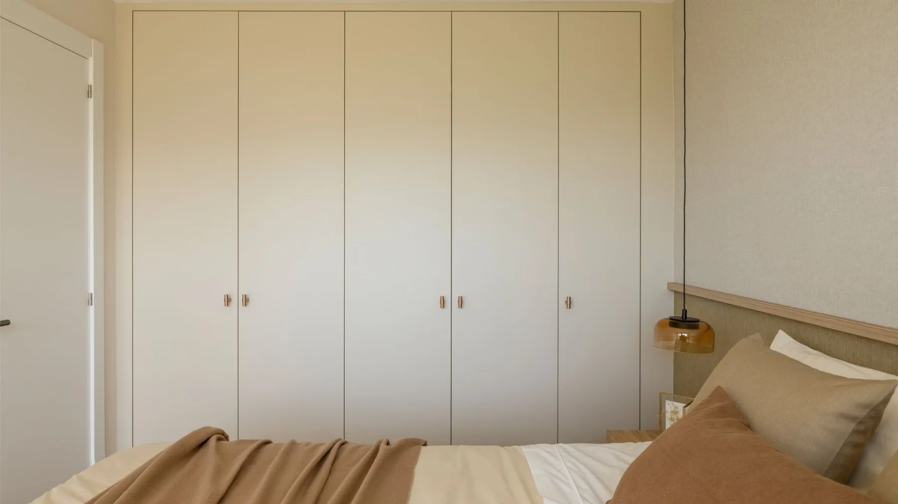
In the bedroom, the wardrobe takes up an entire wall and gathers almost all the storage in one place. According to the designers, wardrobes should go unnoticed, blended into the walls - and there's another storage chest under the bed.
Furniture for awkward corners
In the second bedroom, a desk with built-in storage sits under the window, and the bed once again has a chest. The idea is to find "square metres where there seem to be none" - under beds, beside pillars, in corners that usually stay empty.
The bathroom: continuity and few elements
The same applies in the small bathroom: a light palette, a large mirror and unbroken surfaces. The studio suggests carrying the materials from the other rooms into the bathroom too, so the visual thread isn't cut.
What actually works
Put all the solutions together and five rules remain: maximum natural light and long sightlines; opening up only when the layout genuinely improves, without losing storage; made-to-measure furniture for wardrobes, kitchen and walls; less visual noise, with storage gathered in one place and only one or two accents; and the same thread of colours and materials through the whole flat. How many of us would pay for an extra room - when the real problem might be the armchair nobody is willing to give up?
The latest 10 news from this category
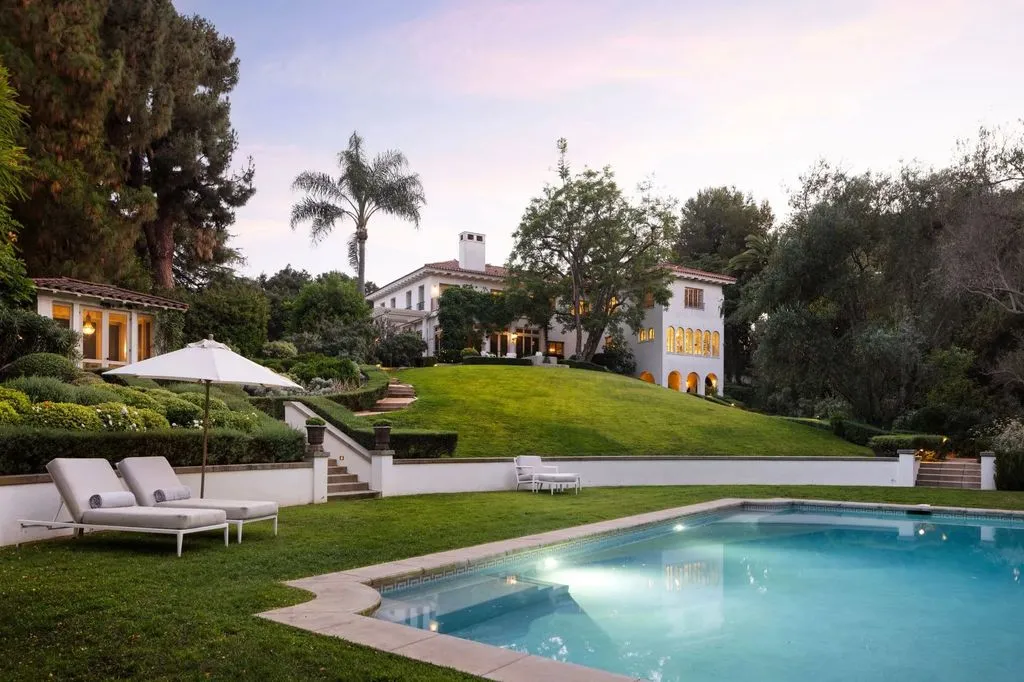
A house from 1913 with six bedrooms, ten bathrooms and a 12-metre pool. Before her, it belonged to the director...
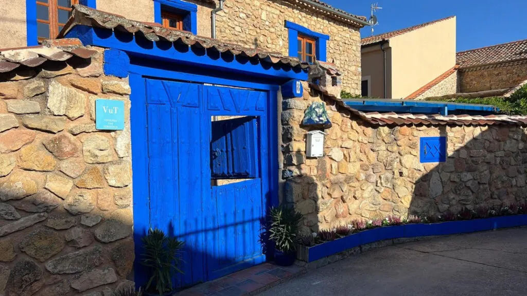
The former model and actress swapped a luxury Madrid suburb for a village of about a hundred people and refused...
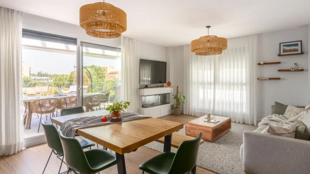
A new flat with great light that didn't feel like home. The designer didn't demolish anything - she changed the...
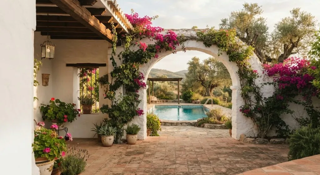
An old mill bought more than 30 years ago that his daughters still keep coming back to. Whitewash, stone and...
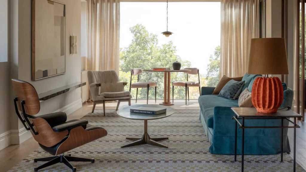
Luxury isn't about showing off, it's about detail, says the architect. That's why the best light in this flat went...
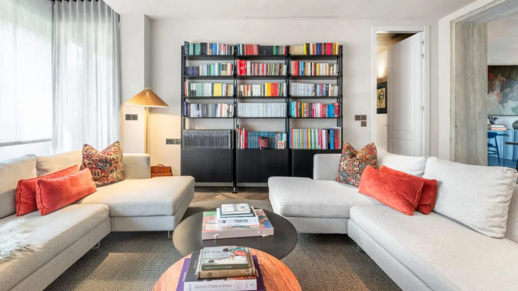
The exposed brick and ribbon windows stayed, and the entire palette came out of a single painting above the sideboard....

An Eames lounge chair from 1956, a Fratini shelving unit and a concave cobalt mirror that reflects the room curved....
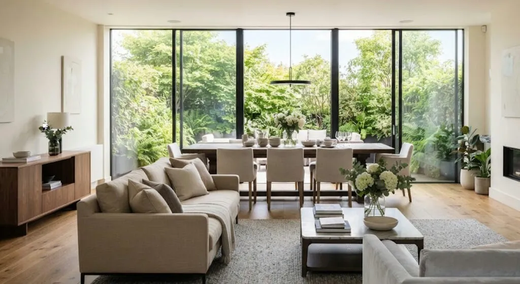
Four bedrooms, four bathrooms and one rug that keeps the dining area separate without a wall. Three things in this...
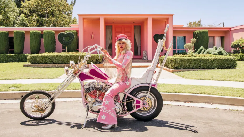
She did not decorate a house - she built a world. And behind all that fantasy there is no inheritance,...
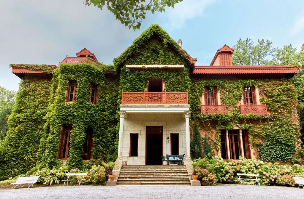
The stairwell has been turned into a gallery, and in the bedroom there is not a single attempt at an...
This site uses cookies - is that okay? Learn more
Be the first to know when Metla launches something new
Leave your email and we will write when there is a new guide or something new on Metla.