
Skopje Breathed Smoke From Two Mountains: 21 Fires in One Day, and Vodno Was Clean
25.08.2026



25.08.2026

24.08.2026

23.08.2026

25.08.2026

25.08.2026

24.08.2026

25.08.2026

25.08.2026

25.08.2026
25.08.2026

24.08.2026
23.08.2026

25.08.2026

25.08.2026
25.08.2026

25.08.2026

25.08.2026

25.08.2026

09.03.2026

27.02.2026

19.02.2026

23.04.2026

23.04.2026

12.04.2026
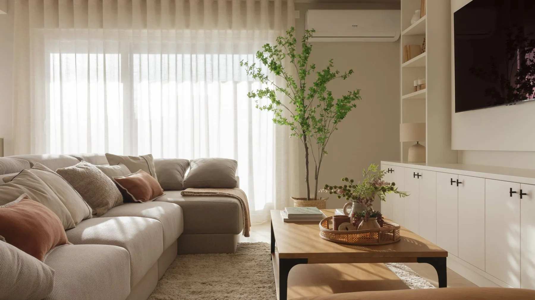
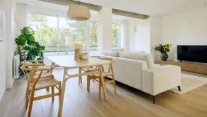
The elongated living room - the one that's longer than it is wide, often joined to the kitchen or dining area - is one of the most common headaches in apartments around here. It looks like a hallway with furniture, it's hard to arrange, and it easily turns into a space you just pass through instead of one you live in. But the problem is usually not the square meters, it's the layout. According to one interior designer, with a few well-chosen decisions the same narrow space can breathe.
The small room - up to 18 square meters
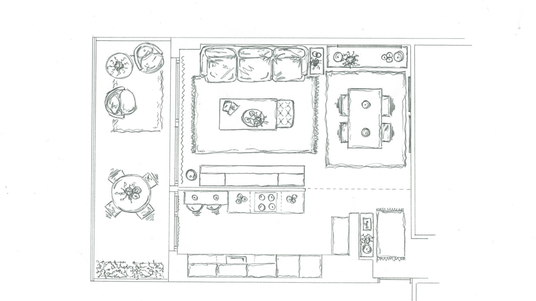
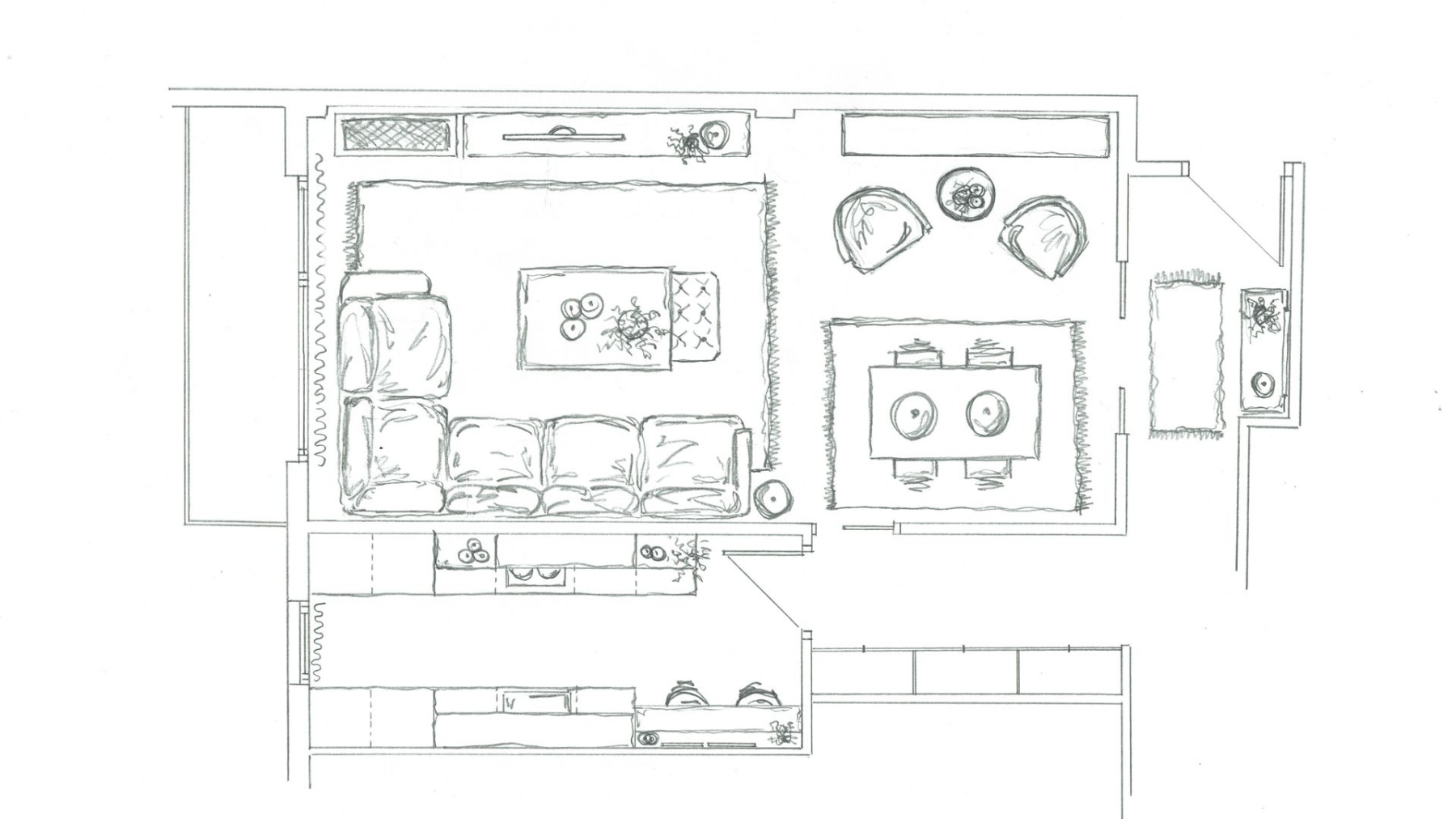
When the space is small, the first question is whether the kitchen should stay separate or be opened up. One solution is to keep it closed, with the dining area placed right next to it for easier serving, and the seating area lined up along the wall. That way each zone stays clearly defined and the room has a readable, tidy look. The second option is to partially open the kitchen wall with a glass sliding door - you gain depth, natural light and connection, but with the option to close it off when needed.
The medium room - around 24 square meters
With a bit more space, a good idea is to keep the original structure but remove only the doors, while the walls stay - that way the dining area and the seating area are clearly separated. For a more contemporary look, the kitchen can be set off with a half-height glass wall and sliding doors. Here a large sofa is recommended, plus an extra armchair and a built-in unit made to measure that integrates the TV and storage into one whole - which keeps the space from looking cluttered.
The large room - around 32 square meters
When there's space, you can play more boldly. One option is a closed kitchen with the dining area set right at its entrance, a large bookshelf that combines open and closed storage, a corner sofa in the living part and a low TV unit. Another, more contemporary option is a full floor-to-ceiling glass wall that changes the perception of the space - a large sofa, two armchairs, side tables and a big rug create an open, bright and modern atmosphere.
Tricks that apply to every size
Regardless of the floor area, a few rules keep repeating. A dining area near the kitchen makes everyday serving and movement through the space easier. Round tables, especially those on a single central leg, are ideal for narrow rooms - they have no sharp corners, you pass by them more easily and they feel visually lighter. Custom furniture along the long wall is the best ally: it organizes, stores and unifies, instead of letting the space look like a sum of random pieces.
Finally, there are the small, cheap tricks that make the biggest difference - light linen curtains that filter the light without blocking it, a rug that clearly separates each zone, and a mirror placed in the right spot that visually doubles the space. The elongated room doesn't call for knocking down walls or a big budget; it just asks that we stop seeing it as a problem and start reading it as an opportunity.
The latest 10 news from this category
The architect did not ask about style, but about how they wanted to live five years from now. The result...

Jordi Cruz and Rebecca Lima opened up their house two years after the wedding. The basic material is not oak...
The most expensive family in the story gives the cheapest lesson. Not one piece in the living room is from...
330 square metres in Biscay, a living room on two levels and a red staircase deliberately left untouched. The idea...
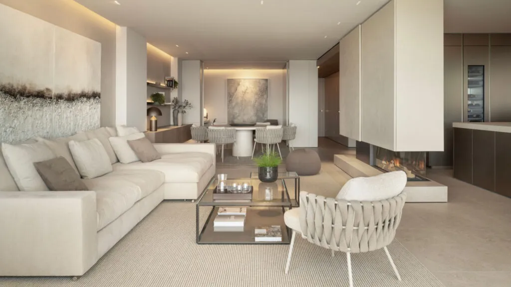
If the same tone and the same finish go literally everywhere, the space does not become calm - it becomes...
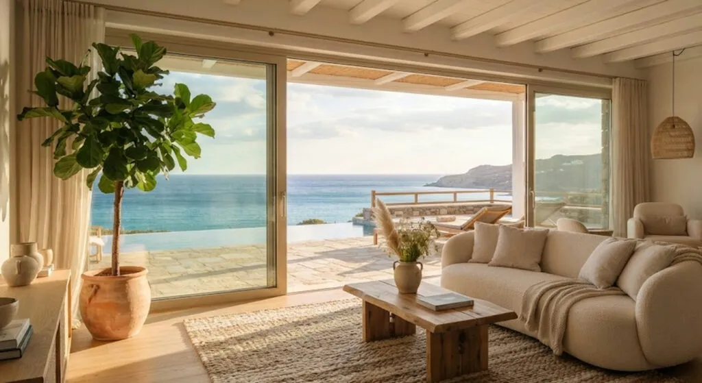
From Malibu to Mijas and Como. Some are real properties you can stay the night in, some are a set...
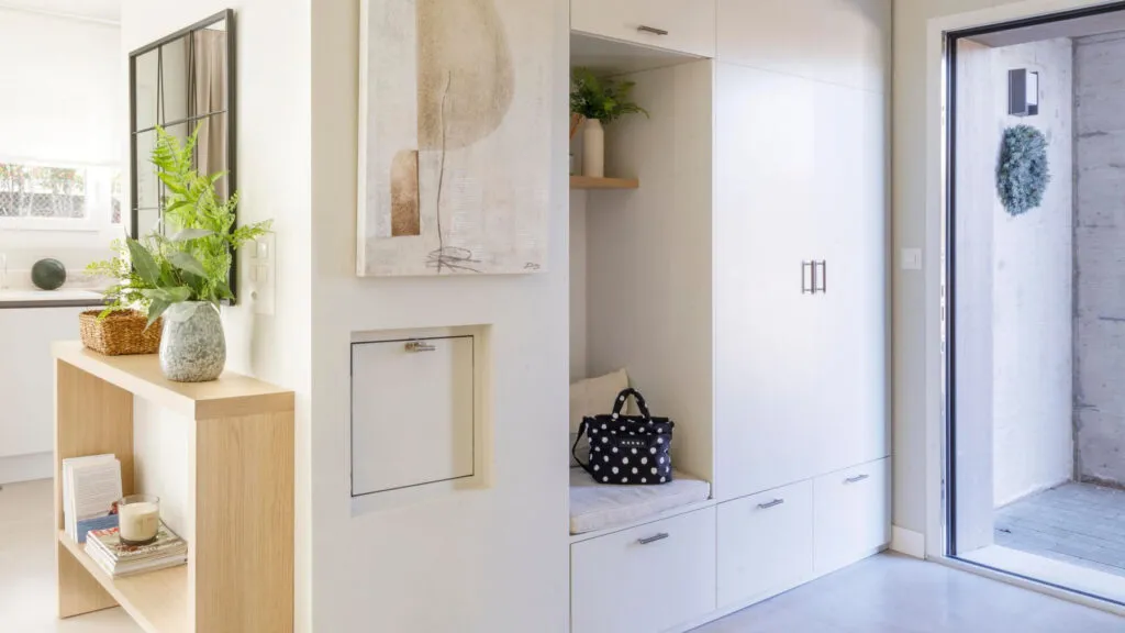
A twenty-centimetre shelf, a bench that hides shoes and one tray for the keys. The biggest enemy is not mess...
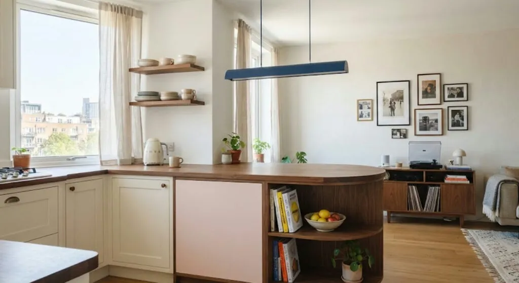
Colour here is not decoration but layout. The curved counter with a built-in bookshelf, the coral corridor and the wardrobes...
The trend is back, but not out of nostalgia - those pieces are solid wood, not chipboard with foil. Three...
The object bought to hide one white rectangle ends up taking more space than it does. And it makes the...
This site uses cookies - is that okay? Learn more
Be the first to know when Metla launches something new
Leave your email and we will write when there is a new guide or something new on Metla.