
Another search in Ohrid, another scale dusted with white powder: the small fish is always the easiest catch
04.07.2026
04.07.2026

04.07.2026

04.07.2026

04.07.2026

04.07.2026

03.07.2026

30.06.2026

29.06.2026

29.06.2026

30.06.2026
30.06.2026

29.06.2026

30.06.2026
30.06.2026

30.06.2026

04.07.2026

04.07.2026

03.07.2026

04.07.2026

04.07.2026
03.07.2026

09.03.2026

27.02.2026
19.02.2026

03.07.2026

03.07.2026

03.07.2026

23.04.2026

23.04.2026

12.04.2026


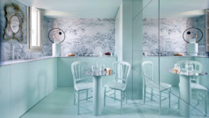
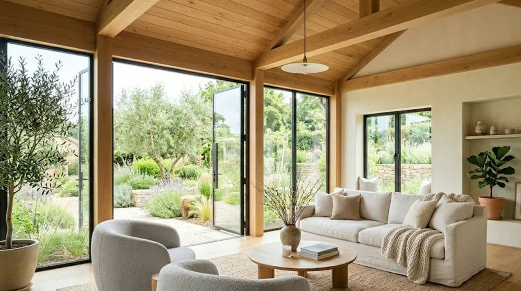
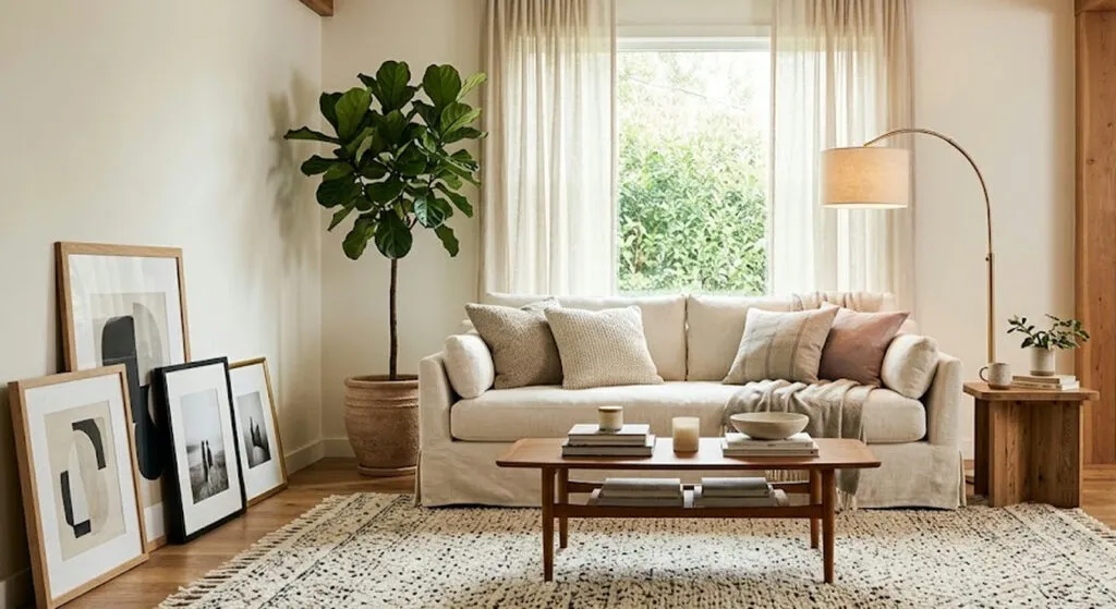
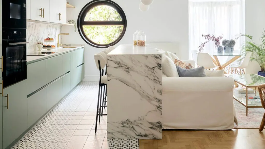
White was for decades the synonym for a modern, clean home - but in 2026 its reign is ending. In its place come soft green tones, offering calm, sophistication and a connection to nature. Designers call it the „emotional interior" - a space built to carry a sense of wellbeing, not just to look good in a photo.
This isn't just any green. The trend is for soft, low-saturation shades - a mint green with a mineral freshness, an olive that ties the space to Mediterranean tradition, a timeless sage green, and dusty greens with grey undertones that are the easiest to combine. Fluorescent and oversaturated greens are out, as are shades too dark for large surfaces without enough light.
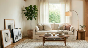
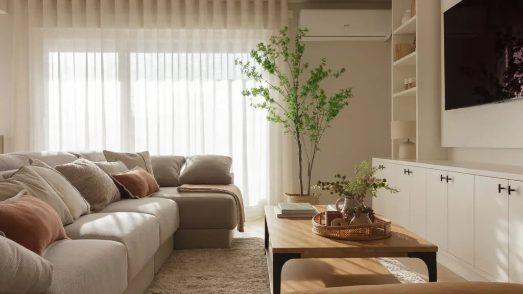
The colour works differently in every room. In the bedroom it encourages rest and a „pause mode" - neuroarchitecture confirms that green lowers nervous arousal and prepares the body for sleep. In the kitchen it brings calm to cooking and increasingly shows up on cabinetry, because it doesn't tire the eye. In bathrooms it shines on tiles and ceramics alongside stone or wood, and in living rooms it works on large upholstered pieces, wrapping the space in atmosphere.
Why green in particular feels calming has a scientific explanation. Cooler tones visually recede, create an illusion of depth and make small spaces feel larger - especially useful in flats under 60 square metres. Unlike warm colours that fire up the nervous system, green lowers physical arousal and invites you to relax. That's why they call it the „new neutral" - a colour that enters the home without asking for permission.
When it comes to dosing, nature is the best teacher. In nature, vivid colours appear only in small amounts - flowers, insects, fruit - framed by vast soft surfaces. That's why green works best on whole walls, lacquered furniture or floor-to-ceiling tiles in moderate shades, rather than in tiny patches. The human brain simply isn't built to live surrounded by large surfaces of vivid colour.
Green pairs easily with other tones too. With wood and beige it creates a warm, natural setting; with white it carries lightness and brightness; and combined with yellow and pink it brings energy and optimism - designers recommend it especially for older people living alone or for those prone to low moods. Whether you choose a single wall or a whole room, the point is the same: a home shouldn't only look good, it should calm you the moment you walk in.
The latest 10 news from this category
Instead of marble and gold for the guests, the Hollywood actor's home defines wealth differently - as peace and the...
A dozen solutions that transform a space from the ground up, while everything stays reversible - wallpaper, rugs, lighting and...
Longer than it is wide, joined to the kitchen, like a hallway with furniture - but the problem isn't the...
The biggest trend for 2026 has no new piece of furniture in it - just one idea: indoor life pulled...
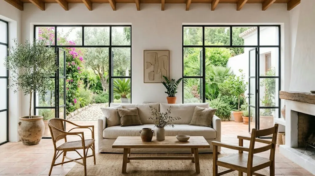
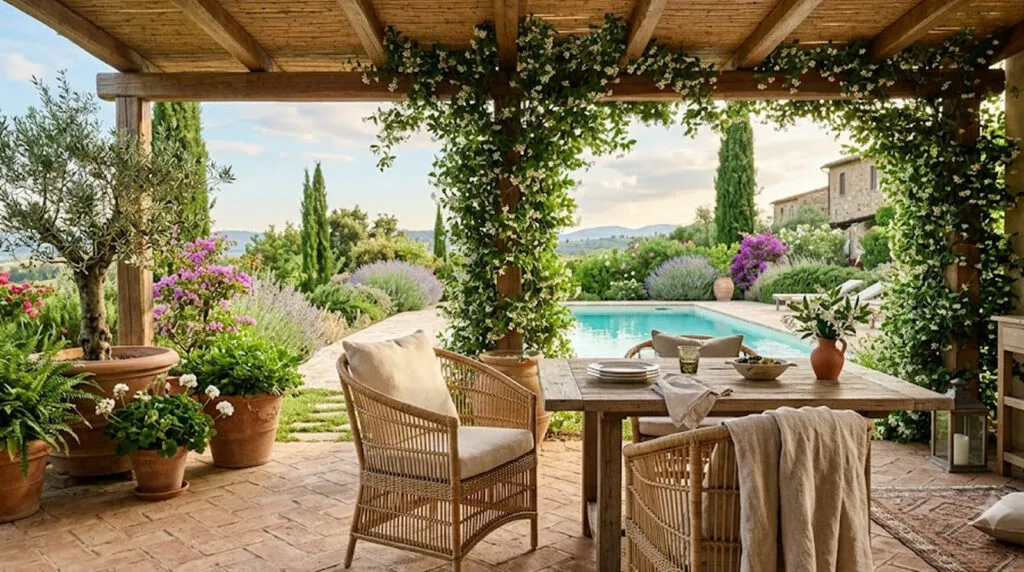
A house that doesn't shout but whispers - natural stone, white, and greenery that keeps reappearing through the windows. The...
An interior designer demolishes the most expensive myth about decorating. From curtains to ceiling height to embracing empty space -...
A new build for a couple with three daughters shows that even a new house can be a home -...
A renovation you do once a decade calls for logic, not flashy details. Ten tips from designers for a kitchen...
Luxury doesn't have to shout. Sometimes the most beautiful home is the one that breathes, not the one that boasts.
Stone walls 80 centimetres thick, zero toxic materials and a passive-house certificate - and from the outside almost nothing has...