

Five Fires Still Burning, at Čanište the Blaze Has Split Into Four Fronts: For the First Time This Summer, the Army Deploys Before the Disaster
21.08.2026


21.08.2026

21.08.2026

21.08.2026

21.08.2026

21.08.2026

21.08.2026

21.08.2026

20.08.2026

20.08.2026
21.08.2026

21.08.2026
20.08.2026
21.08.2026

21.08.2026

21.08.2026
21.08.2026

20.08.2026
19.08.2026

21.08.2026

21.08.2026

21.08.2026

21.08.2026

21.08.2026

21.08.2026

09.03.2026

27.02.2026

19.02.2026

21.08.2026

20.08.2026

19.08.2026

23.04.2026

23.04.2026

12.04.2026
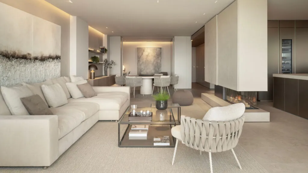
Monochrome decorating sounds like something that cannot go wrong - one colour, no combining, no dilemma. In fact the opposite is true. It is the technique most likely to end in a space that looks like a waiting room rather than a home, and that is exactly why it is worth knowing where the mistake gets made.
What it actually is
It is not one colour everywhere. It is one colour in several tones, with different textures and accessories moving within the same family. It is related to the colour-drenching trend - the one where walls, joinery and sometimes the furniture all go in the same shade - but the monochrome approach has more freedom than it is credited with.
The first and biggest mistake is confusing monochrome with uniform. If the same colour and the same finish are applied literally everywhere, the space does not become calm - it becomes flat. The eye has nowhere to rest and the room starts to look like a rendering rather than a place where somebody lives.
The cure is a scale, not a tone. The same colour, but in different strengths - darker below, lighter above, or the reverse. That small difference in intensity creates depth where there was none.
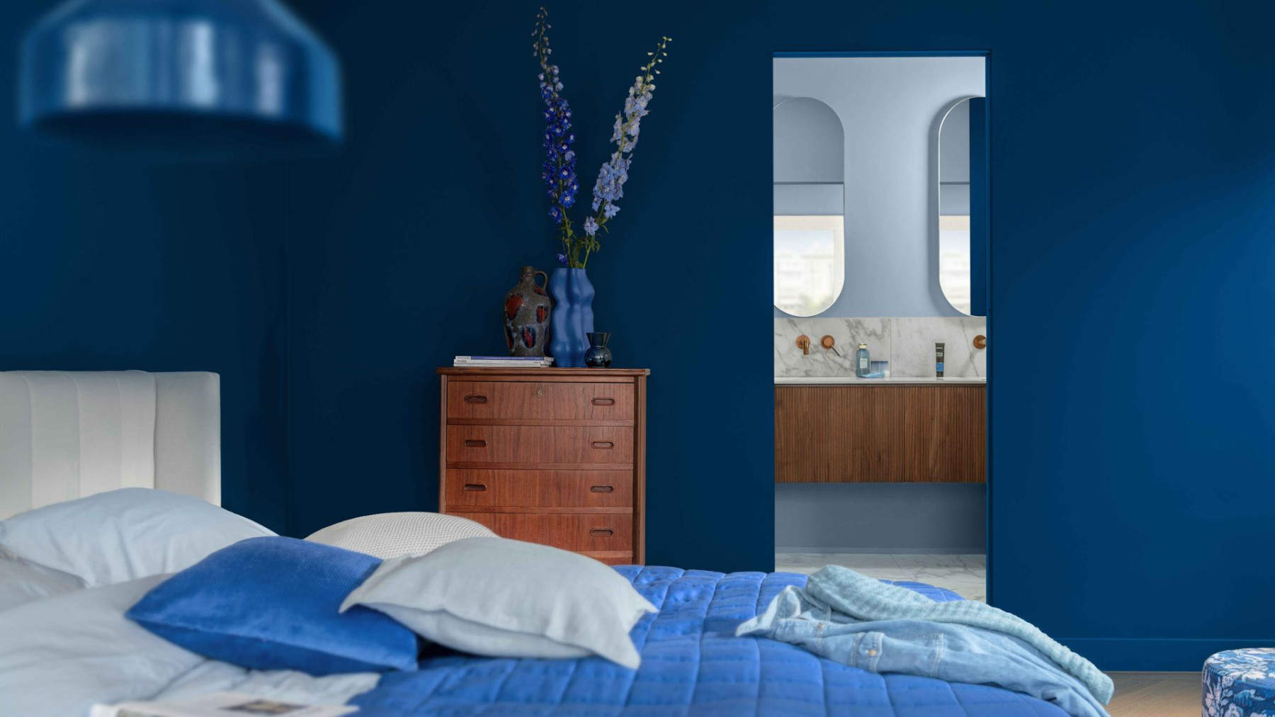
Texture is the contrast that does not require a new colour
This is the part most underestimated. Wool, linen, wood, ceramic, metal and glass in the same colour look like six different things, because each catches the light differently. It is the cheapest way to get variety in a space you have deliberately limited to one palette - and the fastest way to pull it out of catalogue flatness.
The light must be tested before the decision, not after
The same colour in a north-facing room and the same colour in a south-facing room are two different colours. That is why you leave a sample on the wall and look at it at different hours of the day, morning and evening, in daylight and in artificial light. This is the step everyone knows and nobody does, and then the whole room gets painted twice.
Arrangement does as much as colour
When all the elements sit in the same palette, order and layering become the only dramaturgy in the space. What is in front, what is behind, what stands alone, what repeats. In a colourful space, colour solves that; here it does not.
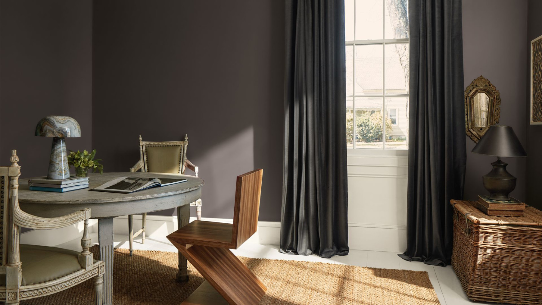
Balance gets lost between connected rooms
If the living room opens onto the dining room and the hallway, the same tone in all three kills the boundary between them. So the tone changes from room to room while staying in the same family - enough for the eye to register a transition, not enough to look like two different houses stuck together.
Fewer pieces, more choosing
A monochrome space does not tolerate clutter. Every object in it is seen more clearly, because there is no colour to hide it. That means pieces should be chosen deliberately, not added because there is an empty spot. This is a rare situation in decorating where the cheaper decision - buying nothing - is also the better one.
And finally, the colour has to be yours
This is the advice that looks least like advice and is worth the most. The colour of the year changes its name every twelve months, while the wall you painted stays with you far longer. If beige calms you, go beige. If you want dark blue, dark blue it is. The space you will live in every day does not need to justify its choice to some catalogue.
The same goes for the technique itself - it adapts to the house, not the house to it. A small flat, low ceilings, little natural light and a large open space call for different decisions with the same colour. Monochrome decorating works when it stops being a rule and becomes a frame. When it stays a rule, you get a room in which every new object looks like a mistake.
The latest 10 news from this category
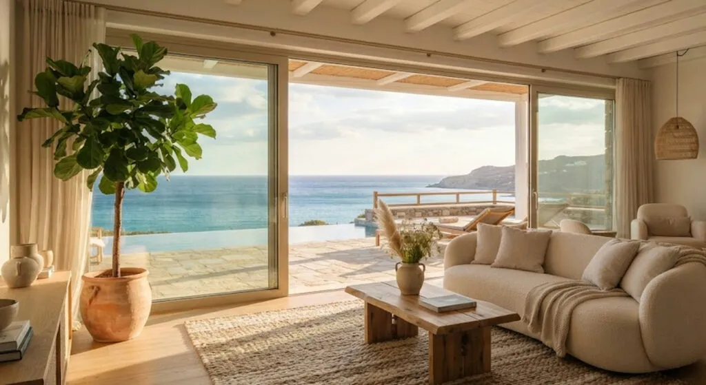
From Malibu to Mijas and Como. Some are real properties you can stay the night in, some are a set...
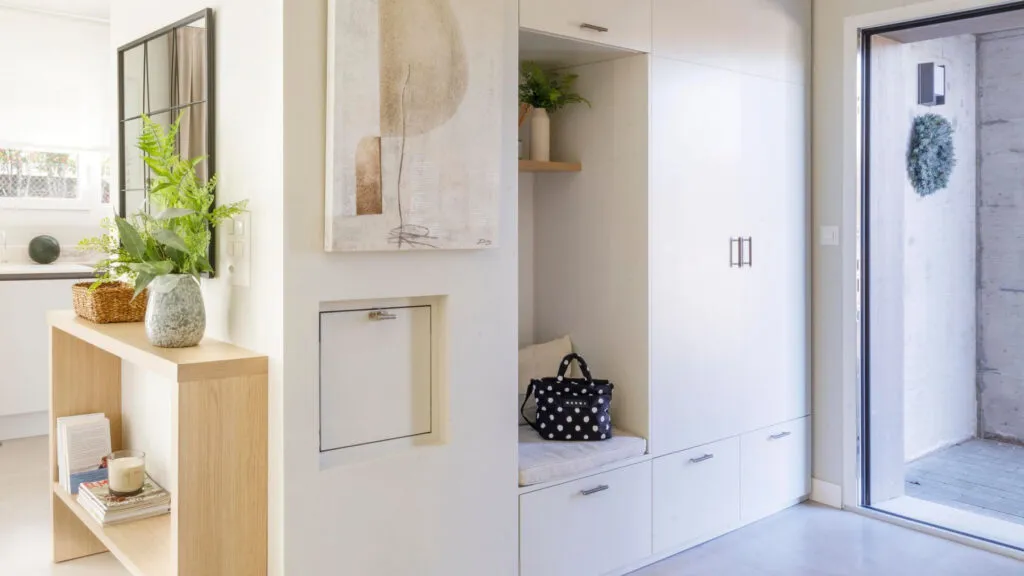
A twenty-centimetre shelf, a bench that hides shoes and one tray for the keys. The biggest enemy is not mess...
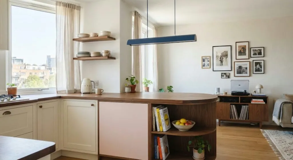
Colour here is not decoration but layout. The curved counter with a built-in bookshelf, the coral corridor and the wardrobes...
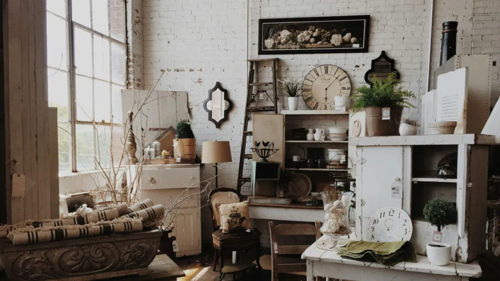
The trend is back, but not out of nostalgia - those pieces are solid wood, not chipboard with foil. Three...
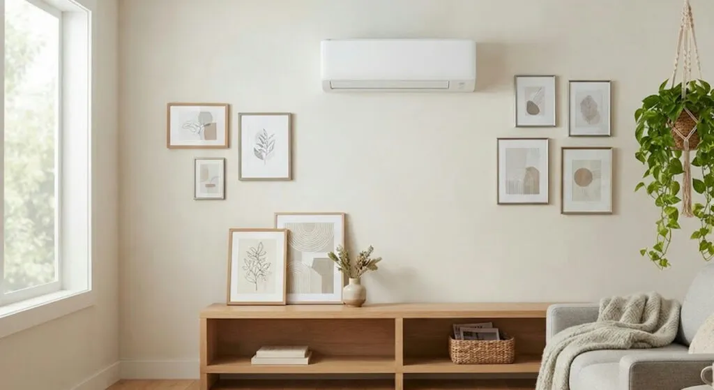
The object bought to hide one white rectangle ends up taking more space than it does. And it makes the...
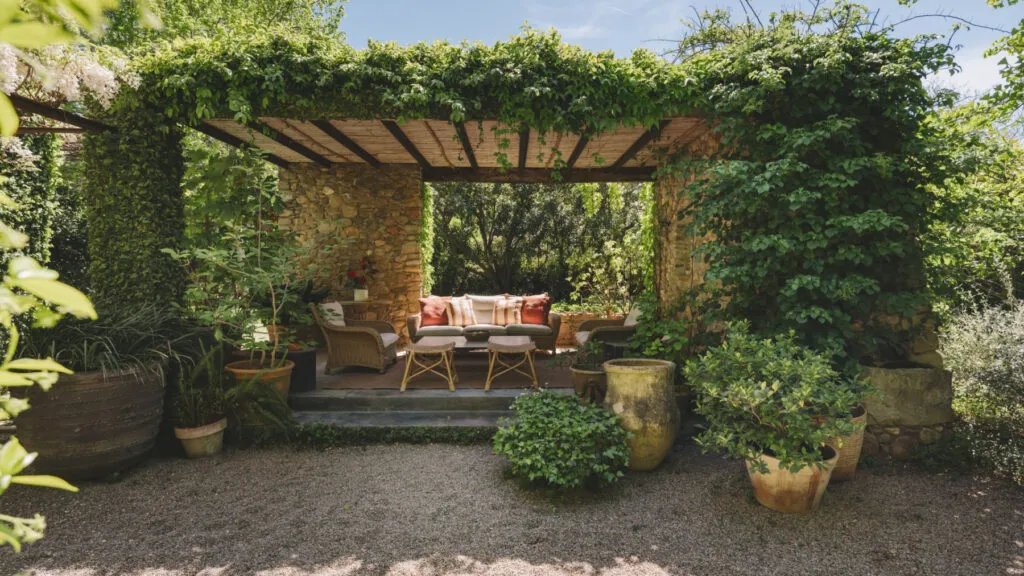
350 square metres without a single corridor, five bedrooms and a pool that does not beg for a photograph. Not...
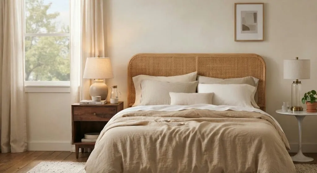
Mixing materials and shapes gives you more than repeating the same model twice. Here it also means the inherited nightstand...
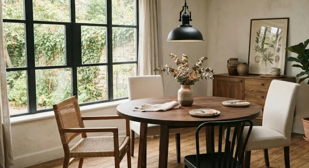
If you like the table but the chairs have fallen apart, you do not have to throw everything out. The...
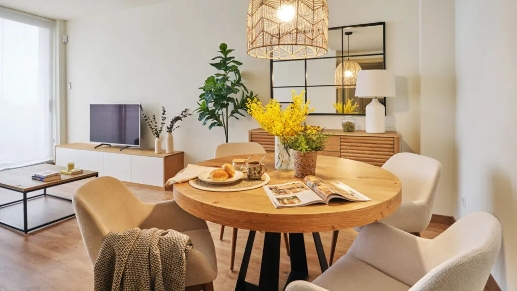
White walls, low furniture and lots of mirrors produce flats that photograph well and live badly. Ten pieces of advice...
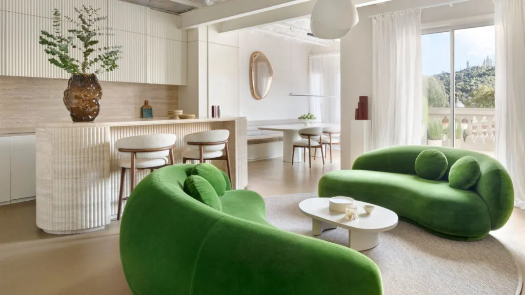
The Catalan vaults stayed, the walnut joinery stayed, and on top of it came an intervention that deliberately does not...
This site uses cookies - is that okay? Learn more
Be the first to know when Metla launches something new
Leave your email and we will write when there is a new guide or something new on Metla.