


Glasses and a Wristwatch for a Tip-Off: Nine Charged Over Tax Inspections at the "Pulse" Nightclub
28.10.2026


28.10.2026

28.10.2026

28.10.2026

28.10.2026

28.10.2026

28.10.2026

28.10.2026

27.10.2026

27.10.2026

28.10.2026

28.10.2026
27.10.2026
28.10.2026
28.10.2026

28.10.2026
28.10.2026

27.10.2026
26.10.2026

28.10.2026

28.10.2026

28.10.2026

28.10.2026

28.10.2026
27.10.2026
28.10.2026

27.10.2026

27.10.2026
27.10.2026
26.10.2026
24.10.2026

23.04.2026

23.04.2026

12.04.2026

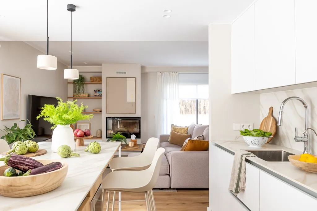
You walk into a new flat and get the feeling you've been there before. Oak on the floor, a handleless kitchen, a bathroom straight out of a spa, walls in sandy tones. It doesn't matter which city the building is in - the picture is the same. Sound familiar to anyone who has toured new builds in Skopje? Spanish interior designer Laura Martínez, of the studio Laura Martínez Interiorismo, has an explanation - and it's not the one you'd expect.
The problem, she says, isn't the colours or the materials. The problem is that solutions get copied without anyone stopping to think about who will actually live in the space.
Finished, yet unfinished
Many new builds, according to Martínez, put profitability ahead of design and function. In bathrooms: wall-hung basins with no storage at all and showers without screens. In kitchens: standard units and exposed slots for appliances, with no real integration into the design. Many flats don't even come with light fittings, just the wiring, and the main lighting is often on the wall instead of the ceiling. Her advice before buying: check where the towels will go, whether a dining table will fit and how much room there is for a wardrobe. This gets fixed on the floor plan far more cheaply than later with a hammer.
Beige isn't the culprit
Neutral tones - off-white, sand, stone - are recognisable, but they aren't the reason everything looks the same. Martínez uses them regularly, as a base. "We want to design homes that age well and don't depend on passing trends," she says - a full renovation is too expensive to repeat every few years. A home's personality comes from books, photographs, memories and people, plus details that are easy to change: burgundy cushions, a cobalt-blue armchair, curtains with character. She loves strong colours but saves them for pieces that are easy to swap out. Instead of pure white, she increasingly uses cashmere shades for a discreet warmth.

Oak, yes - but not from floor to ceiling
Martínez is a big advocate of natural wood, especially oak. But she doesn't insist on everything being the same shade: she mixes tones, grains and finishes, and clients' fear that something "doesn't match" usually disappears once they see the result - in one of her projects the side tables are in a darker wood than the floor. She also watches the proportions: in a small flat or a room with a low ceiling, wood on the walls and ceiling is too much. And for families with kids, pets or direct access to a garden, a good-quality laminate is more practical than real wood.
Even a minimalist kitchen needs a personal touch
Flat, handleless fronts and built-in appliances are standard, especially in open-plan kitchens, and Martínez defends many of those choices. But visual continuity, she says, doesn't mean hiding everything. She likes a breakfast corner with a good coffee machine, a nice toaster, a shelf for mugs and a display cabinet with indirect lighting and patterned wallpaper behind it. Her own kitchen is white and wood, with flat fronts and recessed handles - and today she would add a little decoration: a simple moulding and distinctive handles on the lower units, leaving the upper ones clean.
Microcement looks great in photos and is hard to live with
Microcement has no joints and a sleek, industrial, minimalist look. Martínez loves its continuity but doesn't recommend it for everyday use: it can crack, it handles impacts badly, and repairs are hard to match in tone and texture, so sometimes a whole larger area has to be redone. Her alternative is large-format porcelain tiles, for example 120 by 60 centimetres with thin grout lines. Even bigger slabs exist, but they're more expensive to transport and lay.
Stone is the new "everyone's got it"
Marble, travertine, quartzite and porcelain that imitates natural stone - they're everywhere in kitchens and bathrooms. Aesthetically, Martínez prefers natural stone, whose veining is unique. But it's sensitive to acids, stains and some cleaning products, so in homes with children she recommends good-quality porcelain. Scale matters too: a dark, heavily veined marble can look stunning in a 20-square-metre bathroom and suffocate a 3-square-metre one. Ask for a sample and compare it with the other materials, because light and the tone of the furniture change the result.
An arch has to solve something
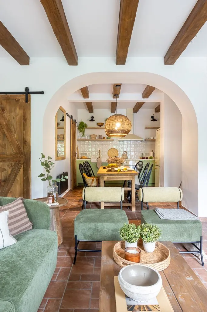
Arches, niches, curved walls and soft furniture are everywhere. Martínez likes curves when they improve the layout, the flow through the space or the sense of space - then they can last for decades. In one of her projects she restored the original arch between the living room and the kitchen-diner: the floor runs continuously, while the arch creates a subtle division and preserves the home's history.
A bathroom that survives the morning rush
She defends wall-hung bathroom furniture without reservation: with about 30 centimetres of clearance above the floor, the bathroom is easier to clean and the floor carries on underneath. A full-wall or floor-to-ceiling mirror makes a small bathroom feel bigger. Countertop basins she keeps for the guest toilet; for the main family bathroom she prefers integrated ones. She likes taps built into the wall, with no corners for dirt to collect. And the lighting - at least three independent layers: general, above the mirror and ambient in the niche.
More ceiling spots doesn't mean better lighting
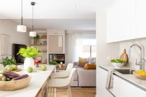
A common mistake is filling the ceiling with spotlights that have no clear purpose. Every light should have a job - to light a painting, a wardrobe or guide you down a corridor - and the spots need to be lined up. In one of her open-plan kitchens the ceiling is smooth, with small discreet spots and two pendant lamps with white shades above the island, for cooking and breakfast. LED strips with indirect light work when they're planned, but she doesn't put them everywhere just because they're fashionable. The colour temperature in the studio is usually around 3,000 kelvin, warm and pleasant. "What I try to avoid is white, cold light that wipes out the feeling of home," says Martínez.
The message is for anyone buying a flat off-plan: what looks good in the developer's brochure isn't always what you'll need day to day. Towels, the table, the lighting: asking about them costs nothing before you sign - and can cost a lot after.
The latest 10 news from this category
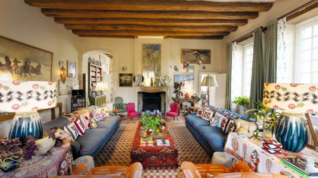
Descended from the Radziwiłłs, she grew up under communism and learned to remake everything. An 18th-century house with no minimalism...
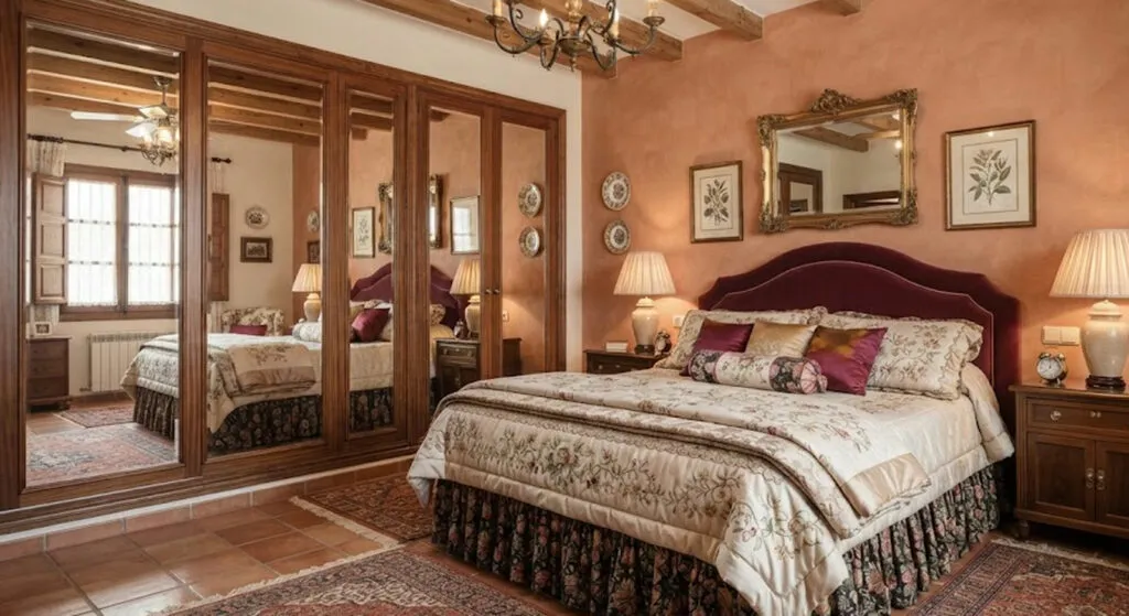
Five bedrooms, five bathrooms, a pool in Sierra Helada and not a single minimalist corner. The Spanish legend's home is...
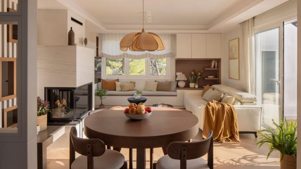
Sloping walls are usually an excuse for empty corners. Here they became a walk-in wardrobe, a reading bench and a...

The singer who joined Operación Triunfo 25 years ago has decorated a home without luxury. Most of the ideas in...
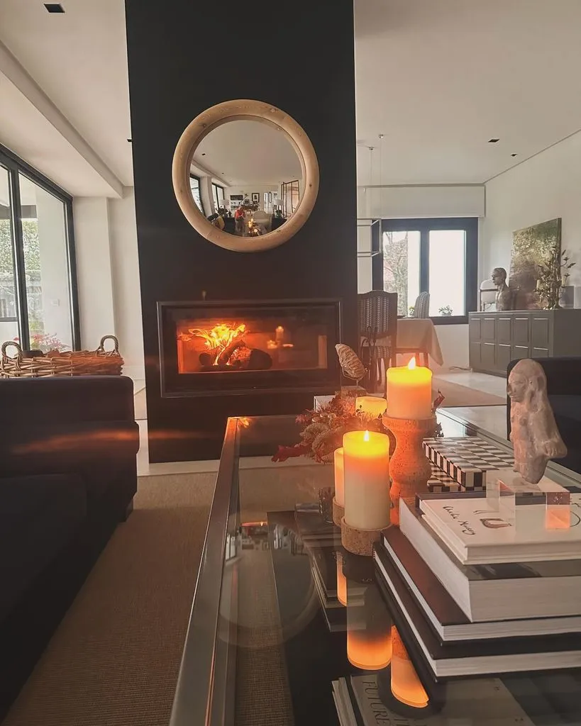
A TV presenter who lives in a rush every morning built herself a home where everything moves slowly. The best...
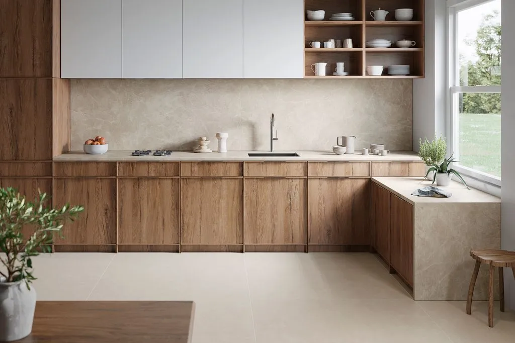
Before you pick a tile because it's on trend, ask the question rarely heard in a tile showroom: what will...
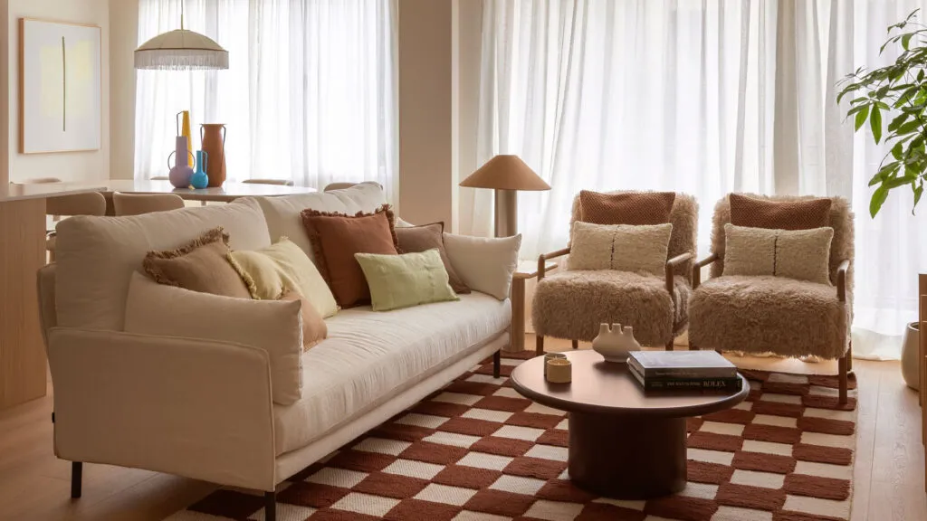
The designer removed an entire bedroom so the kitchen could reach the dining table. Sometimes a small flat is saved...
Bare walls, glass, an open kitchen and too much empty space: a home can look perfect and sound like an...
The dark wood wall unit is back in fashion, but the rule is clear: borrow the decade's warmth, don't reconstruct...
Dark colours supposedly make a room smaller. Designer Juancho González proved the opposite - with white walls, a mirror in...
This site uses cookies - is that okay? Learn more
Be the first to know when Metla launches something new
Leave your email and we will write when there is a new guide or something new on Metla.