
The Entire Interior Ministry Lost Its Health Insurance Overnight: Police Officers Turned Away From Chemotherapy Over One Unposted Entry
11.08.2026


11.08.2026

11.08.2026

11.08.2026

11.08.2026

11.08.2026

11.08.2026

11.08.2026
10.08.2026

10.08.2026
11.08.2026

11.08.2026

10.08.2026
11.08.2026
11.08.2026

11.08.2026
11.08.2026
10.08.2026
09.08.2026

11.08.2026

11.08.2026

11.08.2026
11.08.2026
11.08.2026

11.08.2026

09.03.2026

27.02.2026

19.02.2026

23.04.2026

23.04.2026

12.04.2026
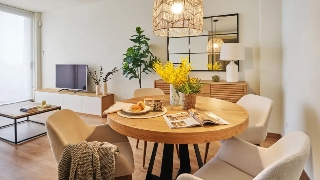
There is a ready-made recipe for small flats that everyone recites: white walls, low furniture, plenty of mirrors, everything so the space looks bigger. Two Spanish interior designers argue that this very recipe is why so many small flats photograph well and are lived in badly. Juliette Abello and Rebeka Nemet, founders of the Nota studio, put the question differently: not how to make the space look bigger, but how to make it work better.
That isn't a semantic distinction. For a fifty-square-metre flat in Skopje, Bitola or Tetovo, it is the difference between a home and a showroom. Here is what they say actually works.
Less furniture, but with presence
The first and most common mistake is shrinking the furniture in proportion to the space. "We tend to think that if the space is small, all the furniture has to be small too. Yet many times the opposite happens. It is better to choose a few pieces, well proportioned and with presence," they say. Many small pieces create visual fragmentation, and fragmentation reads as clutter even when everything is clean.
The second dogma to fall is white. "We don't believe there is a colour that always works. Light tones help reflect light, but a small space can also take more intense colours if there is a concept behind them." That last part is the key. A dark colour in a small flat isn't a risk in itself, only when it is applied without a plan.
Not every wall comes down - each one gets questioned
Open plan has become the automatic answer for every small flat, and it shouldn't be. "Whenever the use allows it, removing visual barriers helps a lot. It isn't about everything being completely open, but about questioning which walls are really necessary. Many times a shelf, a curtain or a change of material solves a division better." That is advice worth money, literally, because knocking down a wall is the most expensive step in any renovation and the hardest to undo.
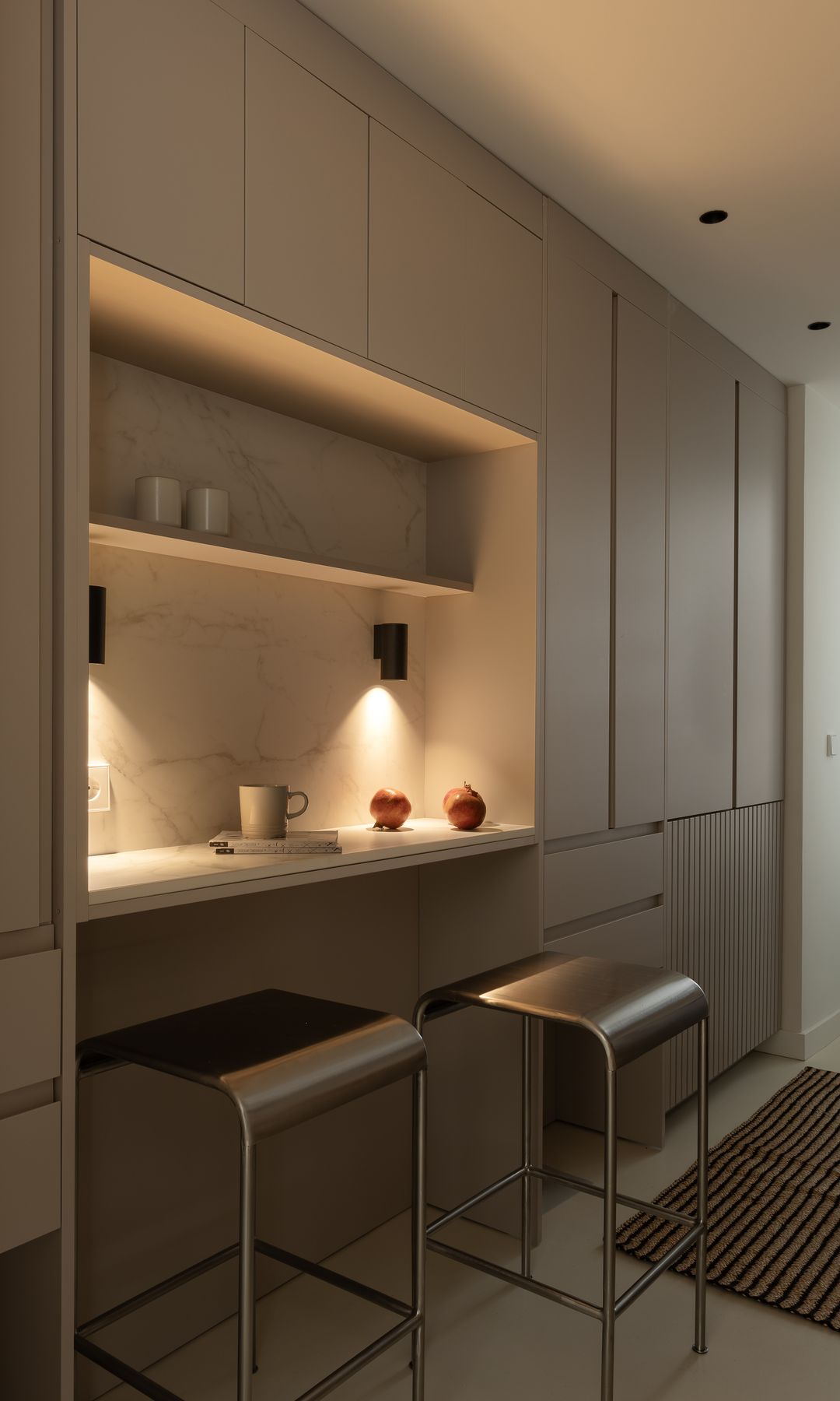
Storage is the next topic, and here the answer is counterintuitive: the best storage is the storage you don't see. "We like storage to be part of the architecture. Floor-to-ceiling wardrobes, doors flush with the wall or integrated furniture make the space read much cleaner." What matters isn't the number of cupboards but how many of them read as wall rather than as furniture.
Height is square footage you don't pay for
This is the advice used least here. "In small flats every metre matters. Many times we focus only on the floor area and forget the vertical plane. Tall shelving, full-height wardrobes or well-designed bespoke furniture free up the rest of the space." With ceilings of two and a half or three metres, the metre and a half above eye level is space you have already paid for and never used.
Multifunctional furniture, meanwhile, is where the designers are more sceptical than the industry would like. "We aren't advocates of building in furniture that transforms simply because it transforms. We believe it has to answer a real need. A bench that also stores, an island that serves for cooking and for working, or a bookcase that organises and divides spaces make sense." A bed that turns into a dining table usually doesn't fall into that category.
Fewer materials, more calm
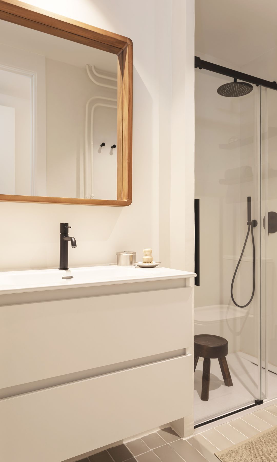
"When we reduce the number of materials, the space is experienced more calmly. We like using the same flooring across several rooms or repeating finishes on different elements. That continuity prevents visual breaks." This runs directly against the habit of giving every room its own floor, its own tile and its own colour, which here is almost the standard in renovations.
Light is the next tool most often wasted. "Many times we think only of a general ceiling light, when it is precisely in small flats that it is interesting to work with different layers of lighting. Wall lights, table lamps or indirect lighting create depth." A single bulb in the middle of the ceiling is the cheapest way to make a space look flat and clinical.
And finally, the least expected piece of advice: furniture doesn't have to be glued to the wall. "There is an idea that to gain space, all the furniture must be placed around the perimeter. Yet pulling the sofa, the table or the shelf away a little can greatly improve circulation." Sometimes it is a matter of a few centimetres that cost nothing and change the way you move through the flat.
All of it comes down to the sentence the designers end on: "Getting the most out of a small flat isn't so much about making it look bigger as about making it work better." That is advice that doesn't require a budget, but a decision. And it is the opposite of everything every home decor catalogue sells you.
The latest 10 news from this category
The Catalan vaults stayed, the walnut joinery stayed, and on top of it came an intervention that deliberately does not...
Everyone who walks into an inherited house tells you what should come down. The architect here did the opposite, and...
A family that sleeps badly for fifteen years is normal. A family that puts in two beds becomes neighbourhood gossip....
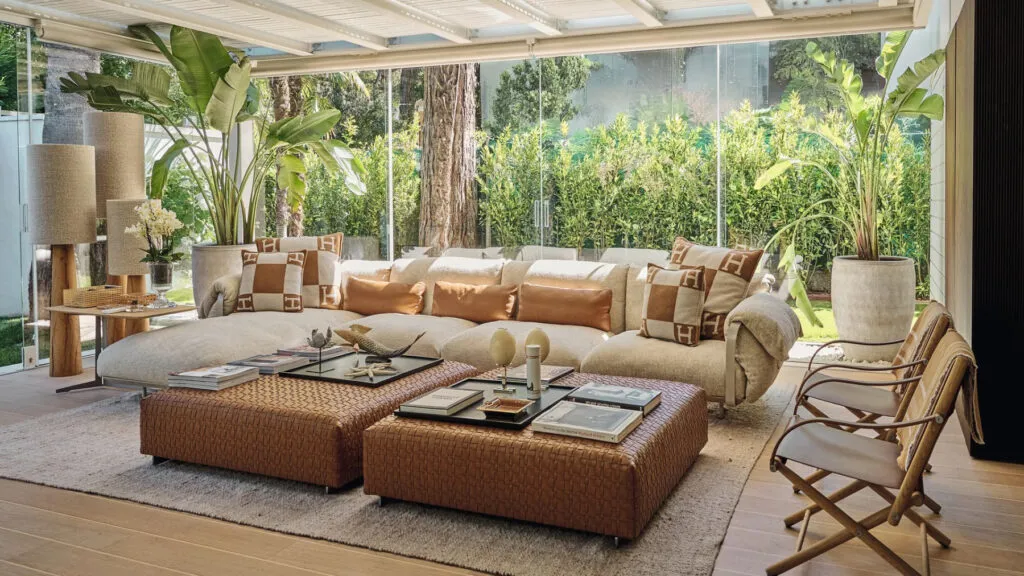
Three floors, each with a clear function, and one black kitchen that deliberately breaks the harmony. The most treasured object...
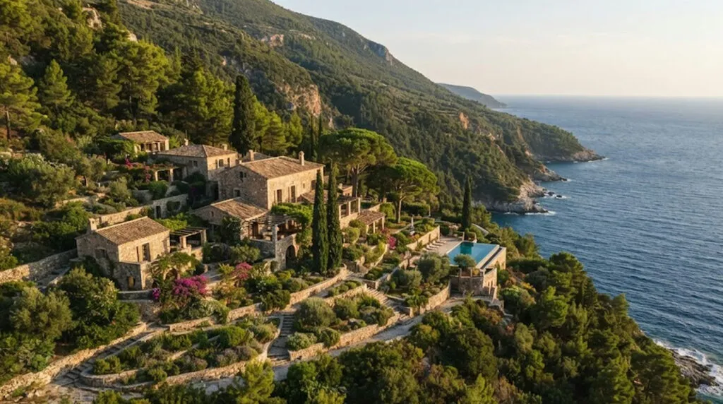
Seven buildings, a private harbour and vineyards - none of it is applicable. But the principle behind the interior costs...
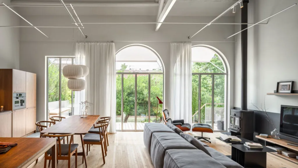
The most expensive decision in the whole renovation was not to touch what already worked. Under the false reed ceiling,...
A photo does not show you where the backpacks get dumped when the kids come home from school. You end...
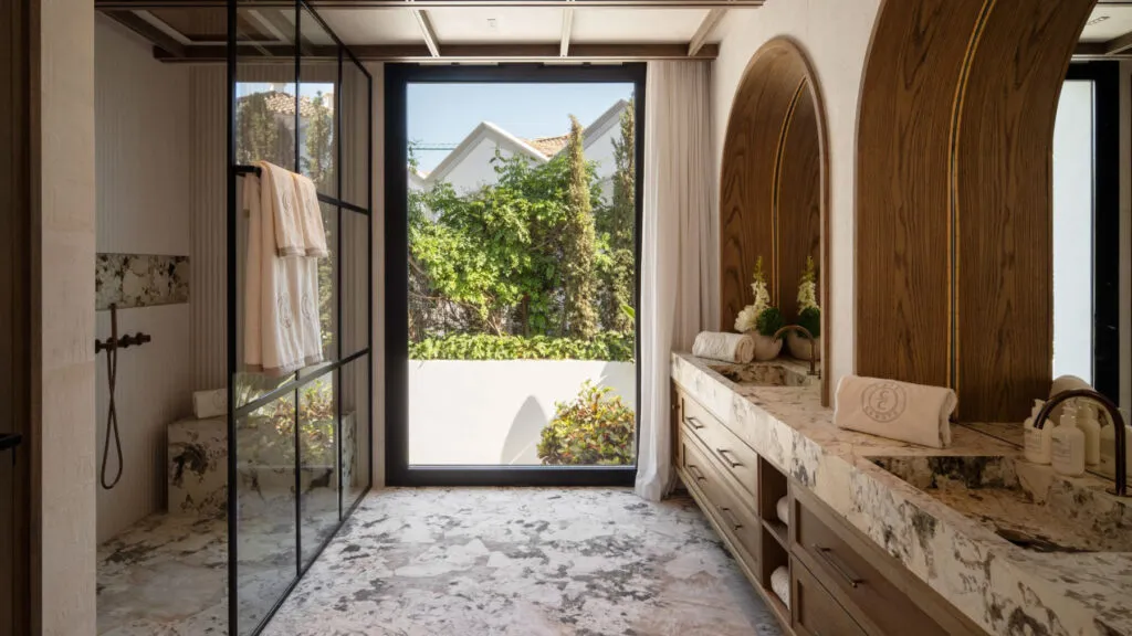
A 1.5 percent floor fall, a shower head at 2.20 metres, a bench at 45 centimetres. Almost nothing on this...
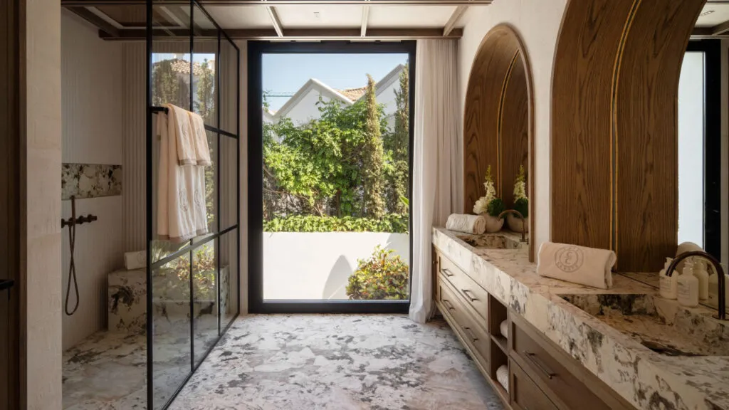
An expensive bathroom isn't recognised by its marble but by the fact nobody looks bad in it. A renovation happens...
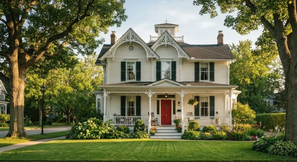
2.1 million euros for 264 square metres from 1875 in a Toronto suburb. The aesthetic minimalism cancelled is coming back,...
This site uses cookies - is that okay? Learn more
Be the first to know when Metla launches something new
Leave your email and we will write when there is a new guide or something new on Metla.