

Kitka Has Been Burning for Days, and the Emergency Agency Says Someone Relights It Every Single Day
27.08.2026


27.08.2026

27.08.2026

27.08.2026

27.08.2026

27.08.2026

27.08.2026

27.08.2026

26.08.2026

25.08.2026
27.08.2026
27.08.2026

26.08.2026
27.08.2026
26.08.2026
25.08.2026

27.08.2026

27.08.2026

27.08.2026

27.08.2026
26.08.2026
26.08.2026

09.03.2026

27.02.2026

19.02.2026
27.08.2026
26.08.2026

25.08.2026

23.04.2026

23.04.2026

12.04.2026
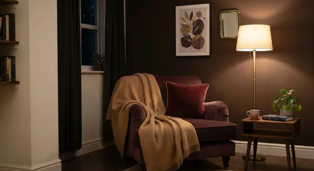
For ten years we were told neutral is safe. Beige, grey, milky white - colours that offend nobody and interest nobody. The autumn 2026 palette finally admits what anyone living in their own flat already knows: a room where nothing happens is not calm, it is empty.
Autumn has a particular relationship with the home. After months in which life happens outdoors, coming back inside starts to mean something - a lamp goes on when it gets dark, warmer textiles come out, rooms you actually stay in are rediscovered. The light changes too. The days shorten, the sun weakens, and the colours of walls and fabrics take on a different dimension from the one they had in July.
Deep tones lead the season
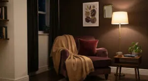
Three colours carry the most weight. Plum - a mix of reddish and violet, warm without being sharp, good in small doses on an armchair, a lampshade or cushions, and on a whole wall in a hallway. Chocolate brown, which houses are using as the new black: Benjamin Moore's Silhouette AF-655, a blend of espresso, burnt brown and a little charcoal, has been chosen as the colour of 2026. And burgundy - the most elegant red, which does not need a large surface to be noticed.
The same rule applies to all three, and it is the one most often skipped: it does not go on the whole room. Chocolate works on a single wall with mouldings, on doors, on a bookcase or built-in furniture. Burgundy on elements with visual weight - an upholstered headboard, a rug, a chest of drawers, curtains. Put everywhere, a deep colour stops being a choice and becomes darkness.
The warm neutrals have not vanished - they moved
Mocha Mousse, Pantone's colour for 2025, continues to exert influence this year too. Softer than chocolate, associated with cocoa and coffee, and visually lighter - this one can go on large surfaces, on a sofa, a wall or cupboard fronts. Camel returns as a warmer alternative to the usual beige and grey bases; a single duvet, cover or blanket is enough to make a room feel warmer and more lived-in immediately.
Cognac brings retro warmth and is best seen on leather, where the surface changes with use and gains depth rather than wearing out.
The calm tones that do not hide the light
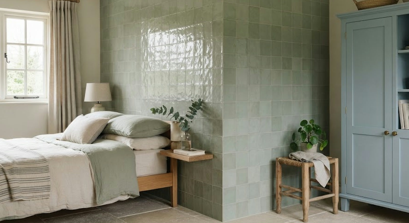
Sage green offers far more possibilities than it looks like at first glance. The grey base reduces the intensity of a classic green and creates a calm room that still has character - unlike a purely neutral palette. This autumn it is recommended for kitchen fronts or bathroom tiles, combined with mid-tone wood and light stone.
Muted blue conveys calm without the room turning cold, which is not always achieved with this colour. It is soft, light, with a grey undertone, and it helps hold on to a sense of brightness as the days shorten. It works on walls, and on kitchen furniture too.
And two colours that serve as a hit, not as a base
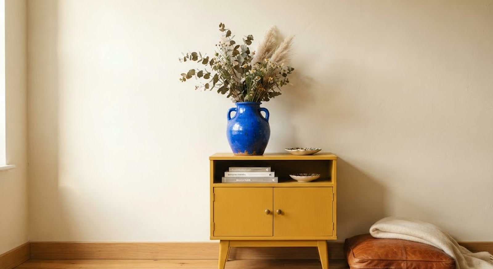
Klein blue is an accent that wakes the whole room - intense, alive and very personal. It does not need a large surface: one armchair, a lamp, a vase or the inside of a shelf is enough to bring a stricter scheme to life. With camel it makes an elegant pairing, with chocolate more sophistication, with baked yellow an energetic contrast. The smartest move is to start with something easy to change.
Baked yellow is softer and earthier than an intense yellow, and it has exactly the kind of warmth that adds light as the days shorten. It goes on armchairs, headboards, curtains, furniture. In velvet or wool it takes on a particular richness and shifts subtly as the light changes through the day.
All of this runs here into one constraint no catalogue writes about - rent, or a flat where the walls are not yours to paint. That is exactly why the list is worth reading backwards: from the cushion, the blanket, the vase and the lamp upwards. Those are the objects you take with you when you move, and they are the only ones that truly belong to you.
The latest 10 news from this category
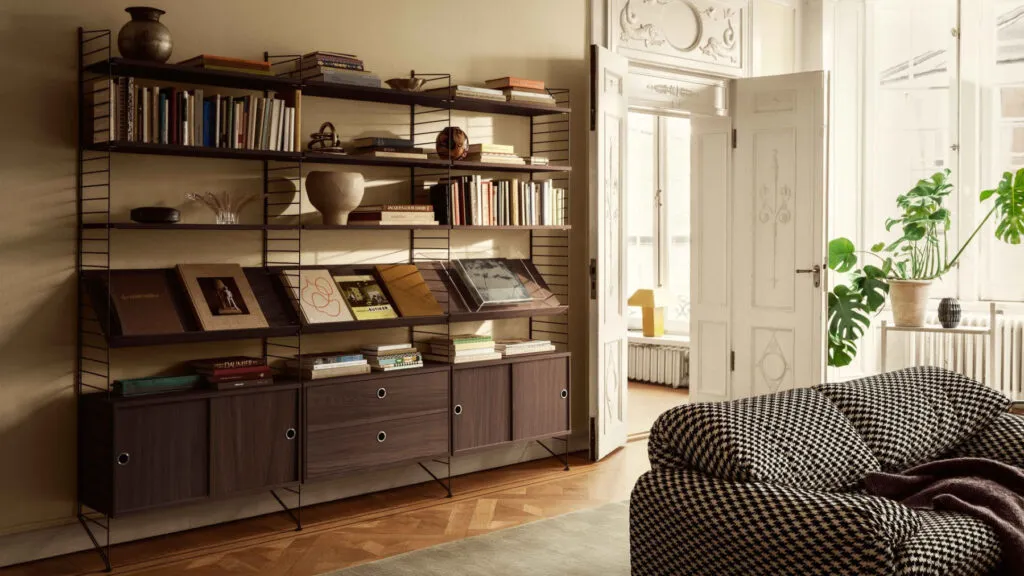
For years we have asked flats for something they never signed up to, and we still furnish them as though...
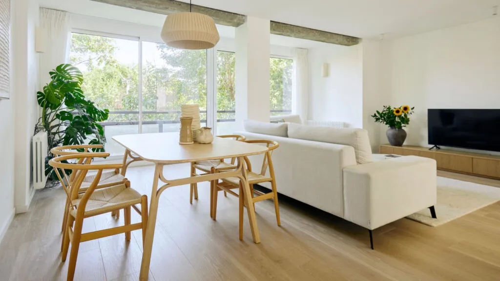
The architect did not ask about style, but about how they wanted to live five years from now. The result...

Jordi Cruz and Rebecca Lima opened up their house two years after the wedding. The basic material is not oak...
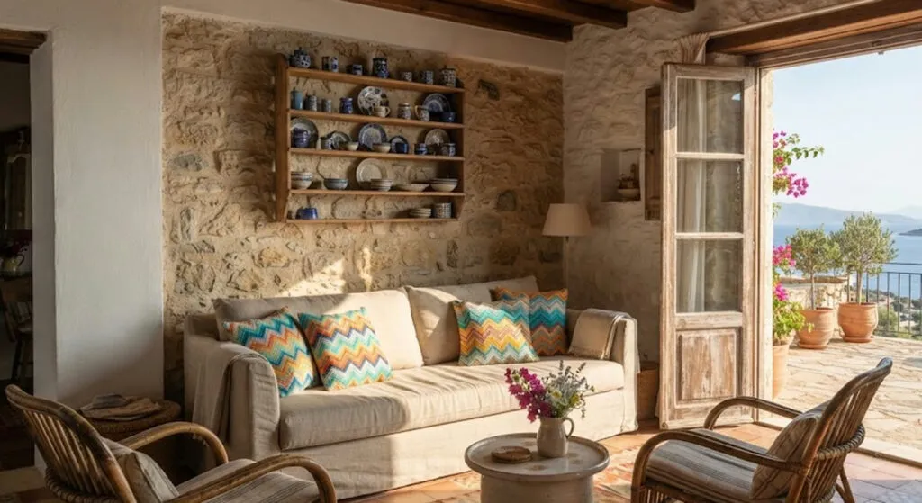
The most expensive family in the story gives the cheapest lesson. Not one piece in the living room is from...
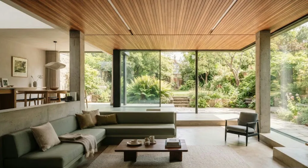
330 square metres in Biscay, a living room on two levels and a red staircase deliberately left untouched. The idea...
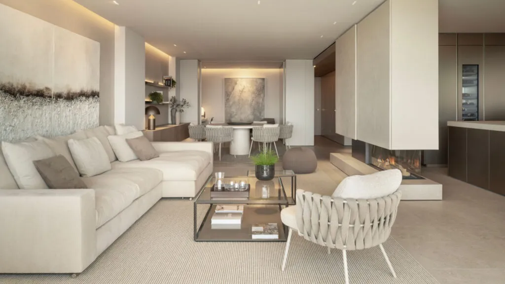
If the same tone and the same finish go literally everywhere, the space does not become calm - it becomes...
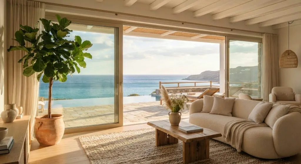
From Malibu to Mijas and Como. Some are real properties you can stay the night in, some are a set...
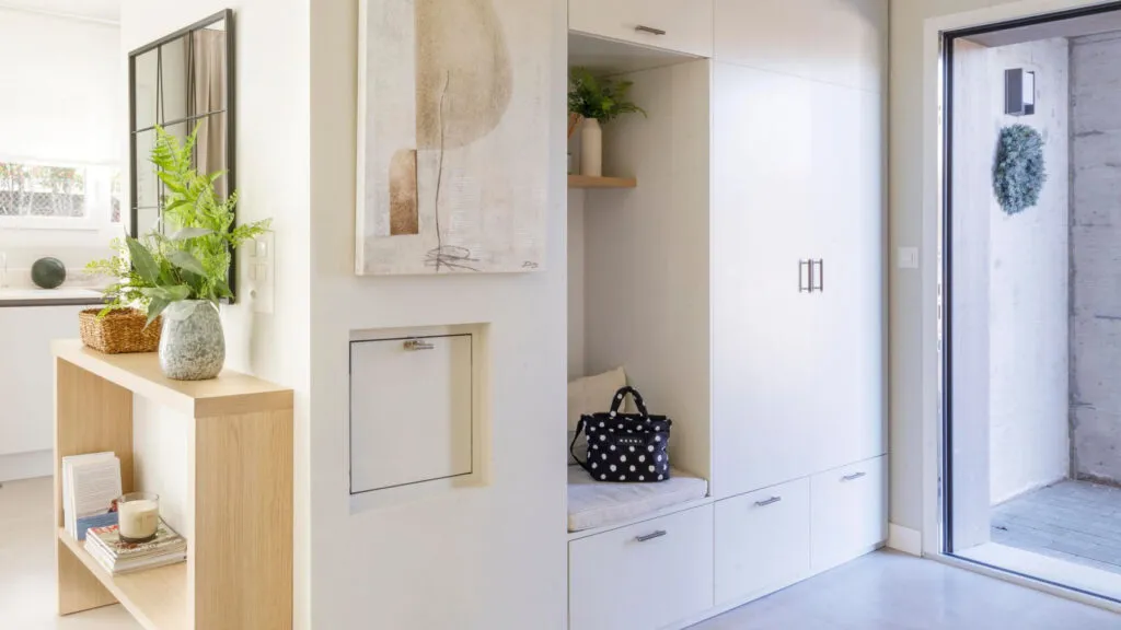
A twenty-centimetre shelf, a bench that hides shoes and one tray for the keys. The biggest enemy is not mess...
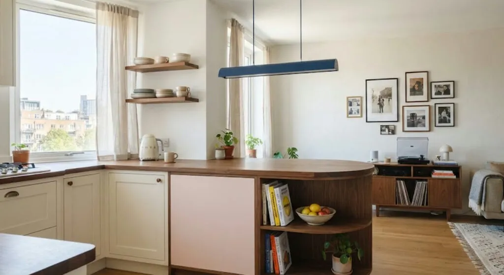
Colour here is not decoration but layout. The curved counter with a built-in bookshelf, the coral corridor and the wardrobes...
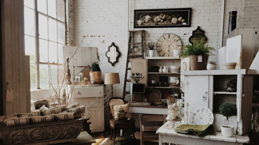
The trend is back, but not out of nostalgia - those pieces are solid wood, not chipboard with foil. Three...
This site uses cookies - is that okay? Learn more
Be the first to know when Metla launches something new
Leave your email and we will write when there is a new guide or something new on Metla.