
Two Reports in One Day: an 80-Year-Old Beaten in Her Own Yard in Tearce, an 82-Year-Old from Veles Detained for Years of Beating His Wife
22.08.2026


22.08.2026

22.08.2026

22.08.2026

22.08.2026

22.08.2026

22.08.2026
22.08.2026

22.08.2026

21.08.2026

22.08.2026

22.08.2026
21.08.2026
22.08.2026

22.08.2026
22.08.2026
22.08.2026
21.08.2026
20.08.2026

22.08.2026

22.08.2026

22.08.2026
22.08.2026

22.08.2026
21.08.2026

09.03.2026

27.02.2026

19.02.2026
22.08.2026

21.08.2026

20.08.2026
23.04.2026

23.04.2026

12.04.2026
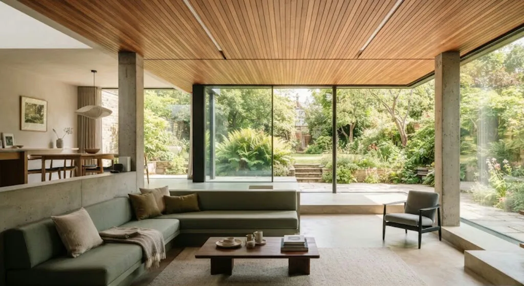
A house from the seventies, 330 square metres, on the Uribe Costa in Biscay, not far from the Cantabrian Sea. The original project was overseen by architect Secundino Zuazo - a name that means something in Spanish architecture. Fifty years later, the Garmendia Cordero studio took it on and did something most renovations do not dare: instead of decorating it, they turned it inside out around one single idea.
That idea is the garden. The whole renovation starts from the question of where the house looks, not how it looks inside. The original layout was reorganised to produce far more open, larger and more flexible spaces, and every decision after that flows from the relationship between interior and greenery. Here we renovate the other way round - first you pick the tile, then you see what comes out.
The entrance tells you immediately how the house will work. It is built as a Japanese vestibule, with a few steps, a wooden ceiling and a wooden door - a place where you physically descend to another level before you go in. It is not decoration; it is an announcement of the layout that follows.
The living room sits on two levels, three steps apart. The lower part is organised around a fireplace with built-in log storage, and above it runs a wooden slatted ceiling. The corner sofa is masonry-built, in a pale sage green. The floor is microcement, continuous throughout the ground level - no thresholds, no interruptions. Instead of a wall towards the yard there is an enormous sliding glass wall in a wooden frame.
The work zone is the most interesting move, because it does not exist as a separate room. It is open to both the living room and the dining room, without a single door, with a built-in desk, two Cesca chairs and floating wooden shelves. A place to work that is not an office, in a house that did not want a room standing empty twenty hours a day.
The dining room continues the same logic. It connects to both the kitchen and the work area, with a wooden table and a pendant light, and a view of the garden. It serves for eating, working and playing - which is an honest description of how a table actually gets used.
The kitchen is partly closed, but with a glass partition in a wooden frame and an interior window looking onto the living room and the work area. It is a solution rarely seen - neither an old-style closed kitchen nor a fully open one. The smell stays in, the conversation gets out.
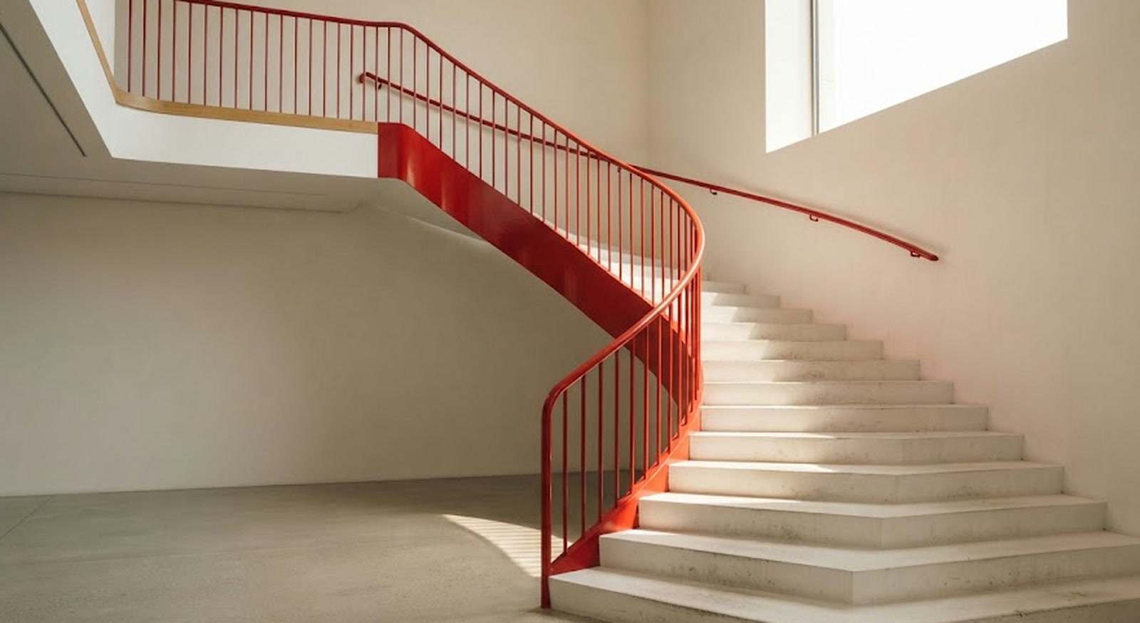
One thing from the original house was kept deliberately: the staircase. A sculptural railing, painted in a strong red, over white steps. It is the one piece that unmistakably says the house is from the seventies, and that is exactly why it was not touched. Every renovation faces this question - what to preserve. The answer here was: whatever has character, even when it is loud.
The bedroom is the opposite of all that. Minimalist, in white, with white columns, a wooden door and a latticework headboard, and a large monstera as the only element of colour. A room that consciously has nothing to say.
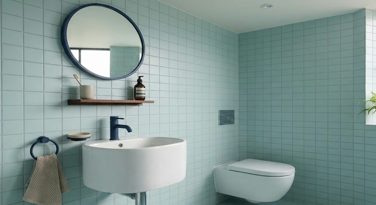
The bathrooms bring the boldness back. The main one is clad floor to ceiling in square tiles in mint pale blue, with a rounded ceramic basin, a wall-hung toilet and dark blue fittings. The secondary one goes pink - square tiles wall to wall, a round white basin and a black tap. Two small rooms that accepted being entirely one colour, which is far braver than another white mosaic.
The lower level carries everything that usually spoils the beauty of a house - the gym, the laundry and the garage. Removed from view, rather than turned into a problem.
Outside there is a covered terrace with wooden beams and a coral-coloured table, and the old trees from the original yard have been kept. That is the last message of this project: what exists is not demolished automatically. Not the trees, not the red staircase, not the concrete columns left visible.
Three hundred and thirty square metres is a luxury few people have. But the idea underneath is not expensive - turning the house towards what it already has, instead of closing in on itself. That works on eighty square metres with a balcony too.
The latest 10 news from this category
If the same tone and the same finish go literally everywhere, the space does not become calm - it becomes...
From Malibu to Mijas and Como. Some are real properties you can stay the night in, some are a set...
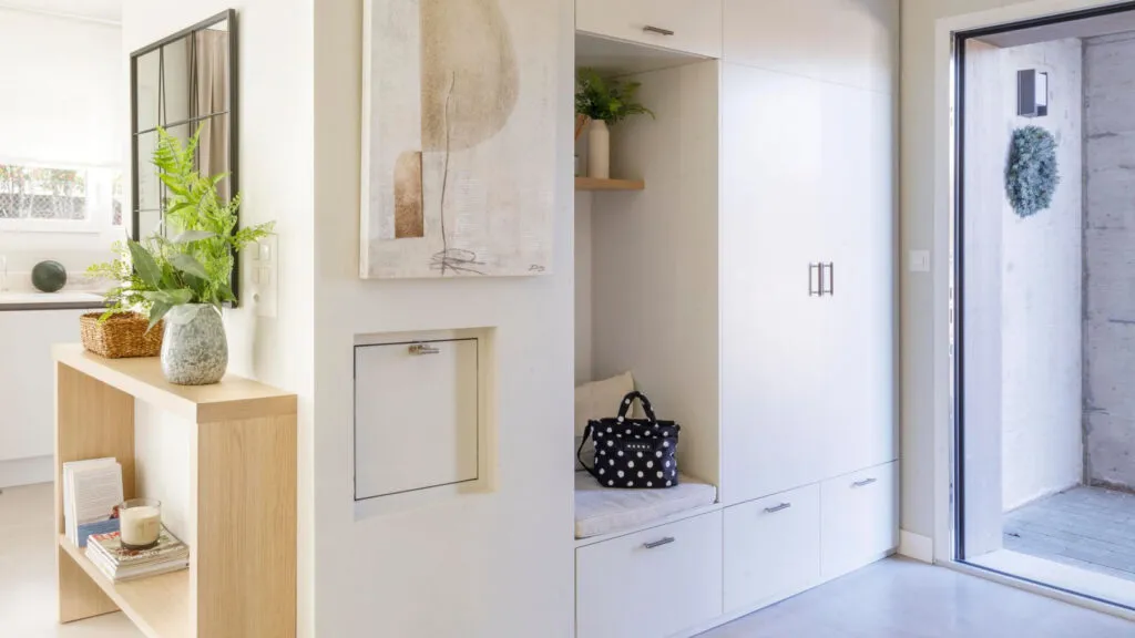
A twenty-centimetre shelf, a bench that hides shoes and one tray for the keys. The biggest enemy is not mess...
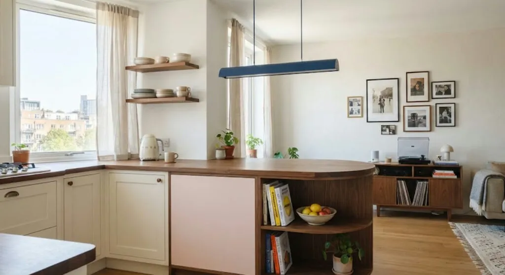
Colour here is not decoration but layout. The curved counter with a built-in bookshelf, the coral corridor and the wardrobes...
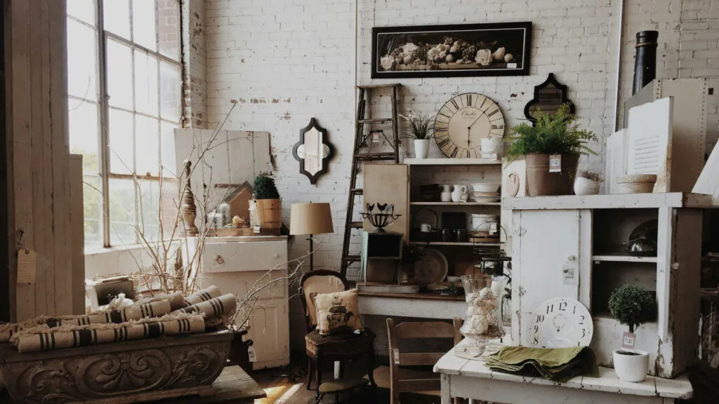
The trend is back, but not out of nostalgia - those pieces are solid wood, not chipboard with foil. Three...
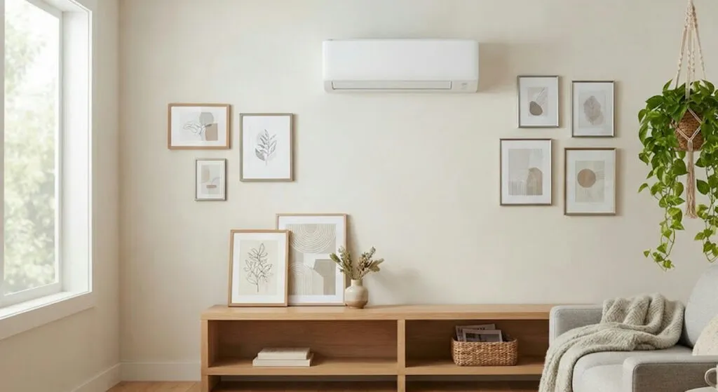
The object bought to hide one white rectangle ends up taking more space than it does. And it makes the...
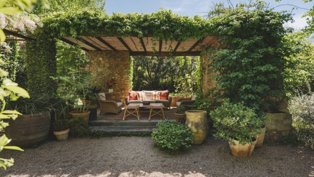
350 square metres without a single corridor, five bedrooms and a pool that does not beg for a photograph. Not...
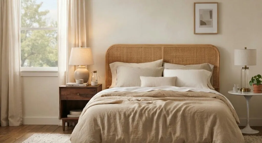
Mixing materials and shapes gives you more than repeating the same model twice. Here it also means the inherited nightstand...
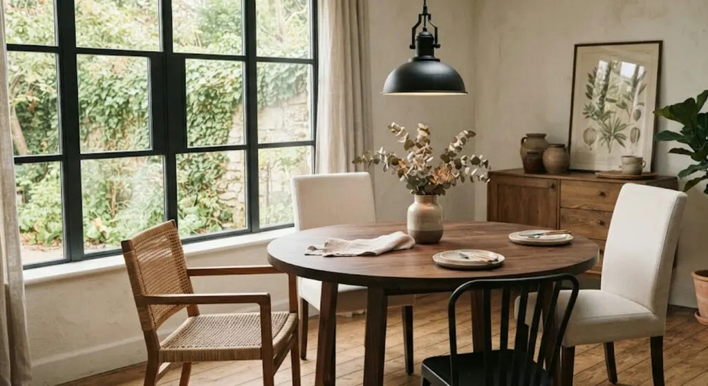
If you like the table but the chairs have fallen apart, you do not have to throw everything out. The...
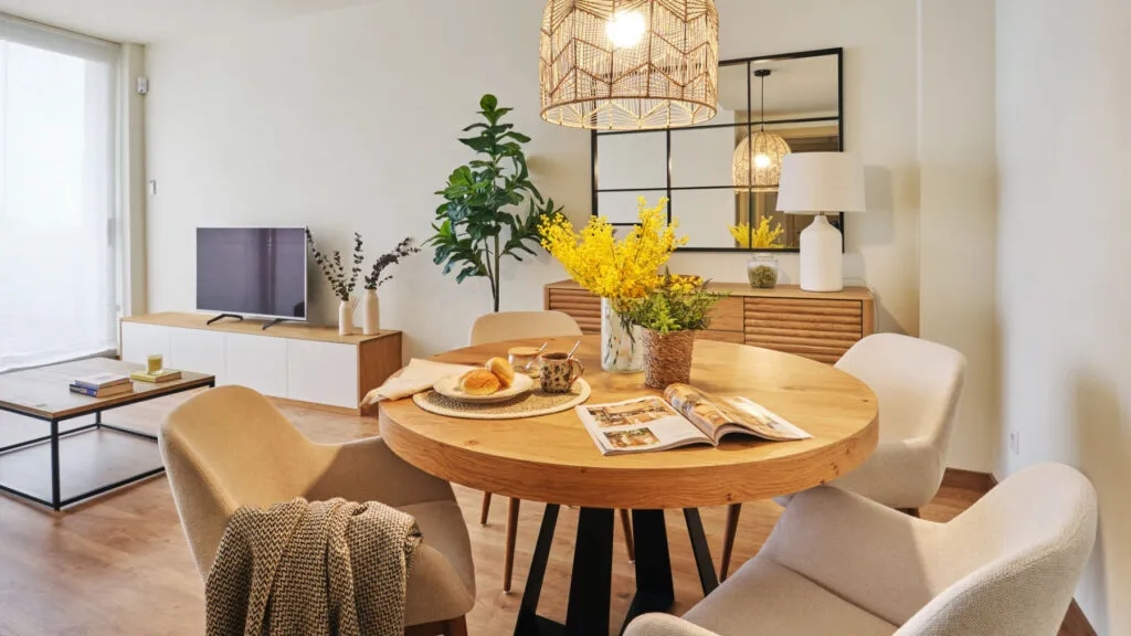
White walls, low furniture and lots of mirrors produce flats that photograph well and live badly. Ten pieces of advice...
This site uses cookies - is that okay? Learn more
Be the first to know when Metla launches something new
Leave your email and we will write when there is a new guide or something new on Metla.