

Судење за „Лотарија“: 231 доказ, а досега ниту една порака меѓу Груби и Бајрами
24.09.2026



24.09.2026

24.09.2026

24.09.2026

24.09.2026

23.09.2026

22.09.2026

24.09.2026

24.09.2026
23.09.2026

24.09.2026

24.09.2026

24.09.2026
24.09.2026
23.09.2026
22.09.2026

24.09.2026

24.09.2026

24.09.2026

24.09.2026

23.09.2026

23.09.2026

09.03.2026

27.02.2026

19.02.2026

23.09.2026
22.09.2026

21.09.2026

23.04.2026

23.04.2026

12.04.2026

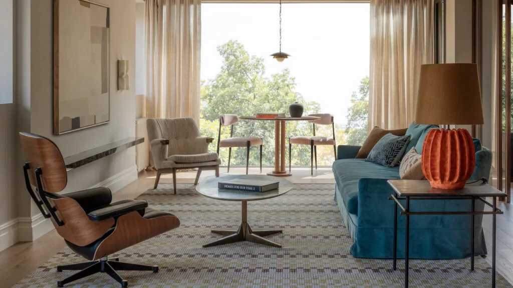
When architect Borja Vildósola first saw the 280-square-metre flat in Bilbao, it had what most people are looking for - big windows and an exceptional view - yet almost nothing worked. A poor layout made it dark and impractical. The solution wasn't expensive cladding but a different map of the home: making light the main decoration.
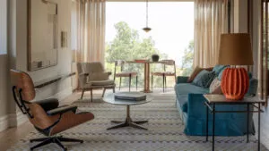
"Luxury isn't understood through ostentation, but through quality and detail," says Vildósola. You see it straight away in the living room: large glass doors open onto the view, and inside there's a Vitra Eames Lounge Chair, Kasthall rugs and a mix of natural wood, velvet and linen. Nothing shouts. Everything has been chosen to age well.
A dining room with no dead corners
The dining room was made to measure, so there are no spaces that exist only for show. A round table with custom chairs, a floor-to-ceiling bookcase in graphite, and a chandelier by CTO Lighting. The layout is rational - every square metre pulls its weight.
The kitchen and dining room are linked by a natural walnut partition with rounded corners that lets light flow through the flat. "It articulates the relationship between the open rooms and gives them a bit of hierarchy," the architect explains.
The kitchen came out of the dark
The biggest change is the kitchen. Once tucked away in the dark interior, it is now the social centre of the home, connected to the living room, dining room, study and terraces. The units are by Leicht, in natural walnut, and the worktop is Baobab quartzite from XTONE's Altissima line, in green-blue tones. The walnut partition allows the kitchen to be opened up or closed off as needed.
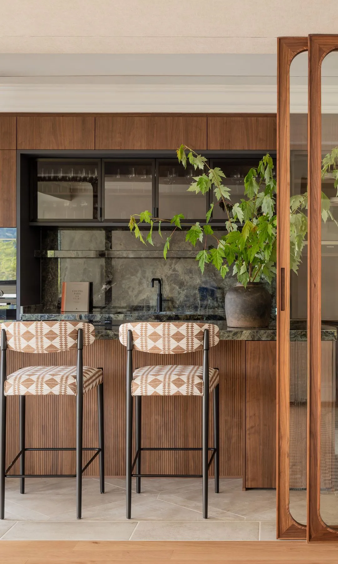
How many flats in the Balkans hide the kitchen in the darkest corner and waste the best light on a hallway or a room that gets used twice a year? In Bilbao the answer was radical: the kitchen goes where life actually happens.
From six bedrooms to four - but better ones
The original six bedrooms became four, larger and brighter. The main bedroom looks out through a big window, with soft tones, linen, wood, profiled mouldings and blue accents. The rule is simple: the best orientations belong to the most important rooms, while secondary functions have been moved towards the inner courtyard.
Between the bedroom and the bathroom sits a large rectangular walk-in wardrobe, with floor-to-ceiling cabinets in light lacquer and modular fronts with profiles and handles. Its position is no accident - the wardrobe helps the flow of light and cross-ventilation.
A black-and-white bathroom with ribbed-glass cubicles
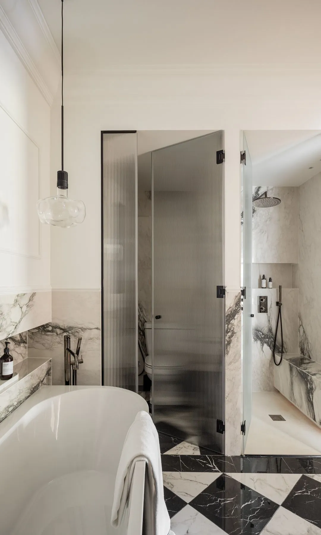
The main bathroom is graphic and elegant: a freestanding bathtub facing the entrance, a pendant lamp, a chequerboard floor, marble, and finishes in white and black. The shower and toilet are in separate cubicles of ribbed glass, which lets light through while blurring shapes. The goal, says Vildósola, is "for several people to be able to use the bathroom at the same time, while keeping a certain privacy". A practical fix for the morning rush every family knows.
A child's room without childish things
The second bedroom has a custom bunk bed, natural wood and black details, naturally textured fabrics, a desk and a large wardrobe. "We wanted a young, relaxed but also pared-back room," says the architect. It's a room that can keep up with the child as they grow.
The guest bathroom is more playful: blue Marazzi tiles laid vertically with a glossy finish, a basin on a wooden cabinet, steel fittings and light surfaces for balance.
Washing and drying - in the inner courtyard
The flat is divided into three zones: public, private and service. The laundry, a work area and a place to dry clothes have been moved to the inner courtyard side, with floor-to-ceiling cabinets, a continuous worktop and built-in appliances. The outward-facing facades are reserved for the living rooms, kitchen, study and bedrooms. This may be the most useful lesson for anyone renovating: before you choose the tiles, decide which room deserves the light.
The latest 10 news from this category
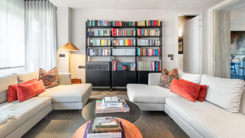
The exposed brick and ribbon windows stayed, and the entire palette came out of a single painting above the sideboard....

An Eames lounge chair from 1956, a Fratini shelving unit and a concave cobalt mirror that reflects the room curved....
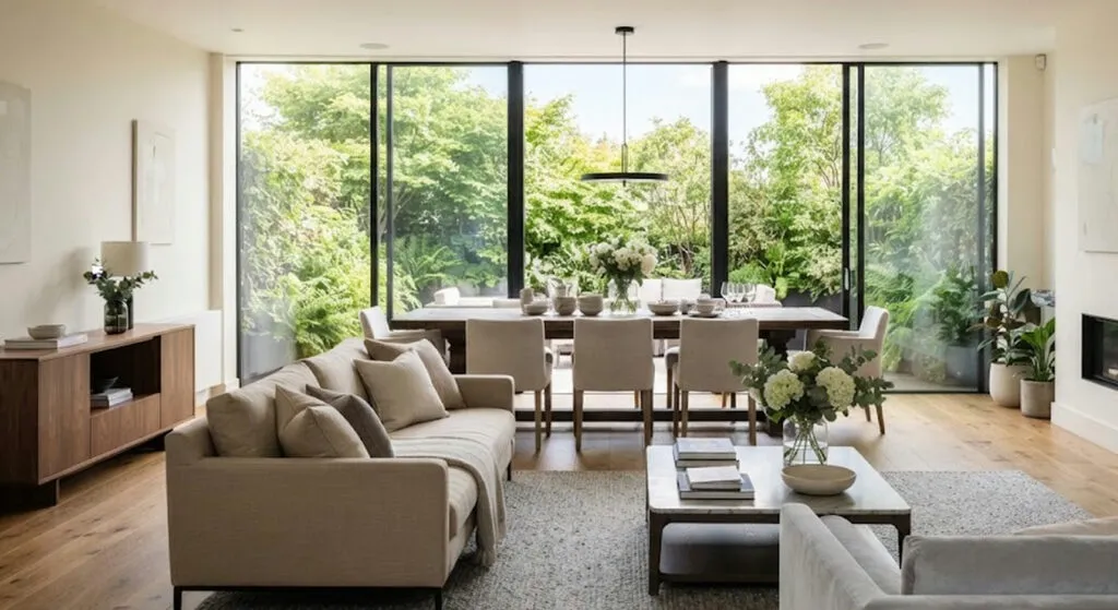
Four bedrooms, four bathrooms and one rug that keeps the dining area separate without a wall. Three things in this...

She did not decorate a house - she built a world. And behind all that fantasy there is no inheritance,...
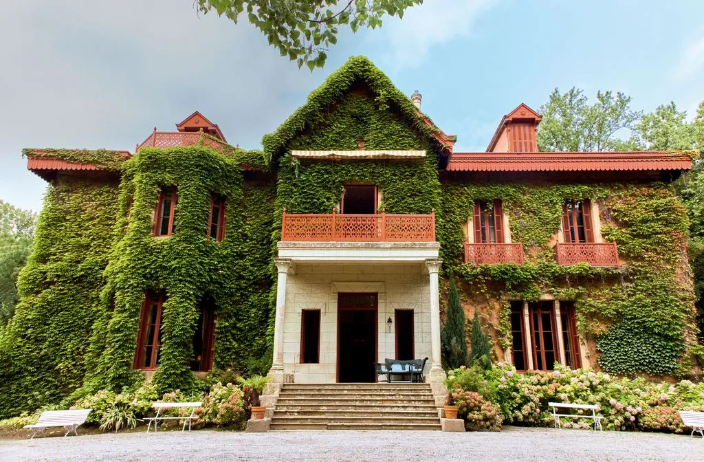
The stairwell has been turned into a gallery, and in the bedroom there is not a single attempt at an...

In the vast majority of flats the ceiling stays white because that is how it was found - not because...
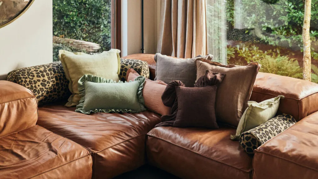
It is not hoarding and it is not maximalism. Ten things that used to be hidden when guests came and...
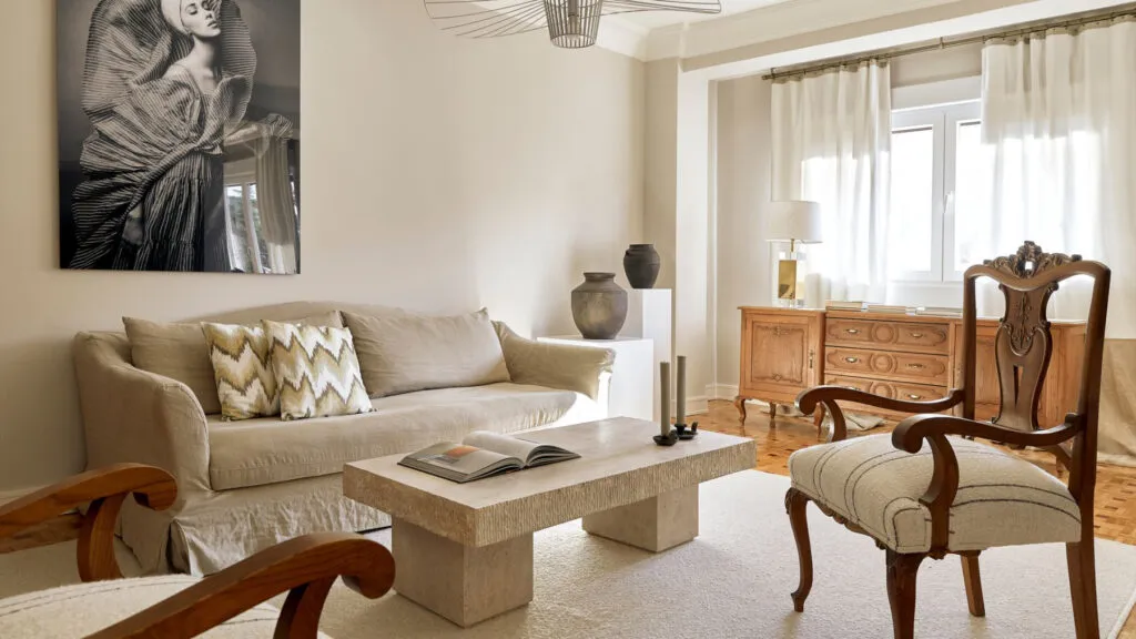
A bespoke console, reupholstered armchairs and wallpaper hung like art. The most expensive thing in the flat is the decision...
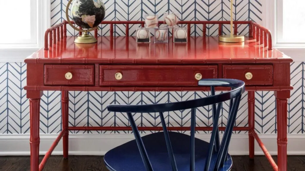
For years the rule was everything neutral and everything from the same collection. The result is a living room that...
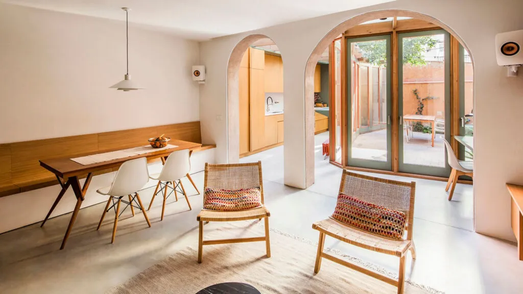
Two doors between the living room and the bedroom. That is the whole arithmetic, and that is what you lose...
This site uses cookies - is that okay? Learn more
Be the first to know when Metla launches something new
Leave your email and we will write when there is a new guide or something new on Metla.