

Kratovo man stabs police officer mid-intervention: prosecutors want the 40-year-old detained
15.09.2026


15.09.2026

15.09.2026

15.09.2026

15.09.2026

15.09.2026

15.09.2026

15.09.2026

14.09.2026

13.09.2026

15.09.2026

15.09.2026
14.09.2026

15.09.2026
15.09.2026

15.09.2026
15.09.2026
14.09.2026
13.09.2026

15.09.2026

15.09.2026

15.09.2026

15.09.2026

15.09.2026

14.09.2026

09.03.2026

27.02.2026

19.02.2026
14.09.2026

14.09.2026

13.09.2026

23.04.2026

23.04.2026

12.04.2026

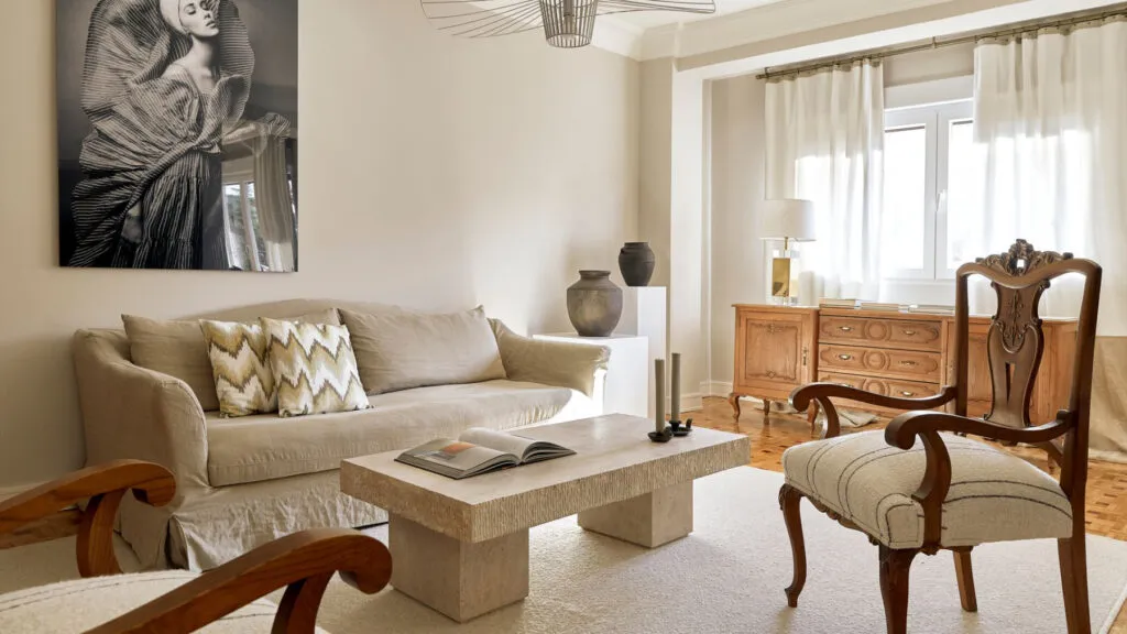
A 120 square metre flat in Madrid, built in 1972. Renovated in 2026. And the biggest decision in the whole project was what was not demolished.
The studio Vílchez Uriarte - architect Cristina Vílchez and interior designer Mireia Uriarte - kept most of the original layout, all the ceiling mouldings and part of the furniture the house already had. At a time when every renovation begins with a skip and the words "open plan", that is an almost provocative decision.
Living and dining room: one space, two roles
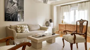
The two share an open space but are not merged. A floor-to-ceiling partition separates them without isolating them - a solution that gives a clear boundary where a wall would give enclosure. The palette is neutral: powder-toned beige, white and wood. The armchairs were not thrown out but reupholstered in fabric from Gancedo. Above the sofa hangs a contemporary work by Elena Yv-Skaya.
In the dining room stands a classic wooden table with contemporary light chairs - a combination that does not demand everything come from the same era. A door of black iron and glass leads to the kitchen: it keeps the view open and the space independent.
The hallway is not wasted floor area
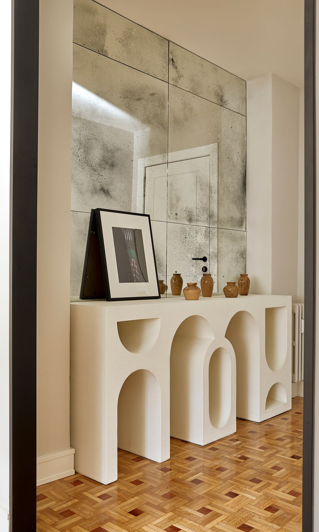
The entrance solves the hardest question in any 1970s flat - too little light and too little depth. The answer is a floor-to-ceiling mirror, deliberately aged, which gives the light back and doubles the perception of depth. In front of it stands a stone console made to measure by the studio itself, with rounded geometric openings that run directly counter to the traditional tone of the mirror.
The kitchen and the work corner
The kitchen is functional without being surgical: bespoke units, light below and dark above, a Dekton worktop and a continuous front that reduces visual noise. Next to it is the work nook, and that is where the most interesting decision in the flat happens - a botanical William Morris wallpaper, hung so that it reads as a framed picture rather than a wall covering. With a rounded table and a built-in bench, it stops being an office and becomes a place where somebody sits down.
The bedrooms: green instead of white
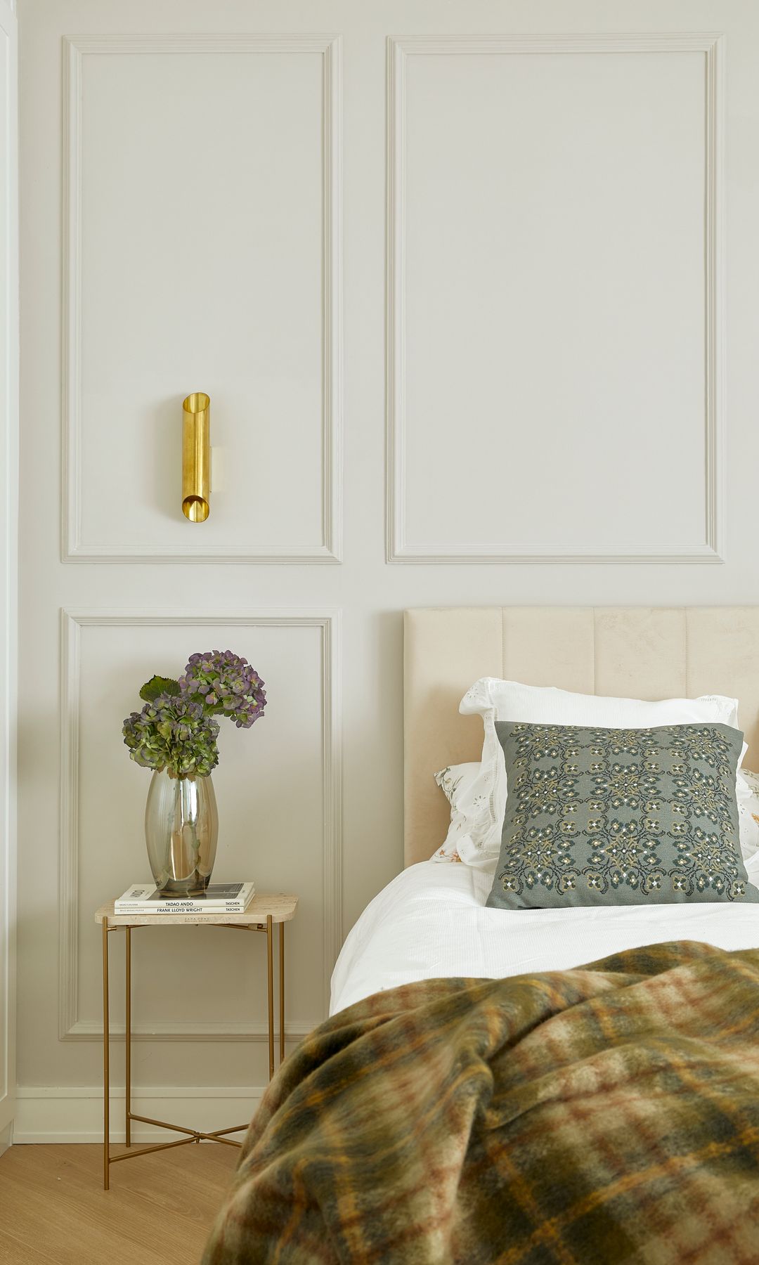
The main bedroom kept the classic mouldings on the wall behind the bed and goes for light tones, with green textile accents and gold wall lamps. Next to it is the dressing room with white panelled doors and black metal fittings, the floor continuing without a break. The washbasin there is designed as a dressing table, not as a sanitary fixture.
The guest bedroom goes bolder: a wall in deep green textured resin, and above the bed four botanical prints. White, green and wood, in balance. The second bathroom combines stone, dark wood and white, with a large mirrored surface and a niche in the wall instead of shelves.
What this renovation says
Around here, renovating an old flat almost always means one thing: everything down to the concrete, then plasterboard, then everything new. That has its own logic - the effort of saving old moulding is greater than the effort of a new ceiling, and the craftsman who knows how to restore it costs more than the one who knows how to replace it.
But the arithmetic at the end is more interesting than it looks. This flat is not expensive because it has expensive materials; it has a bespoke console, reupholstered armchairs and wallpaper hung like art. The most expensive thing in it is the decision to keep what had already stood for fifty-four years. How many flats in our own 1970s blocks had mouldings exactly like these before the first suspended ceiling covered them?
The latest 10 news from this category
For years the rule was everything neutral and everything from the same collection. The result is a living room that...
Two doors between the living room and the bedroom. That is the whole arithmetic, and that is what you lose...

Kitchen in its own room, living room separate, dining room a third, and corridors between them. The architect knocked down...
Interior designers have one formula to stop a home ending up either as a catalogue or as a storage unit....
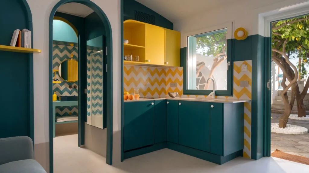
A forgotten flat in Posillipo, two colours taken from the fishing boats and the lemons outside, and furniture in which...
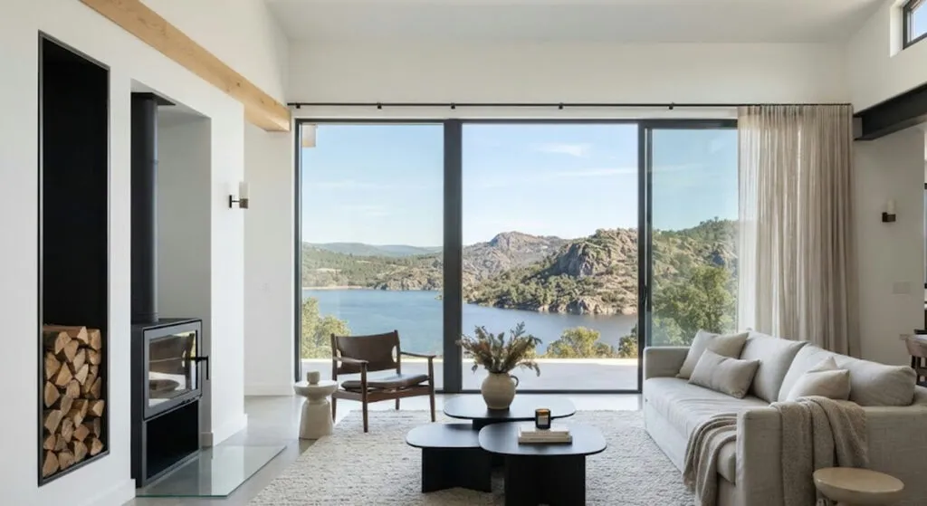
Three hundred square metres, four bedrooms and one decision that dictated every one after it: the view of the water.
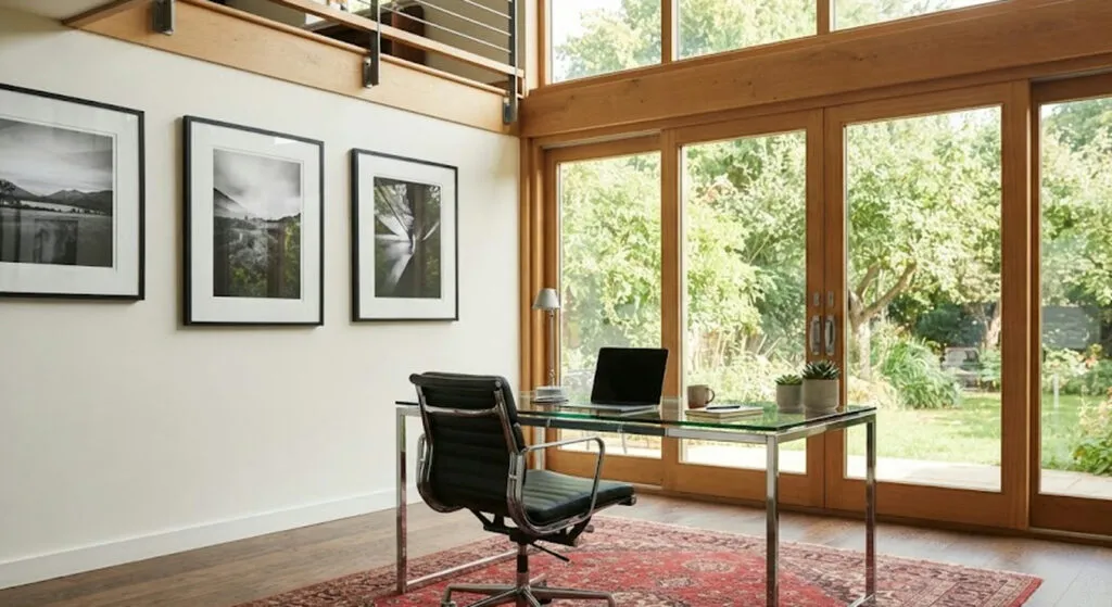
Double height, a Persian rug under the chrome and a bookshelf beneath the window. Three solutions at completely different prices,...
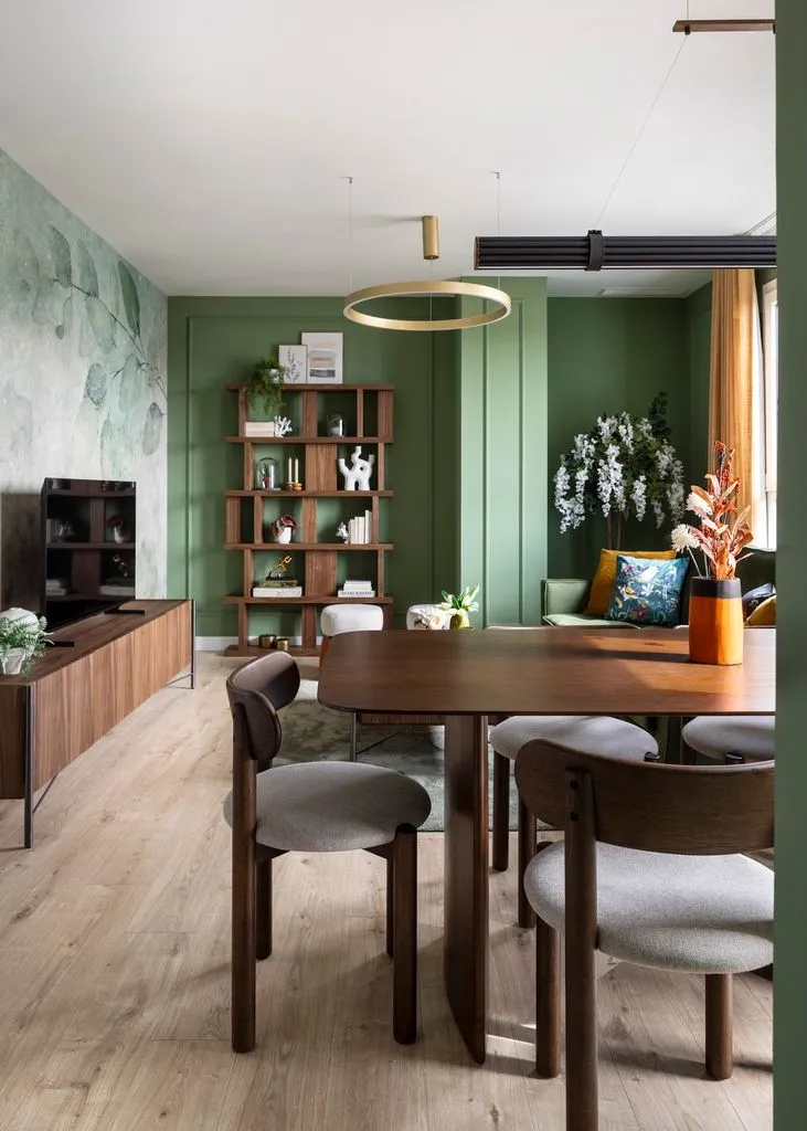
Four things change a home - walls, light, doors and floor. Everything else comes later, and demolition is last on...
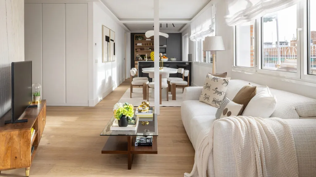
Order, calm and light - not one of the three costs money. What costs is the decision not to fill...
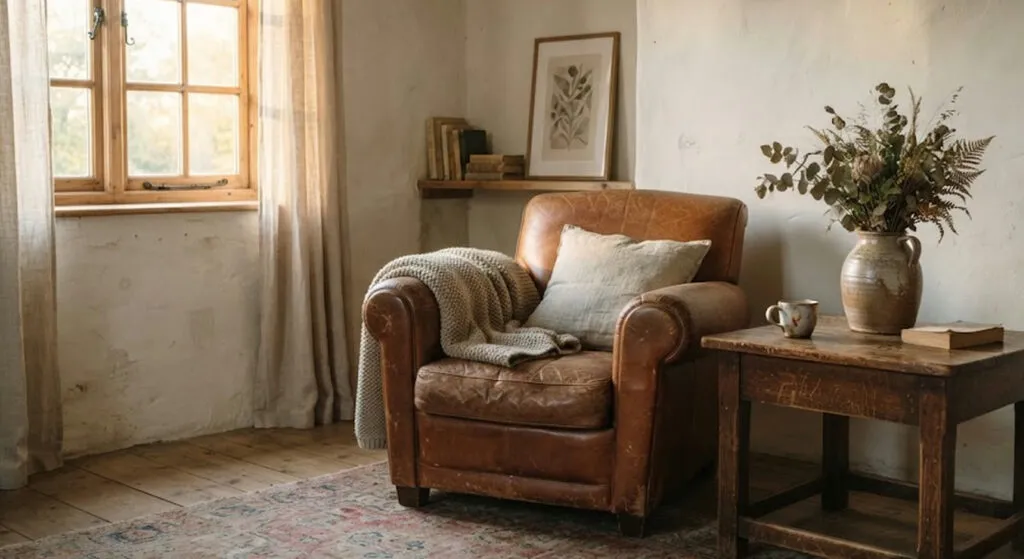
An interior designer describes found luxury - objects with a biography, visible wear and materials that improve with time. Here,...
This site uses cookies - is that okay? Learn more
Be the first to know when Metla launches something new
Leave your email and we will write when there is a new guide or something new on Metla.