

After 19 Months on the Run, Bajrami Handed Himself In at Blace at 5:35 AM: Same Crossing, Same Early Hour as Grubi
10.09.2026


10.09.2026

10.09.2026

10.09.2026

10.09.2026

10.09.2026

10.09.2026

10.09.2026

09.09.2026

08.09.2026
10.09.2026

10.09.2026
09.09.2026

10.09.2026
10.09.2026

10.09.2026
10.09.2026
08.09.2026
07.09.2026

10.09.2026

10.09.2026

10.09.2026

10.09.2026

10.09.2026

09.09.2026

09.03.2026

27.02.2026

19.02.2026

23.04.2026

23.04.2026

12.04.2026

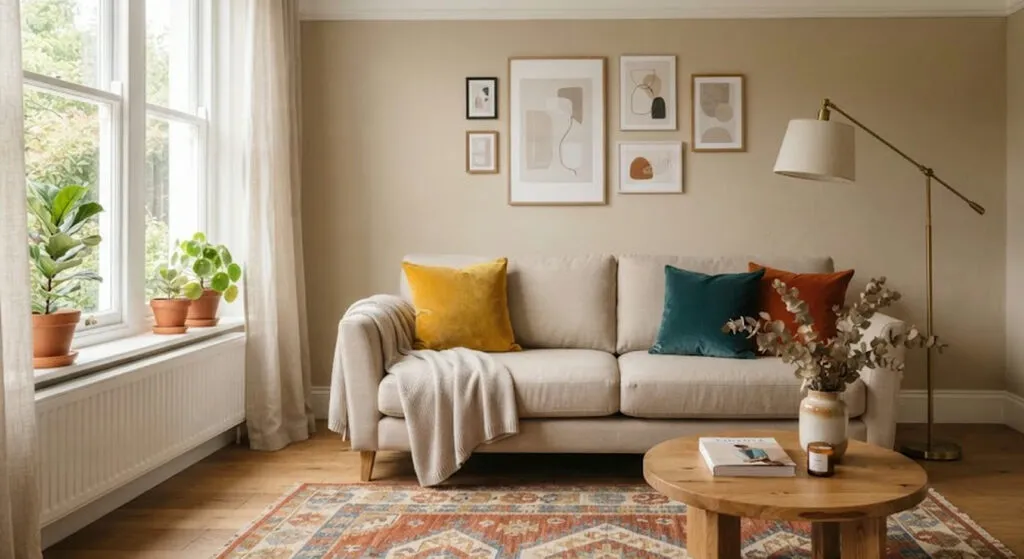
There are two ways to get your own living room wrong. The first is to make it so controlled it looks like a catalogue - everything matches, nothing says anything. The second is to buy piece by piece, as things come, until the room becomes a storage unit. Interior designers have one formula for avoiding both, and it is simpler than it sounds.
The rule is called 70/30. Seventy percent of the space is a neutral base, thirty percent is colour, texture and character. That is it. No course, no consultant, no overhaul.
What goes into the seventy percent
The walls, the floor and the large fixed furniture - sofas, beds, tables, wardrobes. These are the things that cost the most and are hardest to change. That is why they go in neutral or restrained tones. Not because neutral is prettier, but because a mistake there is the most expensive.
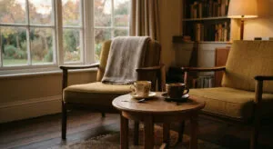
The remaining thirty percent is the margin for contrast: cushions, rugs, lamps, pictures, objects brought back from trips, inherited pieces. Anything is allowed here - a strong colour, an unexpected texture, something that matches nothing else. These are also the things most easily swapped out when you get bored of them.
Why not fifty-fifty
This is the part that surprises people most. An even split looks fair, but it does not work: when no element dominates, the room is left without a clear criterion. The eye has nowhere to rest and nowhere to settle. The rule is a relative of the well-known 60/30/10 for combining colours, except that here it applies to the whole room, not just the palette.
How to apply it, step by step
First you define the base - wall colour, floor tone, a sofa or bed in a neutral palette. Then, and only then, you choose the thirty percent of contrast. Finally comes the check that costs nothing: photograph the room with your phone and look at the picture. A photograph instantly shows whether the neutral tones really dominate or you only think they do.
Where it works best
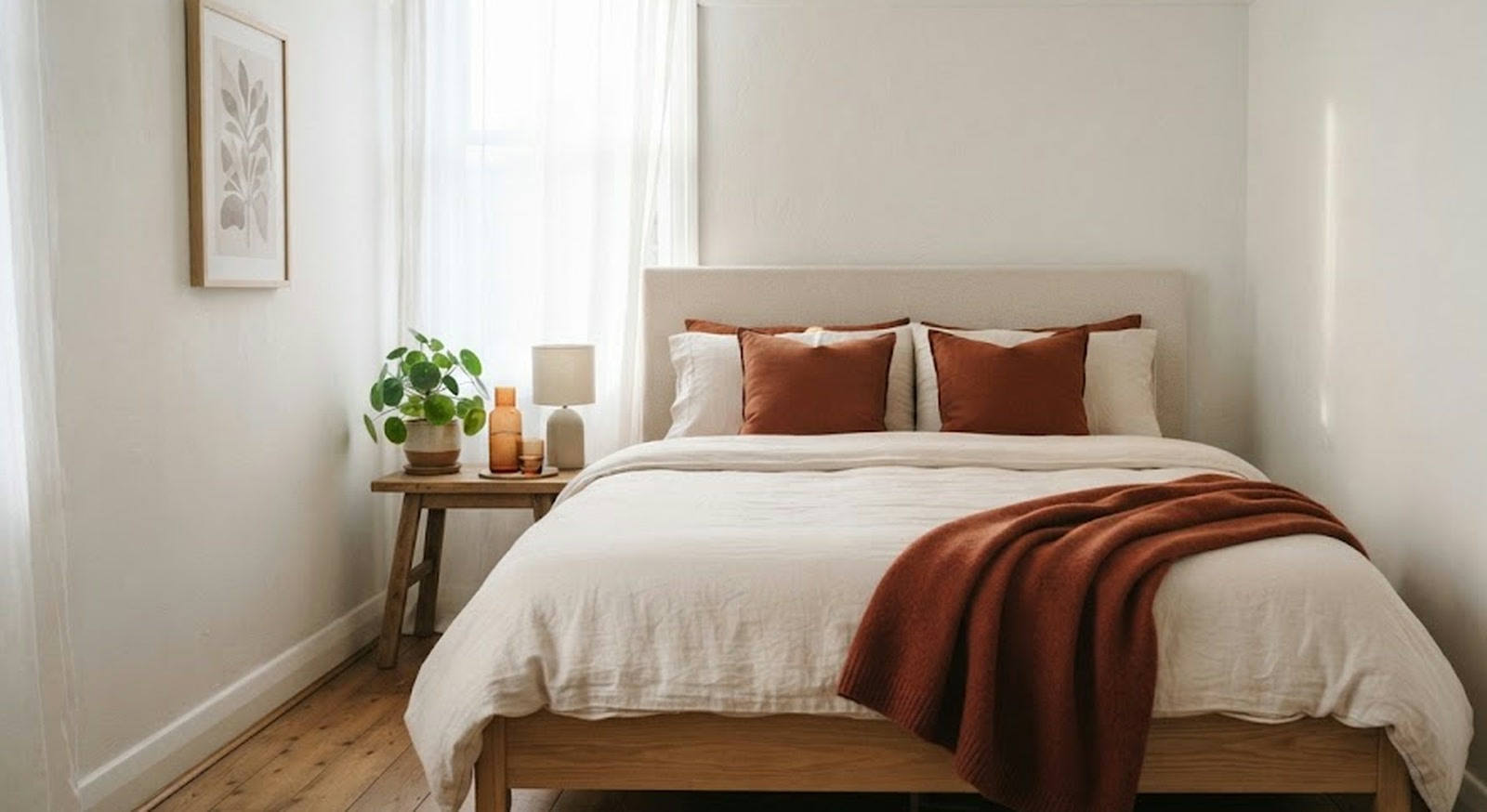
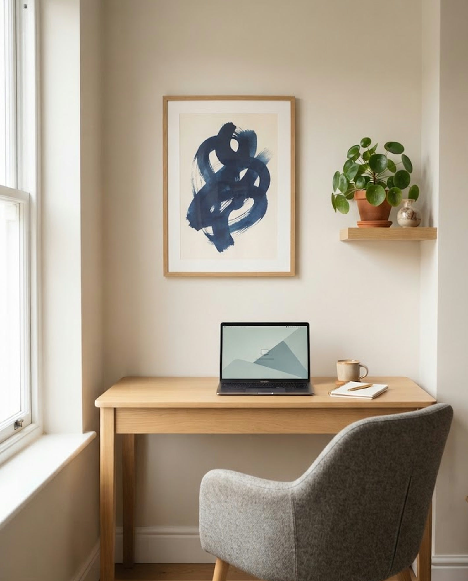
In a living room with a neutral sofa and coloured cushions or a patterned rug. In a bedroom with accent cushions and small objects. In an open kitchen with light units and darker chairs or lights. But it makes the biggest difference in two places: in small spaces, where too many different elements immediately overload the eye, and in neglected corners - the entrance, the work nook - where a neutral base plus a single detail with character is enough.
What you get besides the look
Order that is visible but never touched. The seventy percent base gives the eye a resting point before it moves on to the colour and texture in the remaining thirty. Without that stable ground, every object competes for attention and the room looks messy even when each piece is beautiful on its own.
There is a practical side for people who work from home too. Fewer competing elements means less scattered attention. A wall with a heavy pattern, an overloaded shelf and three colours fighting each other - all of it pulls you away again and again without you noticing. The rule frees your gaze to return to the screen or the book.
Where to start tonight
It needs no renovation. Pick the room that bothers you most, split it in your head into seventy percent fixed and thirty percent movable, and change one thing - a cushion, a rug, a lamp or a picture. The rule does not demand perfection on the first attempt. It only asks that you know what you are doing the next time you buy something for the house.
The latest 10 news from this category
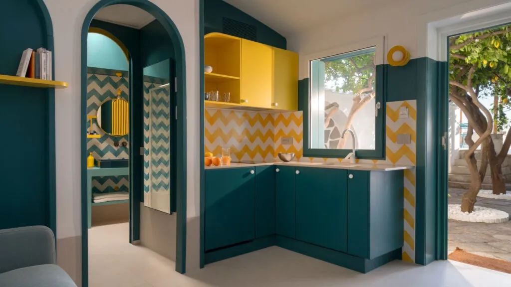
A forgotten flat in Posillipo, two colours taken from the fishing boats and the lemons outside, and furniture in which...
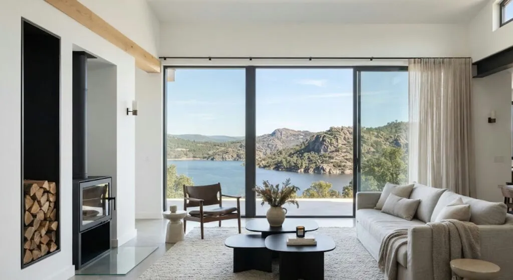
Three hundred square metres, four bedrooms and one decision that dictated every one after it: the view of the water.
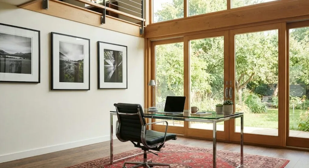
Double height, a Persian rug under the chrome and a bookshelf beneath the window. Three solutions at completely different prices,...
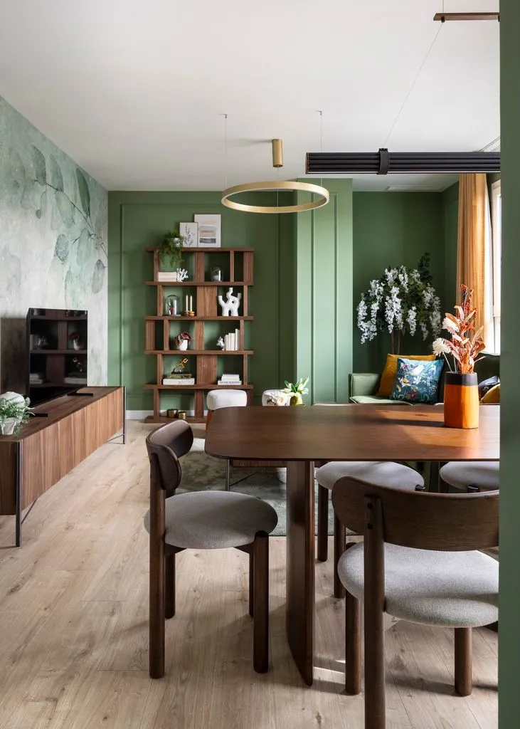
Four things change a home - walls, light, doors and floor. Everything else comes later, and demolition is last on...
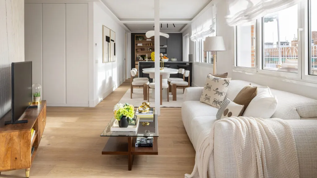
Order, calm and light - not one of the three costs money. What costs is the decision not to fill...
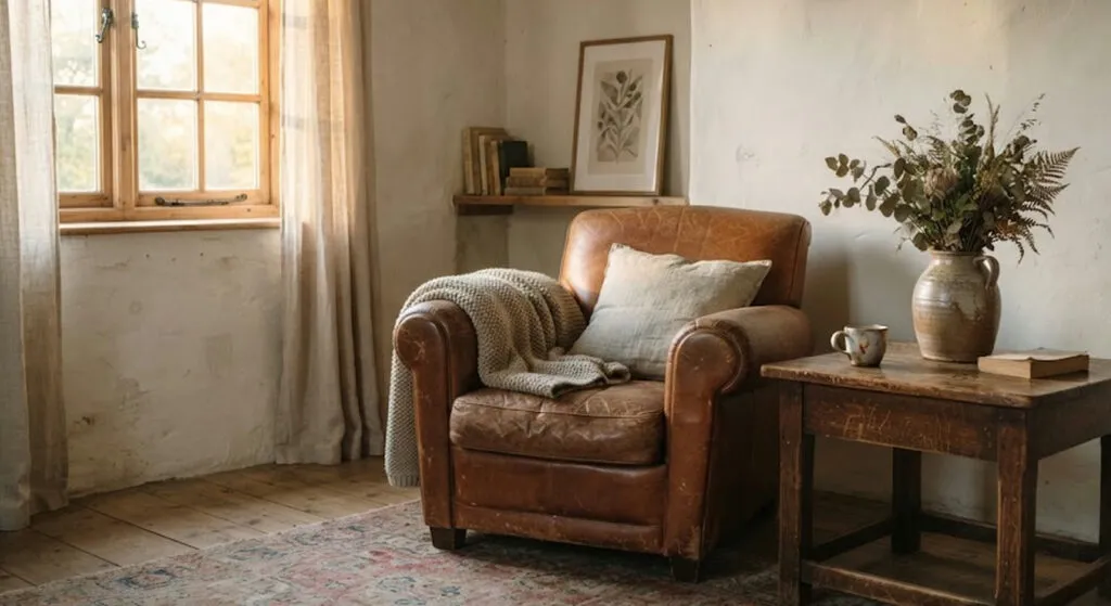
An interior designer describes found luxury - objects with a biography, visible wear and materials that improve with time. Here,...
Here a renovation starts with the sentence "since we're starting anyway, let's do everything" - and that is where the...
You walk into a flawless living room and start wondering where you are allowed to sit. Ten principles from a...
The difference is not the money, but whether the space was decided in advance or filled with whatever had nowhere...
An interior designer said the thing that is hardest to accept around here - an empty wall is a decision,...
This site uses cookies - is that okay? Learn more
Be the first to know when Metla launches something new
Leave your email and we will write when there is a new guide or something new on Metla.