
A Fire Truck Burned Down Near Struga: Two Firefighters in Hospital, and the Season Has Barely Started
08.08.2026


08.08.2026

08.08.2026

08.08.2026

08.08.2026

08.08.2026

08.08.2026

08.08.2026

07.08.2026

06.08.2026
08.08.2026

08.08.2026
07.08.2026

08.08.2026

08.08.2026

08.08.2026
08.08.2026
07.08.2026
06.08.2026

08.08.2026
08.08.2026

08.08.2026
08.08.2026

08.08.2026
07.08.2026

09.03.2026

27.02.2026

19.02.2026

08.08.2026

07.08.2026
06.08.2026
23.04.2026
23.04.2026

12.04.2026
You inherit a house and you inherit a problem. Not because the house is bad, but because everyone who walks in will tell you what needs to be knocked down. The wall is thick, the kitchen is small, the ceiling is low, the staircase is narrow. The list is always the same and always sounds reasonable.
In a small Catalan masia of just 120 square metres, architect Romina Caliz of the Caliz studio did the opposite. She demolished nothing. „From the very beginning we knew the real value was in the intangible. Every corner held something: a texture, a proportion, a way of behaving with light,” she says.
The studio phrases it differently, with the same logic: „This is not a traditional renovation, but a translation between eras.”
The kitchen that deliberately stayed small
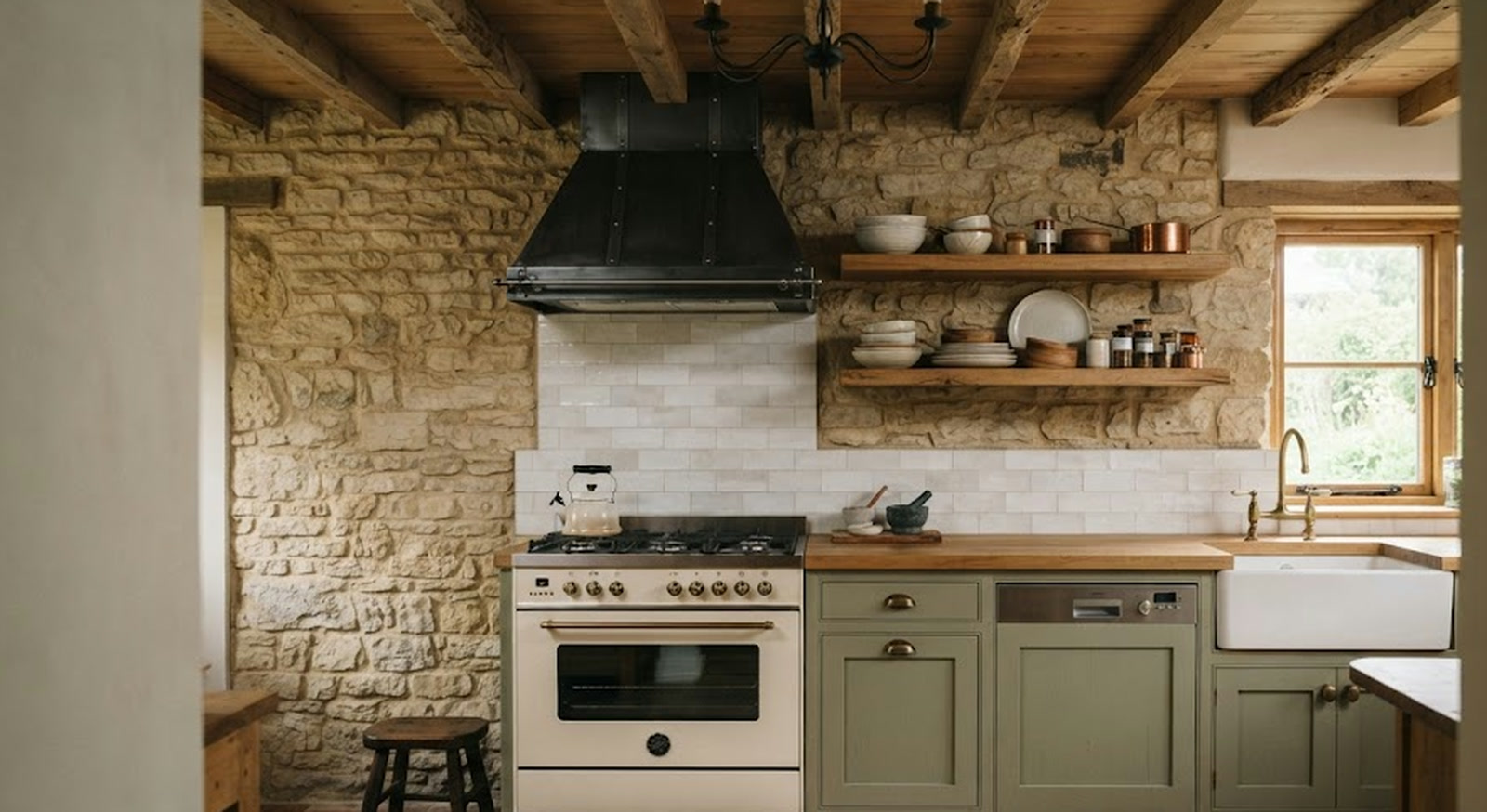
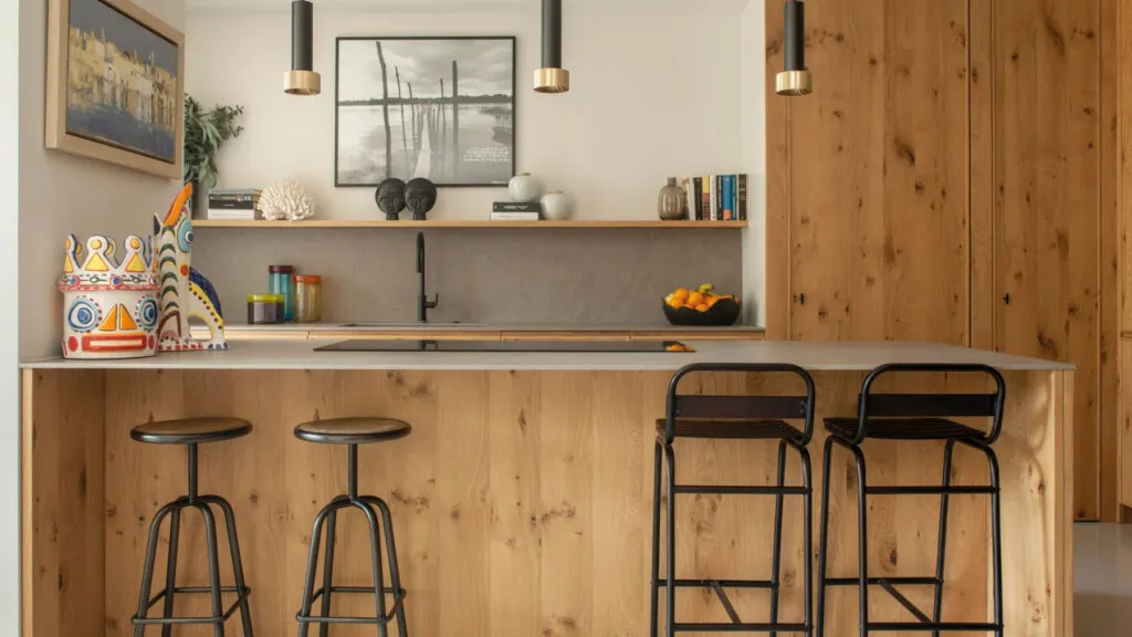
This is the part that goes most against instinct. The greatest challenge of the renovation, the architect says, was redesigning the kitchen at the same size. „Far from enlarging it, we decided to preserve its reduced scale and, with a contemporary approach, to echo the style of the small kitchens of that period.”
The result is a calm coexistence of the rustic and the contemporary. „We installed modern appliances with a classical aesthetic, functional pieces but visually embedded in their surroundings. The whole intervention leaned on noble, humble materials, in keeping with the essence of the masia,” Caliz explains. Even the extractor hood was made to measure by a blacksmith so as not to break that aesthetic.
The kitchen furniture, the doors and the windows were commissioned from a local carpenter. That is not nostalgia - it is the decision that holds the whole thing together, because nothing looks like it came out of a catalogue.
The porch that takes the living room outside
When a house is small, the cheapest way to gain space is not to build, but to go outside. The porch here is exactly that. „To create a larger shared zone and connect the private spaces, we built a porch that works as an extension, a place to meet and a link,” says Caliz.
It is divided into several zones, one of them reserved for an outdoor dining area. There people eat, read on the bench in the afternoon, play a board game, even work. In the Balkans this is nothing new - the porch and the summer kitchen keep a house open all summer long. The difference is that here it was designed deliberately, not added once nobody knew where to put the table.
A living room that was built, not bought
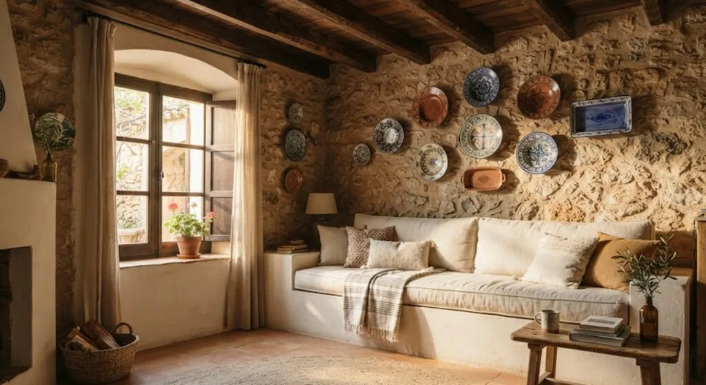
The whole masia points back to its agricultural connection. „The stone remains the structural and emotional protagonist. The textures were worked in depth, valuing the imperfect and the handmade,” says the interior designer.
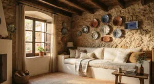
The floors are Catalan brick, the rug is plant fibre, and the masonry bench has been turned into a comfortable sofa with soft seats and backrests. The details finish it off: the plates hung on the wall above the sofa are the return of an ornament that stood in our grandmothers' rooms for decades. The fireplace provides the warmth.
It is worth noticing what is missing from this living room: a three-piece suite. The bench is part of the house, not a piece of furniture replaced every ten years.
The bedroom went up, not sideways
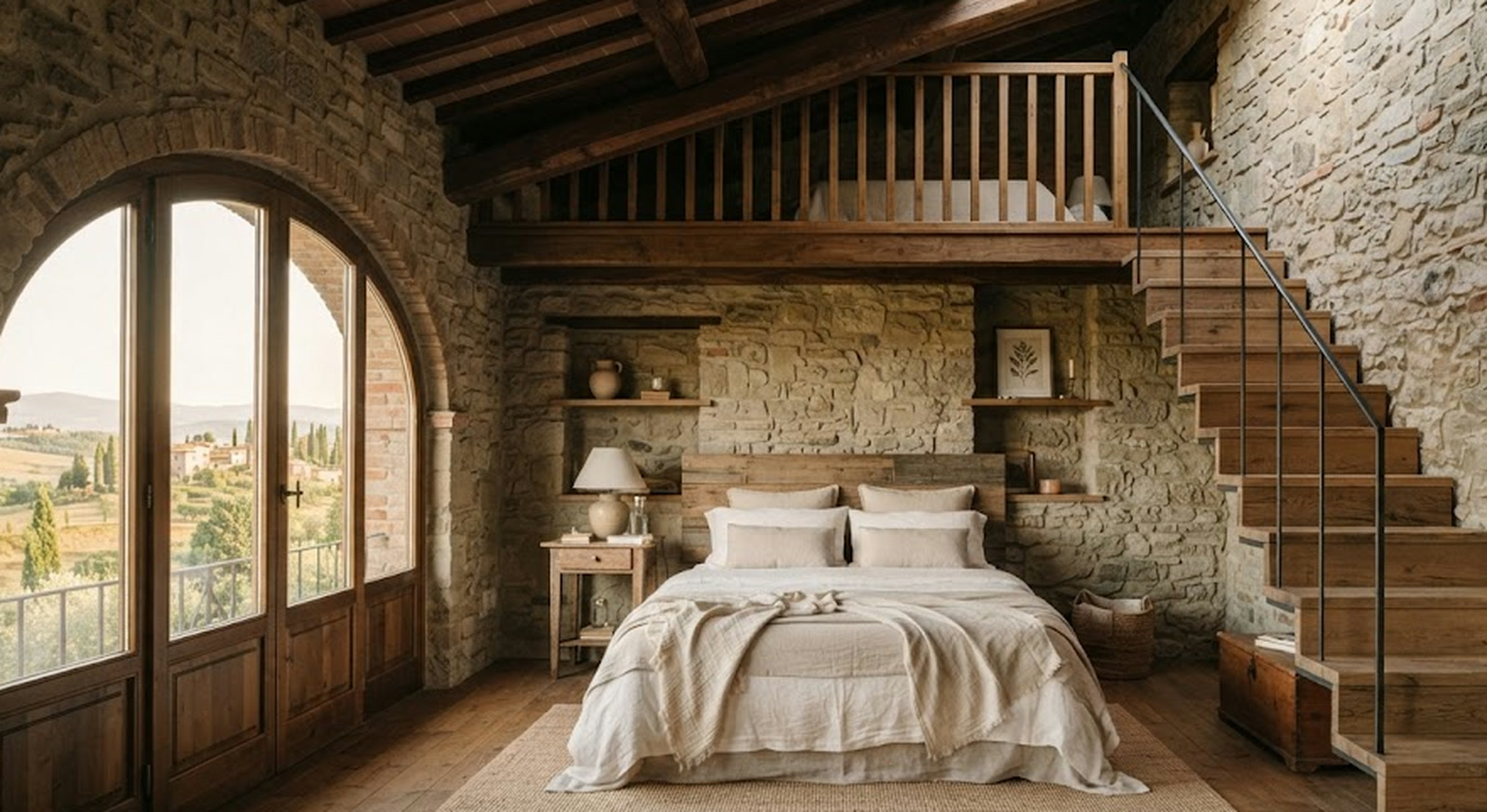
The original house had a very small staircase. To solve the new requirements without changing the spirit, the studio designed a mezzanine within the existing double height. That is where the main bedroom with a shower and washbasin sits today. A solution that uses the space without closing it off, and that brings in another source of natural light.
Below the mezzanine is the dining area, placed strategically right next to the kitchen, with a round table - a reminder of the table in a grandmother's house, and easier to move around than a rectangular one.
Lighting that is deliberately visible
One detail deserves attention. The lighting „was resolved with visible mechanisms, referencing old electrical installations. We also fitted restored lamps and unique pieces found at local antique dealers,” says Caliz.
So the wiring is not hidden inside the wall - it is part of the picture. That is a decision that takes confidence, because all of contemporary construction works hard to do the opposite.
The furniture, she adds, was chosen „by criteria of coherence and emotional narrative, not decorative ones”. That is a sentence many interior designers would say, but few would carry through to the end.
The bathrooms and what is missing in them
The bathrooms keep the same authenticity. „For the bathrooms we combined natural stone basins with traditionally inspired taps and subtle ceramic cladding only in certain places,” says Caliz. The taps are from Valadares.
Among those details, the white-tiled splashback set behind the tap stands out - it protects the wall and adds charm. And here is what is missing: there is no standard kitchen base unit under the basin. Instead - a shelf with baskets. Easier on the eye, cheaper on the pocket, and it does not fall apart from damp within five years.
The toilet next to the kitchen is solved with a sliding wooden door so as not to burden a small space. A small thing that anyone living in a sixty-square-metre flat will immediately recognise as useful.
A pool that does not demand attention
The garden and the pool are part of the interior of the house, at least in the way it is experienced. The pool is minimalist and simple and fits into the landscape. It does not stand out, it does not try to seize the attention, but to accompany.
The studio sums up the whole project like this: „The task of the Caliz studio was to accompany that heritage in its transition to a new life, without losing what had been.”
And here is the point that is worth more than any renovation tip. This renovation is not about square metres or materials, but about memory. „This project is a statement about how to preserve, reinterpret and design the past with deep admiration for what remains,” the studio says.
A 120-square-metre house that stayed 120 square metres. A kitchen that stayed small. Stone that stayed stone. The only thing that grew is the meaning - and that is the one thing you cannot measure with a tape.
The latest 10 news from this category
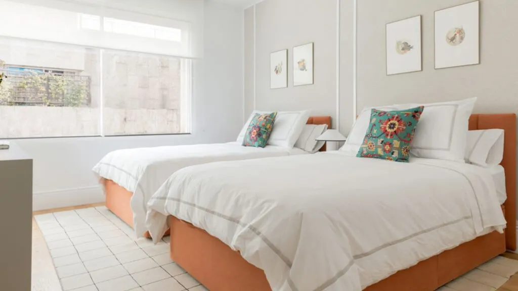
A family that sleeps badly for fifteen years is normal. A family that puts in two beds becomes neighbourhood gossip....
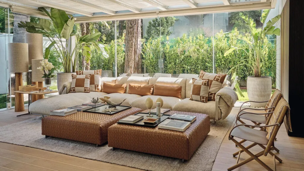
Three floors, each with a clear function, and one black kitchen that deliberately breaks the harmony. The most treasured object...
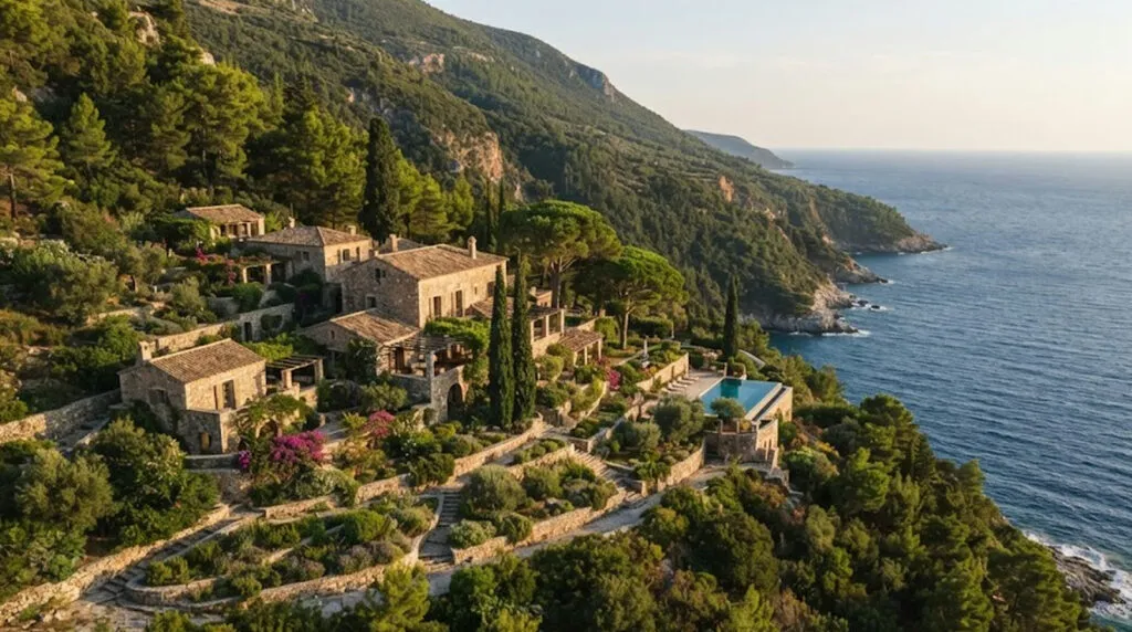
Seven buildings, a private harbour and vineyards - none of it is applicable. But the principle behind the interior costs...
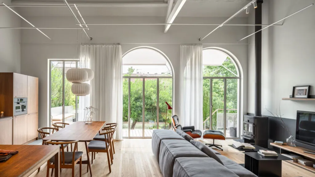
The most expensive decision in the whole renovation was not to touch what already worked. Under the false reed ceiling,...
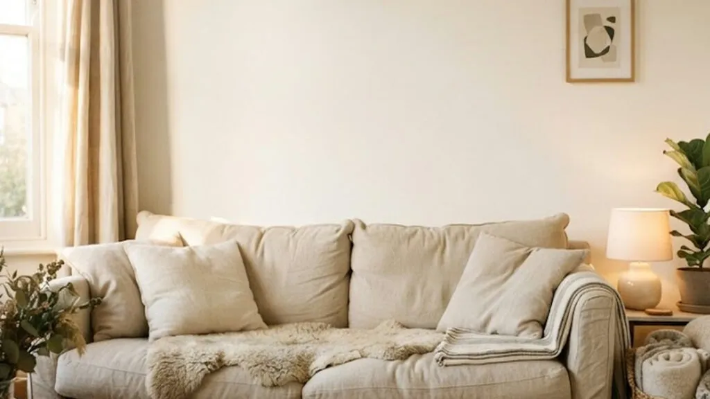
A photo does not show you where the backpacks get dumped when the kids come home from school. You end...
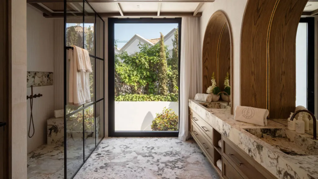
A 1.5 percent floor fall, a shower head at 2.20 metres, a bench at 45 centimetres. Almost nothing on this...
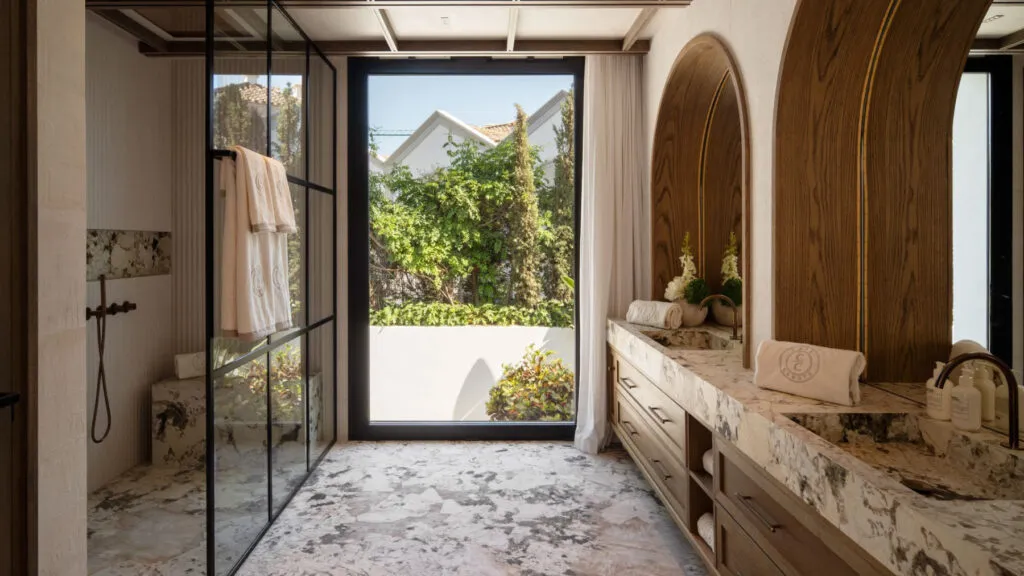
An expensive bathroom isn't recognised by its marble but by the fact nobody looks bad in it. A renovation happens...
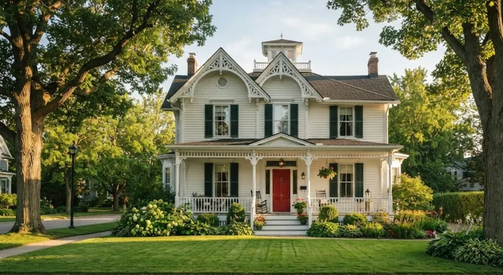
2.1 million euros for 264 square metres from 1875 in a Toronto suburb. The aesthetic minimalism cancelled is coming back,...

She bought it in 1999 and moved in after her sister died. Basque stone, Mexican colours and an inherited cabinet...
A shelf is not a replacement for a cabinet and nobody tells you that. A designer explains where it may...
This site uses cookies - is that okay? Learn more
Be the first to know when Metla launches something new
Leave your email and we will write when there is a new guide or something new on Metla.