
Prime suspect in the Dukjandžik killing arrested in Kosovo - the hunt for the second goes on
26.09.2026


26.09.2026

26.09.2026

26.09.2026

26.09.2026

26.09.2026

26.09.2026

26.09.2026

25.09.2026

24.09.2026

26.09.2026

26.09.2026
25.09.2026

26.09.2026

26.09.2026
26.09.2026
26.09.2026

25.09.2026
24.09.2026

26.09.2026

26.09.2026

25.09.2026

26.09.2026

26.09.2026

26.09.2026

09.03.2026

27.02.2026

19.02.2026

26.09.2026

25.09.2026

24.09.2026

23.04.2026

23.04.2026

12.04.2026

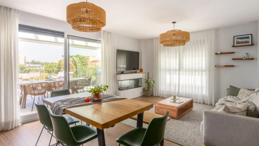
Some new flats are perfect on paper: good light, the right orientation, a layout that works. And yet when you walk in, they don't feel like home. That's exactly what this 200-square-metre penthouse in Madrid Río, in the centre of the Spanish capital, was like before interior designer Lucía Rivelles took on the project. Without knocking down a single wall or touching the original layout - using only materials, furniture, lighting and made-to-measure pieces - she gave it the identity it was missing.
The family with children had a clear brief: a warm, practical home with well-thought-out storage, far from passing trends, and a 50-square-metre terrace that would finally stop being empty space and become an extension of the living room. The verdict came from the strictest critics in the house - the children, who, the moment they saw the finished flat, declared it "the most beautiful house in the world". "It was missing that warmth and personality that would make it feel like a home for family life," Rivelles explains.
The entrance and living space
Right at the entrance, through a black-lacquered door with a frame in the same shade, you see the two ideas that run through the whole flat: contrast and warmth. A black-framed mirror from Sklum hangs above a floating console in the same colour; beside it a wicker basket with a blanket hides what shouldn't be seen, and on the other side a low wooden bench is there for taking off shoes. A built-in wardrobe lacquered in white handles storage without stealing a centimetre from the walkway - and announces the project's main theme: every room gets its own system for order, however small the space.
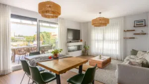
The hallway is separated from the living area by a glass door with black iron panes, which divides the spaces visually without stealing the light. Behind it, the kitchen, dining room and living room share one open space. Two natural-fibre pendant lamps, of different sizes and at different heights, mark out the seating area and the dining area, while a wooden shelving unit with geometric lines from Kave Home separates off the living room without a single wall. The plan had been open from the start, but it lacked a clear sense of what happens where. Now the furniture and the lighting do that job, not the builders.
A kitchen with an island, the heart of the home
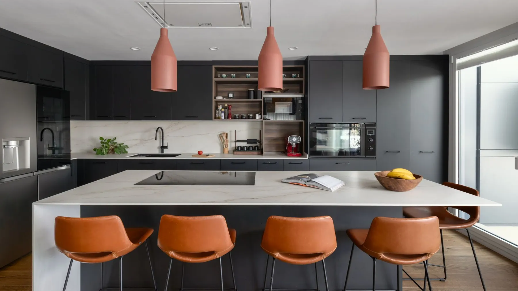
If one image sums up the project, it's the kitchen island: a white worktop on a matt black base, under three funnel-shaped pendant lamps from Kave Home that bring a terracotta contrast. Four leather stools invite you to eat, work or chat without going to the table. Behind the island, a wall of cabinets hides the appliances and keeps this black kitchen visually clean.
The living room leaves the kitchen's darker palette behind and goes for neutral tones: a wide beige sofa, a wooden coffee table and a low white unit housing the TV and a fireplace designed specifically for this flat. Above it, floating wooden shelves display the objects that give the room its personality without overloading it, and a rug from Benuta softens the whole area.
Bedrooms that grow with the children
The main bedroom is solved with one simple move: a central panel of thin natural wood slats, flanked by two sections of wall in slate blue, serves both as headboard and as the room's focal point. Two floating black bedside tables have built-in reading lamps. Opposite the bed, a wooden chest of drawers in the same tone as the headboard handles storage without a closed wardrobe, and above it a large round mirror with a frame of stacked wooden pieces multiplies the light from the window. Storage here isn't hidden - it's treated as decoration.
The first children's room combines sleep and play under polka-dot wallpaper, with a dark blue skirting band along the lower part of the wall. A trundle bed offers an extra place to sleep without taking up space, and a small table with two chairs organises the play corner. The second children's room, dressed in wallpaper with animals in soft tones, is built around a solid-wood bunk bed with an integrated ladder. Two identical fold-down desks fold flat against the wall when not in use, and a folding chair in mustard velvet from Sklum adds colour. Rivelles admits that designing the children's rooms was what she enjoyed most - with the added challenge of winning over the "little judges".
An office, a bathroom and a laundry you can't see
The small home office solves two needs in one room: by day, two workstations facing each other, each with its own monitor, and when needed, a fold-out sofa bed turns it into a guest room in a few minutes. The main bathroom goes for grey concrete-effect tiles on the walls and floor, a wall-hung vanity unit in near-black with a double basin for two people at once, a walk-in shower flush with the floor and a large, almost frameless mirror that doubles the space.
A 50-square-metre terrace divided into zones
The terrace was one of the biggest challenges: a space that large easily looks either empty or, the opposite, cluttered. The solution was to split it into areas - dining, lounge and built-in storage, "so that each has a clear function and they all live together naturally", the designer explains. The dining area under a white-beamed pergola has a table from El Corte Inglés and woven-rope chairs in terracotta and beige, next to a modular sofa from Kave Home and a double swing seat. Planters give privacy from the neighbouring buildings.
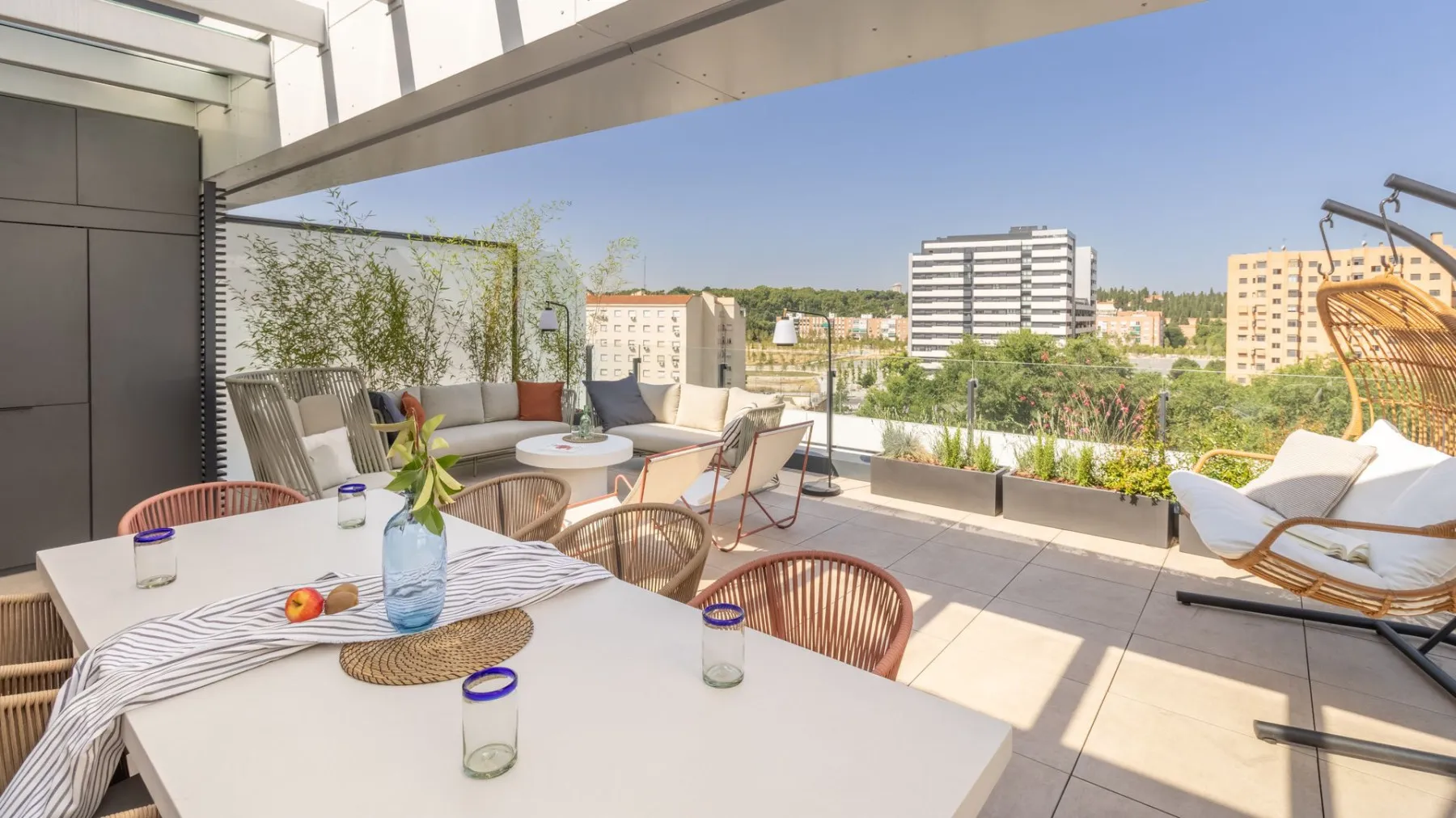
At one end, a hanging wicker chair from El Corte Inglés with white cushions offers a second, more intimate corner to relax, separated from the seating area by an olive tree and a few pots. According to the designer, this is "one of the spaces the owners enjoy most". And at the other end is the least glamorous but most useful solution in the whole flat: a laundry area with drying space, hidden in a graphite-coloured cupboard, with a washing machine, a dryer, a small sink and room to hang clothes.
"My goal is always for spaces to improve the lives of the people who live in them, to work every single day and to reflect the family's personality," says Rivelles. How many owners of new flats back home know that a flat doesn't need a hammer to become a home - just a good plan for where every single thing will go?
The latest 10 news from this category
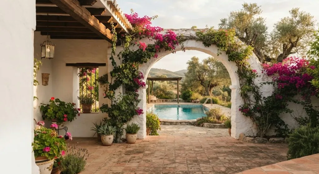
An old mill bought more than 30 years ago that his daughters still keep coming back to. Whitewash, stone and...
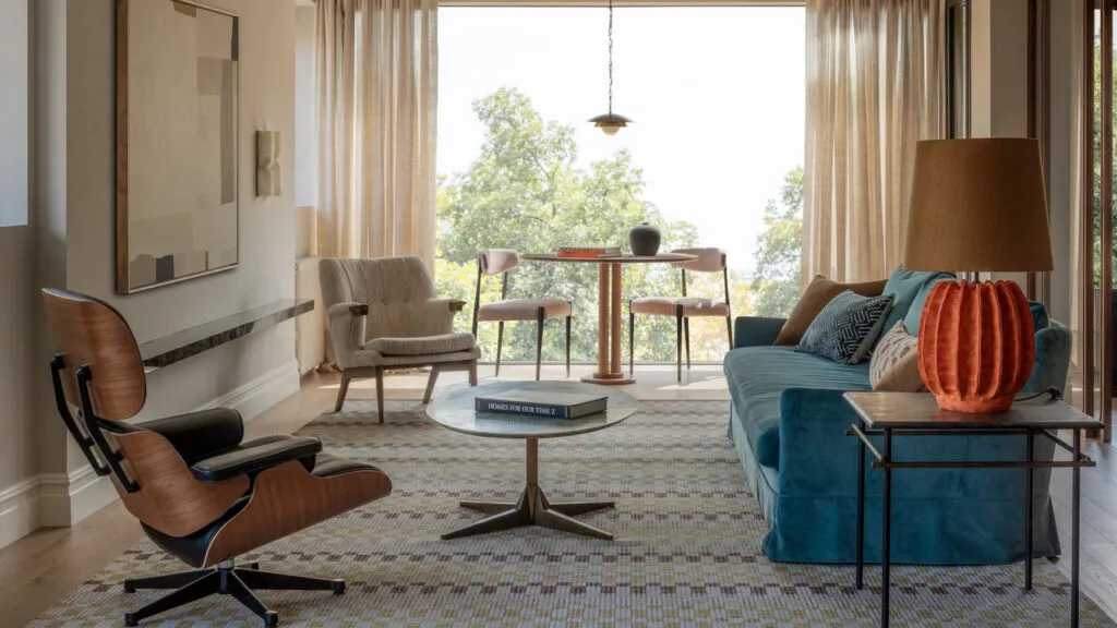
Luxury isn't about showing off, it's about detail, says the architect. That's why the best light in this flat went...
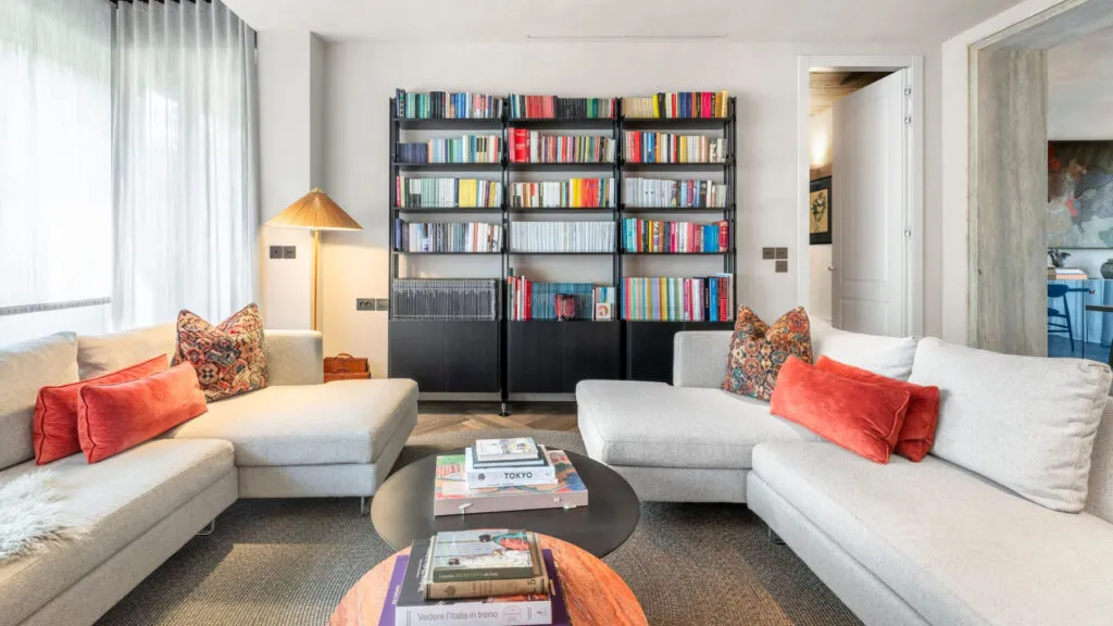
The exposed brick and ribbon windows stayed, and the entire palette came out of a single painting above the sideboard....

An Eames lounge chair from 1956, a Fratini shelving unit and a concave cobalt mirror that reflects the room curved....
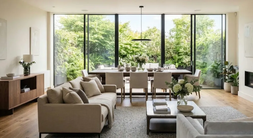
Four bedrooms, four bathrooms and one rug that keeps the dining area separate without a wall. Three things in this...

She did not decorate a house - she built a world. And behind all that fantasy there is no inheritance,...
The stairwell has been turned into a gallery, and in the bedroom there is not a single attempt at an...

In the vast majority of flats the ceiling stays white because that is how it was found - not because...
It is not hoarding and it is not maximalism. Ten things that used to be hidden when guests came and...
A bespoke console, reupholstered armchairs and wallpaper hung like art. The most expensive thing in the flat is the decision...
This site uses cookies - is that okay? Learn more
Be the first to know when Metla launches something new
Leave your email and we will write when there is a new guide or something new on Metla.