

Ljupcho Has Been Missing Ten Days, and the Family Warned Beforehand: They Got the Referral, the Hospital Said It Was Being Renovated
16.08.2026


16.08.2026

16.08.2026

16.08.2026

16.08.2026

16.08.2026

16.08.2026

16.08.2026

15.08.2026

14.08.2026

16.08.2026

16.08.2026

15.08.2026
16.08.2026
16.08.2026

16.08.2026
16.08.2026
15.08.2026
14.08.2026

16.08.2026

16.08.2026

16.08.2026

16.08.2026

16.08.2026

15.08.2026

09.03.2026

27.02.2026

19.02.2026

16.08.2026

15.08.2026

14.08.2026

23.04.2026

23.04.2026

12.04.2026
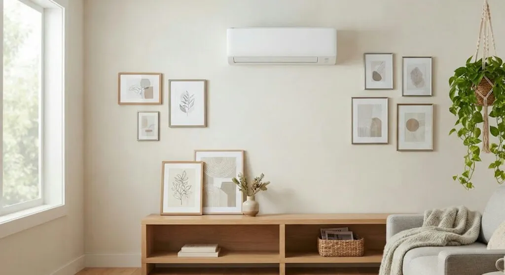
The air conditioner is the salvation of an August flat and at the same time the only item in the living room nobody chose for its looks. It sits high on the wall, white and rectangular, and it draws the eye first - especially in small spaces, where every element carries visual weight.
What interior designers say is the opposite of what most people do: you do not hide it. You integrate it. And the difference between those two things is both aesthetic and technical.
First, let it merge with the wall
The simplest move is continuity of colour. When the wall and the unit are in a similar tone, the appliance reads far more discreetly and does not jump out from the background. If the split unit is white, a light wall will help it pass unnoticed.
It does not have to be white. What matters is creating visual continuity, so it looks as if the unit is part of the surface rather than a separate object hung on it. In small living rooms, single-colour walls also give a sense of greater order and more space.
A composition around the unit, not against it
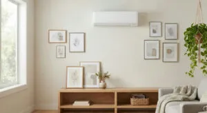
The other option is to let the wall itself become a composition. Paintings, photographs, prints or smaller objects can lead the eye toward the space as a whole instead of only toward the air conditioner. That works particularly well when the unit sits on a wall that is visually very empty - the emptiness is what makes it noticeable, not the unit itself.
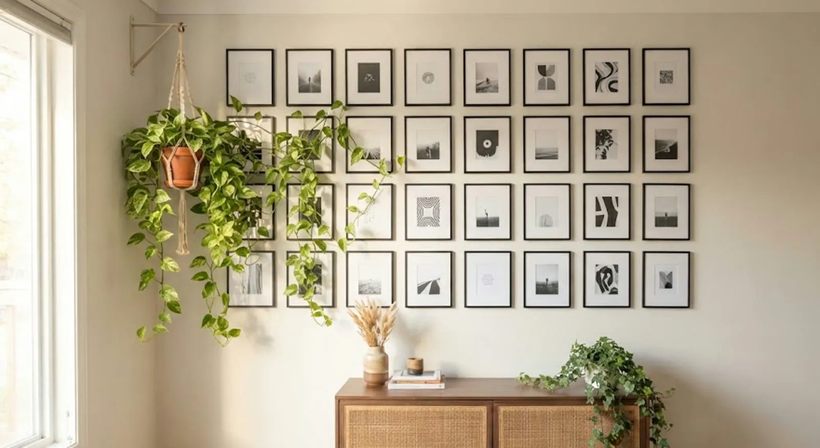
There is one rule that is not broken: the required space around the appliance is always respected, and the zone where the air comes out stays clear. Decoration must never interfere with its operation, because in that case it can break down.
When it sits above furniture
If the air conditioner is above a shelf, above the television or above any furniture at all, the furnishing itself can provide greater visual continuity. Repeating colours, materials or similar lines helps all the elements read as one composition.
That is a particularly interesting solution in contemporary living rooms, where furniture can be designed more integrally with the architecture of the space. Here, where the split unit is almost always fitted last and wherever the pipe comes out, that is a rarer luxury - but the principle holds for an existing installation too.
Plants take the eye away
Plants, placed strategically, bring volume and movement and manage to pull attention toward another point in the room. For small living rooms, hanging plants are a particularly good solution, because they add greenery without taking up floor space.
And now the mistake that costs money
Here is the part no catalogue stresses enough. Manufacturers recommend that the indoor unit remain unobstructed, to ensure proper air circulation. If it is obstructed, the appliance can lose efficiency - and consequently consume more energy to work normally.
So the decoration covering the split unit is not only an aesthetic problem. It shows up on the electricity bill.
For the same reason, wooden covers for split units that are excessively bulky or overloaded are not the best solution. In a small living room they can end up as yet another element on the wall, making the space even fuller and more overloaded. So the object bought to hide one white rectangle ends up taking more space than it does.
Balance, not concealment
The whole point is finding a balance between aesthetics and functionality. There is no need to hide the air conditioner for the living room to keep looking well decorated. It is enough for it to fit in and to stop being the first element the eye lands on when you walk into the room.
That is a different logic from the one most people live with in August: the unit as a necessary evil endured because of the temperature. Designers say it can be just another object in the space. The question is why we treated it for so long as something to apologise for.
The latest 10 news from this category
350 square metres without a single corridor, five bedrooms and a pool that does not beg for a photograph. Not...
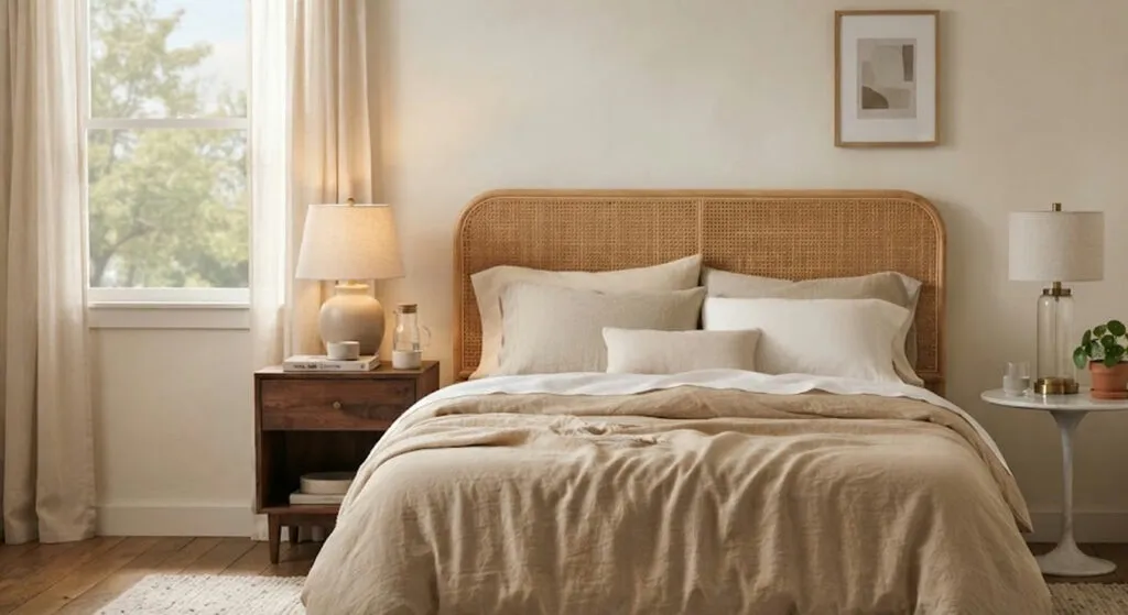
Mixing materials and shapes gives you more than repeating the same model twice. Here it also means the inherited nightstand...
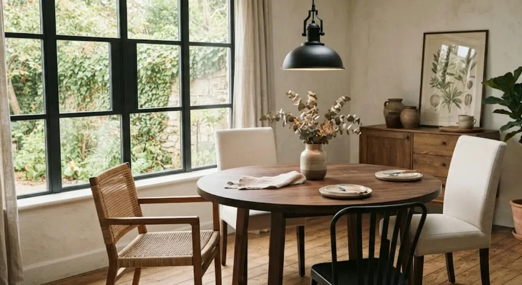
If you like the table but the chairs have fallen apart, you do not have to throw everything out. The...
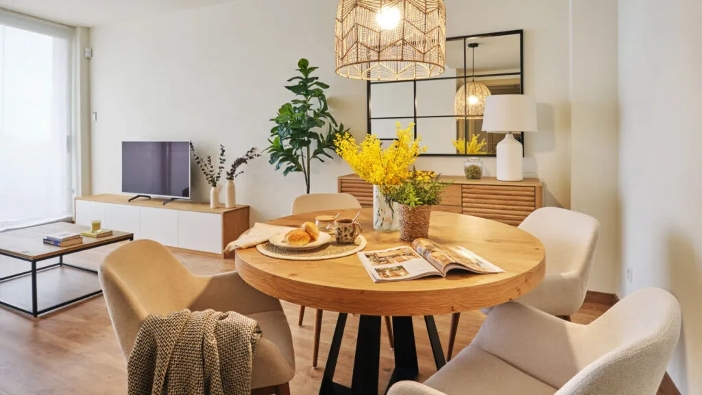
White walls, low furniture and lots of mirrors produce flats that photograph well and live badly. Ten pieces of advice...
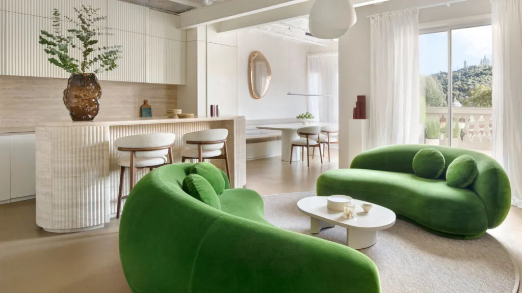
The Catalan vaults stayed, the walnut joinery stayed, and on top of it came an intervention that deliberately does not...
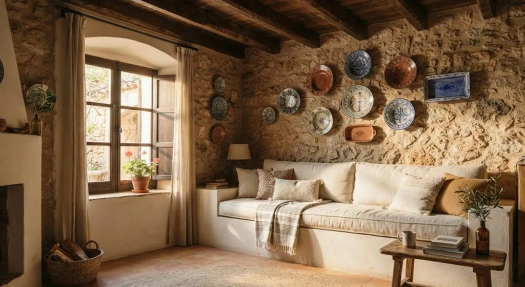
Everyone who walks into an inherited house tells you what should come down. The architect here did the opposite, and...
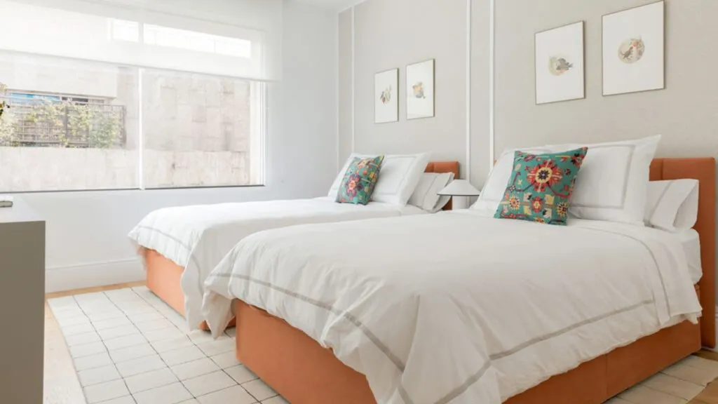
A family that sleeps badly for fifteen years is normal. A family that puts in two beds becomes neighbourhood gossip....
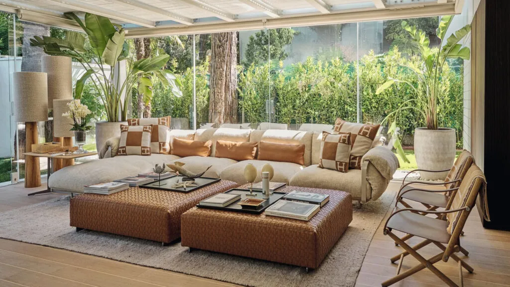
Three floors, each with a clear function, and one black kitchen that deliberately breaks the harmony. The most treasured object...

Seven buildings, a private harbour and vineyards - none of it is applicable. But the principle behind the interior costs...
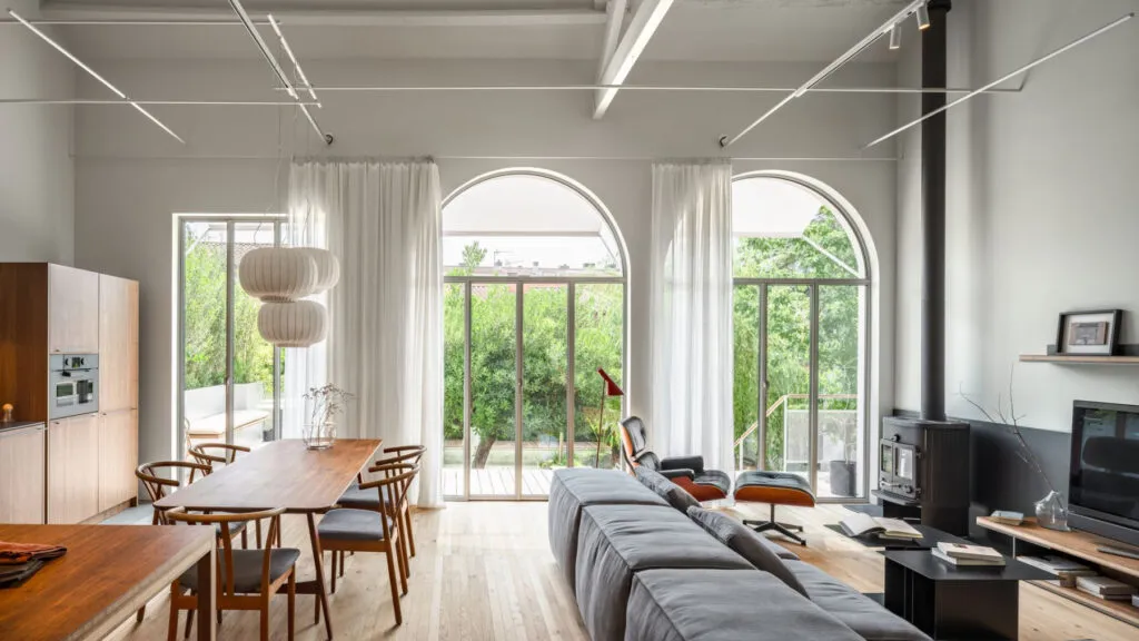
The most expensive decision in the whole renovation was not to touch what already worked. Under the false reed ceiling,...
This site uses cookies - is that okay? Learn more
Be the first to know when Metla launches something new
Leave your email and we will write when there is a new guide or something new on Metla.